Saturday, June 29, 2013

A decision in the silver space

Earlier this month I couldn't decide whether silver was going to drop to an area of stability around $17, or move back to the area of stability near $30.

June has given us our answer.


There was a little head-fake at the beginning of the month.

Most of the price move needed to reach the LSA centred at $17 has happened. What needs to happen for silver to reach the LSA is time--about six weeks at or below the current price.

Friday, June 28, 2013

Friday OT the second

A rare double-header. Because Verdi.


We were fortunate last month to be able to see Richard Margison perform with the Etobicoke Philharmonic. I was able to bring my mother as a sort-of belated Mother's Day present, which was great because she is such a Verdi fan.

Tuesday, June 25, 2013

The evolution of the Case-Shiller index . . .

. . . viewed in real time is like watching paint dry, but without the possible dramatics of runs. Hence, the long break since the last time I looked at this.

In case you are unfamiliar with it, the Case-Shiller index is an inflation-adjusted index for house prices in the United States (data available here; methodology here - pdf). As the recent data is presented quarterly, the annual values in the graph below I have calculated as the average of the four quarterly values for a calendar year.

The analysis is the same as last time, where I outlined three possible scenarios we could see to 2015.


So far we are headed right down the middle towards the main area of stability, where inflation-adjusted house prices remained for about 50 years after WWII. You can throw an apple really high, but it's hard to keep it from falling afterwards.

Clearly, if people are to get wealthy from real estate, Bernanke needs to keep blowing (or is it sucking?)

Below is the same index, but quarterly.


The long and winding road has leads us back to our door.

We'll stop in and look at this later (next year)--after all we don't want to be like the crowd watching Thomas Hardy write in that famous Monty Python skit which would have been embedded right here except all that came up is a notice saying that "this video cannot be viewed on certain [chart-porn] sites".

Monday, June 24, 2013

Disasters in mining, part 723

A friend of mine was telling me about a mine that has encountered a tricky technical problem. The mine is under a lake, and in the company's original filings, they had an agreement to leave a certain thickness of rock between the top of the mine and the bottom of the lake. Of course that rock turned out to be ore, so the company started mining a little bit from the roof. Just a bit. Then a bit more. Then a bit more. Now the rock layer is only about one-third the specified thickness, and fissures have appeared along with water leaks.

As he was describing it, I asked if it was [redacted]. He wanted to know how I knew. I told him I didn't. But I do now.

Thursday, June 20, 2013

The body piezoelectric

Piezoelectricity is all around you, from the clocking chips in computers and watches, to the transducers in certain sonars, to many of the tissues in your body. Piezoelectricity is a phenomenon in which a crystal which is subject to stress develops an electric field. It is reversible, so that applying an electric field across a piezoelectric crystal causes it to distort.

We are accustomed to thinking of piezoelectricity as being restricted to crystals and ceramics. But tissues in the body are piezolelectric as well. The initial discovery (though long suspected - pdf) of piezoelectric behaviour in bone was followed up by its discovery in neurons, intestinal tissue, cartilage, tendons, and ligaments.

The piezoelectric effect may play a role in crystal growth, as when pressure is applied to the crystal, the maximum potential differences will tend to be at the ends of the crystal, so that ions are more likely to report there rather than the middle.

It has long been recognized that the piezoelectric effect is responsible for bone remodeling which is why you should make an effort to stand up straight and don't slouch!

- - - - - - - - - - - -

This story about cellphone towers prompted today's topic. I have long been sympathetic towards the notion of non-heating damage from non-ionizing radiation. Piezoelectricity is a possible mechanism for harm, although there is no study of which I am aware that shows this. The possible mechanism for harm is difficult to elaborate, because the role of electric fields in these various tissues is uncertain. Piezoelectric materials may undergo a distortion when they are subject to external electric fields, which may contribute to vascoconstriction. It's also possible that the external electric fields may also interfere with the growth of these structures.

Tuesday, June 18, 2013

Multistability in the gold-copper ratio

The gold copper ratio is commonly used to illustrate the state of the economy. Note that we usually take the ratio of the gold price per troy ounce and the copper price per pound. A recent graph of this ratio can be found here.

In past articles I have looked at how to study dynamic systems using reconstructed phase space portraits.


Here we see the reconstructed phase space of the gold-copper ratio over the past eight years, using a time-derivative method--plotting the value of the ratio against the average rate of change over six months. My convention is to plot the rate of change against the midpoint of the time window--for example, the last such calculation measures the change in the ratio from November 2012 to May 2013, and is plotted against the month-end price of February. This is why the graph ends at February even though we have month-end pricing to May.

There are three areas of stability in the above graph. In 2006 and 2007, the copper price rose dramatically, and the Au-Cu ratio fell, until there was a sudden pop in the economy in mid-2008, which is recorded in the figure above as a tremendous gyration lasting a year. The Au-Cu ratio settled for several months near the 350 level, before leaping to the 450 area, where it has remained for the past 18 months.

It could be that the economy as a whole was overheating in the middle of the last decade, what with all the demand for copper from China and the US housing boom. Then I suppose we returned to sanity.

Except the current economy doesn't feel sane to me.

The highs for copper in 2006 are not out of the ordinary. By inspection we can find numerous periods where the ratio was 200 or lower. In the late 1920s, Au/Cu fell to about 140, but when the depression hit, the ratio rose to over 400. In the wake of the post-war rebuilding, Au/Cu fell well below 100 and was still at that level when Nixon closed the gold window, although the pegging of the gold price and the military actions of the US both supported this low ratio.

More recently, we have the following . . .


. . . in which our hot, inflationary late '70s economy suddenly slowed. It helped that in the '80s the US wasn't involved in any wars of consequence (just little actions in Iran, the Sinai, El Salvador, Libya, Lebanon, Egypt,  Grenada, Honduras, Chad, the Persian Gulf, Italy, Libya again, Bolivia, the Persian Gulf again, Honduras again, Panama, Colombia, Bolivia, Peru, the Philippines, and Panama again).

Just after where I have ended the graph, the system returned to the area of stability at around 300, during the housing bubble at the end of the '80s. For a look at how terrifyingly huge it was, see below. ;)


So to my non-economically trained mind, the Au-Cu ratio only seems to fall below about 300 during credit-fuelled booms (and maybe during major postwar rebuilding phases). Presumably when it is higher than some level, we could say it indicates we are in a depression--but I haven't figured out what that level is yet. Early in the Depression, the ratio was at 400--but that was in the days of the gold peg at $20.

My gut feeling is that the present ratio is not far from depression levels.

Friday, June 14, 2013

Singapore faces worst dengue fever outbreak in its history (updated)

On our last trip to Singapore, my wife insisted that the mosquitoes there were not a concern. This is no longer the case. Singapore is in the throes of its worst outbreak of dengue fever ever. No explanation has been offered for the size of the outbreak, although there have been comments that the virus has a greater resistance to treatment than normal.

I'm not convinced--in my experience with tropical disease outbreaks in Africa and other places, it is almost always caused by higher than normal rainfall. In Singapore it may be compounded by the large number of construction projects underway.

Dengue is caused by a virus which is spread by mosquitoes. There is no vaccine, so you avoid dengue by avoiding mosquito bites.

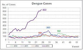
Last year Singapore experienced a little over 4,500 cases of dengue fever (which seems like an awful lot to me). That would be less than one case per thousand population. This year, the number is already over 10,000, with over 800 new cases this week alone. They have not yet reached the time of year where the number of cases normally peaks. There have been two deaths.


Dengue cases this year. From here.

It's hard to make sense of the distribution of cases. The Paisir Ris cluster is an area of apartment blocks, but there is a lot of green space between the buildings and a fairly large series of connected parks.


Downtown shots, not Pasir Ris. Couldn't find any good shots of Pasir Ris except inside the apartment.

Updated June 26


Numbers still growing, with the peak still likely a few weeks away. Graphics source.

Friday OT

The Friday O.T.

For as long as I remember.


Love the girls playing violin on the rooftop in Havana.

Wednesday, June 12, 2013

About the Bay of Pigs . . .

Given the ongoing furor over the NSA's Prism surveillance program, it is useful to remember that ridicule is one method of resisting authoritarian initiatives. With this in mind, I call to your attention the 2000 film Company Man, which purports to explain the Bay of Pigs and presents us with a retelling of the CIA's attempts to discredit Castro via a series of bizarre plots including beard-defoliation, drugs, and poisoned cigars. The opening line of the movie advises "based on some true events".

Even Operation Mongoose gets a mention in the movie ("There's a mongoose in my shorts!").

The movie generated poor reviews. It is not a great film, and John Tarturro brings the film to a screeching halt with some brutally bad acting--but there was some good political humor overall. Woody Allen was a great, albeit hopelessly inept, CIA section chief.

Again, mocking the secret intelligence services is a good thing.

Spoiler alert - the various assassination attempts fail, and the Bay of Pigs invasion is repulsed. At the end of the film, Kennedy compliments the "hero" for his dedication in attempting to kill Castro, and notes that although the invasion failed, it did highlight the need for an increase in the CIA's budget.

Considering what happened to Kennedy later, that line is the real stinker in the movie.

Theme song below.

Tuesday, June 11, 2013

Trust mislaid

I am greatly discouraged over poll numbers presented yesterday at the Washington Post in which the majority of Americans support the government's stance on espionage, provided that the effort is directed at finding terrorists. A large number (45%) agree that the government should go farther than it has already.

It makes feel very sorry for Edward Snowden, who has risked life-altering circumstances in order to bring this particular instance of the US government's abuse of power to light. It seems he needn't have bothered.

Americans have given this a ho-hum and gone back to Dancing with the Stars.

Americans are afraid that Google, Facebook, and various advertising agencies are spying on them. Yet at most these companies only want to sell them stuff (or sell their info to other companies that want to sell them stuff). Yet they trust the US government, which has an established precedent for drone-striking American citizens that have been deemed enemy combatants.

The only thing for which the US government needs information about you is for 1) collecting more taxes, 2) assessing your suitability as a drone target, 3) assessing your suitability as a rendition target, or 4) assessing the likelihood that they will be able to steal your house and all your assets due to drug offences. In the last dozen years there has been only one terrorist case that was not unambigously created as part of a sting operation by the FBI (there is room for doubt on the Boston bombing case).

You can opt-out of Google.


But you can't opt-out of government surveillance.

Friday, June 7, 2013

The mystery of Robertson screwdrivers in Ghana

Every Canadian blog eventually has to have a post about Robertson screwdrivers. We are told they are uniquely Canadian. Especially when they start showing up in Ghana.

I remember once working on an oceanographic vessel out of Bedford Institute--almost 30 years ago. Some of the (at that time analog) recording equipment had been fastened in place with Robertsons. We had to move some of the equipment, and an American colleague remarked, "We need to have some kind of a special tool to undo these."

Some years ago I was running a marine survey in Ghana. We had a variety of braces and mounts assembled here and shipped over. In the course of operations I found myself having to modify our home-made mount for the GPS, which was held together with Robertsons. I had a multi-tool, but there was one screw that had was hard to access, and impossible for the tool (the knuckle couldn't get into the access) so I was stuck unless I could find a dedicated Robertson screwdriver, which was impossible in Ghana.

Uniquely Canadian.

A few years later I needed to buy some screws at a hardware store in Accra, and ended up picking up a few packets of Robertson screws. They even had some of the screwdrivers too. But since cleaning them out that day, I have never found any at any store in Ghana.

Why did they appear in such limited numbers, only to disappear?

In checking out the new Robertson webpage, I did see one clue. It is now part of the Berkshire Hathaway empire.

But a brief market flirtation doesn't really seem like their style. My present guess is that it was some kind of Canadian government initiative--get the Robertson out there. But without any follow-through.

Thursday, June 6, 2013

Whither silver, or wither silver?

Let's look at dynamics of the silver price.

For today's charts I am using the Friday PM London fixes since 2007, which can be obtained here.


This is he week-end closing price for silver over the past 6-1/2 years. Note the trough in 2009 and the spike in 2011. I'm sure we all remember those.

Next up is the reconstructed phase space using the time-delay method (previously described here and here). I actually experimented with several different lags before choosing one of six weeks, as depicted below. Choosing 12 weeks or 24 weeks does not significantly change the results.


Same time period as above.

There are three strong areas of Lyapunov stability around $13, $17,  and just above $30. The mess north of $30 can't yet be resolved as anything but noise, although my opinion could change if the price were to rise to the $40 and stay for a few months.

The price action of the last month is clearly noted. Silver has dropped out of the attractor in the $30 range. Normally, we would expect the price to fall back to at least the $17 attractor, but it is also possible for the price to revert to the $30 attractor. Time will tell.

At this point I would like to look at the fundamentals of silver to help me decide which outcome is more likely. Unfortunately there is a lot of noise and the true fundamental picture is unclear. So we are left with making a gut call. My little pile of silver at the bottom of the sea is telling me that the price will go higher. I think a drop to the $17 area is the most likely outcome--although I think such a drop will be short-lived.

Wednesday, June 5, 2013

To an old friend

Dear Neighbour:

I'm writing this letter to invite you over for a barbecue later this week if you have time. I know we don't talk much any more. Your house is too dark and with your guards and their dogs, it's too dangerous for me to try. Remember how we used to talk over the fence while doing the gardening or mowing the lawn? Those days are behind us. I miss them.

You've changed in the last dozen years since some boys from across town vandalized your property, killing part of your family. The neighbourhood had a great deal of sympathy for you at that time. Remember how afterwards a few of us brought over a meal for you and we had a quiet celebration of your kind spirit and remembrance of those who died.

Unfortunately, rather than opening up to us you drew inward. Worse, you plotted terrible revenge against your tormentors and caused great harm to many families (who have never been positively connected with the crime committed against your family) on the other side of town. This has earned the enmity of many of the people who once supported you; and lost the sympathy of many of your neighbours.

I remember how I often used to see you standing out on your front lawn, radio-controller in hand, while amusing the neighbourhood kids as you performed aerial stunts with your model planes. Now I never see you, but your planes are flying everywhere, over the neighbourhood and across town. Our suspicions that you had armed some of these were confirmed with the news of mysterious explosions on the other sided of town. At the last neighbourhood meeting, you insisted that they made us all safer, and ignored our general nervousness.

You have alarmed people all over town. I am sorry about the occasional acts of vandalism that still occur on your property. Of course it is unjustified, but some of it is, I am sorry to say, understandable.

Your home, which was once open and welcoming, is dark and brooding, covered with fearsome weapons, and surrounded by heavy-set guards with dead eyes. I still recall with horror the screaming of that girl down the street who tried to sell you cookies for a school fundraiser.

I was planning to deliver this in person, but the wife is worried about your model planes flying over the property and really doesn't want to be strip-searched by your security team. In any case,  I don't dare walk up to your front door to ring the doorbell. So I'm sending this by email. I hope you understand.

I would wish you good luck in your endeavours, but don't approve of them. So I'll just wish you well instead.

Sincerely,

A neighbour

Tuesday, June 4, 2013

Coffee broke

I was trying to nap while taking the train into town this morning when there arose a cocaphany of squawks and sputters. It sounded like a flock of chickens being murdered by a pack of dogs.

Yes, as a matter of fact, I have heard that before.

It ended with a godawful screech: "My coffee!" I couldn't see where it came from, but the emergency strip had been pushed so we were going nowhere until the transit police came to sort things out.

I don't know what happened, but coffee was spilled and the police were called. Two individuals were singled out by the transit police and interviewed afterwards. It looked like the sort of thing that would normally be settled by a duel. Coffees at five paces.

Sorry to disappoint you - no chart on coffee at this time.

Monday, June 3, 2013

Gold-silver ratio at its lowest area of stability

I've been working on extending some of my commodity price time series farther back in time and will be reporting on them as I go. Currently I've pushed rice, copper, silver, and gold monthly closes back to 1988 (mainly having trouble finding a consistent record for copper beyond that).

Today we'll look at the gold-silver ratio from January 1988 to the present.


Hopefully this looks bigger if you click on it.

To investigate the dynamics I'll construct a time-derivative phase space portrait. This is a scatterplot of the GSR vs its rate of change (averaged over five months).


Looking at the time-derivative phase space portrait, we can see there have been five areas of stability for the gold-silver ratio in the past 30 years. Those ratios are at approximately 53, 61, 65, 73, and a weak one near 88.

For those who tell me that the proper gold-silver ratio is 15--or maybe 16--my answer is "show me".

It was true historically--but the present system operates on a different dynamic. It seems pretty reasonable to assume that the last 30 years describes the current dynamics of the gold and silver markets. The gold-silver ratio has been nowhere near 16 in that time.

The only way to return to a ratio of 15 or 16 is to return to a time when the gold and silver prices are defined by central financial powers--which is to say, a political solution. Perhaps such a political change is coming. I'm not in a position to say, as Messrs Bernanke and Obama still haven't invited me for a round of golf.

Provided no such political change comes, any decrease in the gold-silver ratio is likely to be a short-lived spike, but long periods with a much higher ratio are possible.

Looking at the above graph, when we are at the far right it is time to buy silver, and when we are at the left it is time to buy gold. Presently we are closer to the left than the right.

Sunday, June 2, 2013

Remarks on some extended records of arctic sea ice

One approach to studying the dynamics of complex systems is to reconstruct phase space portraits of the original time series. The reconstructed phase space reveals the topological structure of attractors (if present) although their geometric shapes are distorted.

Today I present to you reconstructed phase space portraits, using the time-delay method, from some longer Arctic sea ice records, found here and here (pdf). The last record I looked at went back to 1979. The one below begins at 1972.

As in the earlier article, I have used a two-year lag.


There are some interesting differences we note with the slightly longer record. First of all, there appears to be a behavioural change at about 1989, before which the system is confined to the small yellow circle; and after which the system exhibits greater variability with a bias to a somewhat lesser extent. After 2004, as we saw last time, the system has been evolving towards a new state with smaller area covered. At this point we cannot predict where the next area of stability is.

There are those who predict that the Arctic is heading for ice-free conditions in a matter of a few years. Alternatively, we may be observing part of a multi-decade (or longer) oscillation, and that there may be a non-zero stable state somewhere near or below the present-day observed sea-ice extent.

To investigate this possibility, we consider records of Russian sea ice extent compiled by the Arctic and Antarctic Research Institute since the 1930s based on observational methods. As this paper was published a few years ago, the analysis of the hand-drawn charts has only been completed until 2005, although more up-to-date charts can be located on the AARI site. Below I have the reconstructed phase space portrait for autumn sea-ice extent (which I'm guessing compares to the September sea-ice record above) in the Russian Arctic.


There are appear to be two areas of attraction in the above graph--at about 4 million sq km, which characterized sea ice area from about 1950 to the end of the 1970s--and a second at about 4.5 million sq km, which characterized the system from 1980 until 2004. The final year suggests a drop in area of autumnal sea ice, and if the decline since then is anything like our first plot, we would expect the current state to be near the bottom left corner of the graph.

The Russian observations are consistent with other Arctic climate records which suggest a period of cooling until the late 1970s. This idea suggests that there is long-term variability in ice extent, with periods of cooling alternating with periods of warming. However, the current losses in ice extent are greater than any observed back to the 1940s. If we are to argue that the current warming is part of a long-term natural cycle, then it must be on the order of century-scale or longer.