Friday, January 30, 2015

The gold-copper ratio

IKN asks (well, not really), and the World Complex delivers.

Is the current gold-copper ratio unusually high? Based on the month-end closing price, the ratio stands at about 504.


The ratio has only very briefly touched such highs in the last ten years--most notably (and briefly) the last time the world broke.

In fact, over the last 25 years or so, the ratio has pretty much always been below 500. We only see little pop-ups that last no more than a couple of months. This has created a normalcy bias in many observers' minds.

If we go back a few years more, we see this:


In the mid-1980s, the gold-copper ratio spent years higher than 500. And there are at least three areas of stability in this range.

So what happened? Were either gold or copper fundamentally different from today? Did they gain some neutrons or protons or quarks or something in the last quarter century?

As I recall, in the early '80s we had an economic slowdown in much of the developed parts of the world, and the China-growth story hadn't yet got going. The relatively lower gold-copper ratio of the last 25 years may be due to the great build in China. If the rate of building here (China) is going to be a little lower going forward (and people here are worried about falling real estate prices as it is), then it is perfectly reasonable for the gold-copper ratio to not only remain where it is, but possibly surge to levels we haven't seen for 30 years.

Even if China's economy doesn't fall off a cliff, it may have reached the point where the rate of building slows. And while there are other places in the world that need building (Africa and Indonesia really come to mind here), there isn't a lot of money willing to go there just yet. 

Wednesday, January 28, 2015

House prices seek stability of long-term relationship

. . . somewhere in phase space.

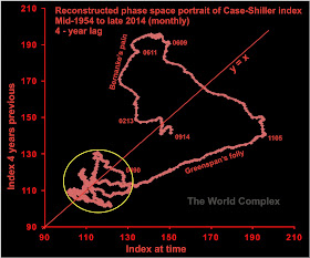
I have often used the the index of home prices in the United States (the Case Shiller index) as an example of a complex system showing multistability. The data are updated monthly here.

The multistable nature of such systems is demonstrated in reconstructed phase space portraits, which can be generated by two principal methods--the time-delay approach and the time-derivative approach.


For nearly 40 years, the system remained confined to the area of the yellow circle. In fact, house prices were confined to this small area for much longer than that--for the longer term chart I've presented previously shows that this yellow area has been occupied for a total of about 70 years.

It looks like there was some kind of redefinition or recalculation of the time series on the Shiller website sometime in the last year or so, as the current time series available on the site (from which the above chart is drawn) differs from the previous time series available (from which my older graphs are drawn). For instance, in my older figure, the house price appears to have been above 100 over the last 60 years--this does not appear to be the case in the graphs I have produced in previous years.

The overall story has not changed--after 50 years of relative stability (the bubble of 1989-90 looks benign in the above figure), the system broke out of its area of Lyapunov stability, and has been meandering through phase space ever since. Two years ago, it seemed to be on a trajectory to return to the yellow area of stability. In the last two years the system trajectory veered away from that target, and is now headed . . . where?

Normally we expect it to migrate to an area which has previously acted as an area of stability--but both such areas are at much lower prices than is currently the case.

It is possible for the system to carve out a new area of stability. For reasons of geometry, stable areas must be located on the y = x line. Since we are close to that line now, it implies that perhaps Yellen can engineer a soft landing for housing at close to the current price range. Unfortunately, the future level of the trajectory in state space is partially determined by the past trajectory--and in 2013, the housing index was in the low 130s (on the horizontal axis). In two years, therefore, the trajectory will dip to the same level on the vertical axis. If house prices remain where they are now, the trajectory will be far enough from the y = x line to be unstable, and a further decline in house prices would be indicated.

If house prices rise again, we will find ourselves in a bubble destined for collapse, just as we were in about 2004. If the yellin' wants to bring housing to stability, the thing to do would be to engineer a slight decline in house prices over the next two years. Unfortunately, I don't think she wants to do that.

Friday, January 23, 2015

Deflationary avalanche building up speed

Another week, another amazing print.


And for context, the longer record . . .


Thursday, January 22, 2015

Near-term struggle for gold

We have a new visitor with an interest in gold.


So let's give him (her?) something to read about, shall we?

Over the past few years I have use reconstructed phase space portraits to try to gain some insight into dynamic systems. Key features that we can identify in these diagrams are areas of stability, where some parameter is trapped into a fairly narrow range for a period of time. It appears to be nearly universal in interesting systems that there are multiple metastable equilibria, meaning more than one area where the system is stable--such systems are characterized by long periods of quiescence punctuated by rapid bursts of activity (volatility).


Since the plot shows the trajectory of the system through time, an area of stability is an area of phase space in which the system remains trapped for a long period of time relative to the shorter periods of time in which the system shifts from one region of the graph to another.

In the above phase space plot of gold x USDX, there are three regions of stability--one centered at about the 650 level, one at about the 1050 level, and one at about the 1350 level. The system has been locked into the area of stability at the 1050 level since about July 2013.

These areas of stability actually have nothing to do with gold or the US dollar. They exist because of mass psychology; and the sudden changes from one region of stability to another is a function of a rapid change in the perception of value.

What I usually look for in these plots is a sign of a breakout from an area of attraction. For instance, last week's print appears just outside the middle region of attraction. It isn't far enough outside the border (which has been placed in completely arbitrary fashion), but if the system trajectory continues to extend in its current direction for a couple more weeks, I would conclude the system is heading towards the area of attraction at the 1350 level.

Complicating this simple picture is the phase space portrait just for gold, seen below.


This graph looks remarkably like the phase space diagram for gold x USDX: there are three areas of attraction, and the system has been mired in the middle one for about a year-and-a-half. But there is a major difference--the present gold price is nowhere near to breaking out of its current area of attraction. It is currently somewhere in the middle of it, having spent most of the past year near the bottom of it.

So one chart suggests an imminent breakout, and one does not. Can they both be true?

The target for gold x USDX (assuming we do get a breakout) would be in the 1350 range, and it would be reached in about 18 weeks. Given the rate of rise of the US dollar, it would not be surprising if it reaches the 100 level in this time. The 1350 level, in this case, would be reached with a gold price of $1350 per oz, which would still be within the current area of attraction for the gold price.

It doesn't seem reasonable for both gold and the US dollar to rise so far together, unless we either accept Richard Russel's suggestion that debt represents a short position against the US dollar, or we are seeing the beginnings of a move in money down Exter's Pyramid.

Monday, January 19, 2015

Grottoes and hobbit holes of Luo Yang

Driving around over the Great Loess Plain of China, you eventually come to Luo Yang, home of the peony festival. Not too many peonies around this time of year, but the city is famous for other reasons, including the Longmen Grottoes, a UNESCO World heritage site.


The grottoes are small caves that have been carved out of a limestone cliff. They are decorated with sculptures representing buddha, boddhisatvas, guardians, and pagodas. The sculptures were all created between the late fifth century (C.E.) and the early 12th century.


View from Xiangshan temple


There are about 1400 caves and over 100,000 carvings (including some very small ones).


Progressive details in Leigutaizhongdong Cave.


Large sculptures of Feng Xian Si (the large grotto in the top two images).

A small reflection of the grottoes is found in the loess cliffs along the highway near Luo Yang. I call these hobbit holes, even though they aren't dwellings. Some of them are brick-lined, but most appear to be for manufacture.


Loess is quite cohesive, and there are regions in China where people live in the stuff. It is pretty stable until there is an earthquake, at which point the casualties can be horrific.


Big hobbit hole.

Saturday, January 17, 2015

Gold x USDX since "decision time"

IWNATTOS has been crowing about gold breaking out for some small period of time now. Central to his thesis is that the price of gold has been rising ex-USD.

My approach is slightly different, although the implications are the same. Instead of looking at just the gold price, I have been looking at the product of the gold price in US dollars and the US dollar index. For most gold mining companies (outside the USA), this product has a strong impact on the economics of their mining operations.

If the gold price remains constant while the US dollar index rises, a mining company in Ghana may get the same number of dollars per ounce, but the purchasing power of those dollars rises. The result is higher profit. In fact, rising US dollar (with near constant gold price) is politically more favourable for producing miners--I have never seen a government slap a 'windfall tax' on a mine because of the rising dollar. Such things tend to only occur when the gold price rises.

On a scatterplot of gold vs US dollar index, the loci of constant gold x USDX values were hyperbolae called isoquants.

A couple of months ago, I was looking for a breakout of gold x USDX. We certainly have one now. The size of the current breakout is revealed on the chart of the gold x USDX below.


Gold x USDX has leaped up towards the 1200 level. The last time this product was higher than its present value was on May 10, 2013, when gold was $1426/oz and the US dollar index was a little over 84.


The current move we are looking at does look out of place in comparison to the last 20 months or so. The chart above suggests that there is a long way to go to get back to the good times of 2011. At some point, however, the rate of ascent has to decline or we'll face another collapse.

More about gold on a later post. 

Monday, January 12, 2015

Zhengzhou Museum

This is a much smaller museum than the better-known Henan museum, where I went last fall.


Nice day, very pale blue sky.

There are only a few galleries, dealing with Neolithic artifacts (bone and stone tools), pottery from early dynastic times, bronze from slightly more recent dynastic times, and carved stone (generally of boddhisatvas).

A lot of my interest is in magic, money, mysticism, and music, so we'll start with those.


Oracle bones, used in divination.


Cowrie shells, used here as money too.


Sculpture of a boddhisatva.


Stone coffin


It wouldn't be music in China without bronze bells.

The museum mainly focused on artifacts found in the vicinity of Zhengzhou, which is an area that was settled in very early times. The exhibits are quite limited in comparison with the Henan museum--no gold, no jade--but on the other hand, there are no crowds.


Friday, January 9, 2015

What hath QE wrought?

First off, let's see how our deflation indicator is playing out.


The latest trend of rising gold and USDX is in its third month.

The last time we had a similar trend was in 2009. That ended with a massive blowout of QE. But a funny thing happened on the way to the bank. After four-and-a-half years, we wound up back where we started.


The ineluctable march of deflation.

And for context, a look at the bigger picture.


One lesson of all this is that if the system needs to deflate, the bankers and politicians who think they are in control can delay it, but not stop it. A little over four years later, we have picked up where we left off.

I would expect the central bankers of the world will try for another inflationary push at some point in the future. Maybe they will let deflation to run for a time to ratchet up the pain enough for the public to scream for more stimulus. I can't help but think that they decided to let deflation run for a bit just to chase out some of the 99.9% who were perhaps betting on continued inflation.

Deflation's the same in a relative way, but you're older;
Shorter of breath, and four years closer to death.

Thursday, January 8, 2015

Reach for the sky

Today's chart is a reconstructed state space diagram of the gold-silver ratio (monthly) over the past eleven years.


It's been awhile since we last looked at this chart. At that time, in March, we were close to the middle of this graph, near where I thought economic crisis beckoned. History, it seems, doesn't repeat, but perhaps it does rhyme. For what it is worth, we have bypassed that spot, but the trajectory is similar to what we saw in late 2008--we are seeing a rapid rise in the gold-silver ratio. At the same time, the oil price is cratering, which fits into the idea of deflation I have been proposing.

I can't comment on the feel on the street, as I am in China rather than North America this time. Certainly here in China, everyone still feels confident. They all believe that all they have to do is buy property and everything will be fine, and they find my interest in gold curious, but for all they know, perhaps all foreigners are so strange.

Even so, someone in China is buying a lot of gold. If the numbers here are correct, then gold is being bought at a rate of over 2000 t per year, which amounts to something about 1.5 g per person in China.  However, you do not find gold offered in such paltry amounts. The smallest bar I have been able to find is 20 g, and it is more common for people to buy 50 or 100 g at a time.

Gold is easy to find here--you can buy it at any branch of any bank (or so I am told--I have only tried it at my local branch of my bank). So perhaps it is just all the banks that have bought it--and for now, they are making it available to anyone with a few yuan to spare.