Today we look at phase space reconstructions of long climate proxies (which are records of some geological parameter which is believed to be related to some climatic parameter--used because we have no way of directly measuring temperatures or global ice volumes of the distant past).
The proxy I will be looking at today is the ca. 2-million-year-long record of deep-sea d18O (difference in concentration of O-18 from some standard) from ODP 677.
The record is actually inverted, as it is a proxy for ice volume. In the figure above, the curve is near the top of the graph at times of low ice volume (i.e., interglacials) and near the bottom during glacial maxima.
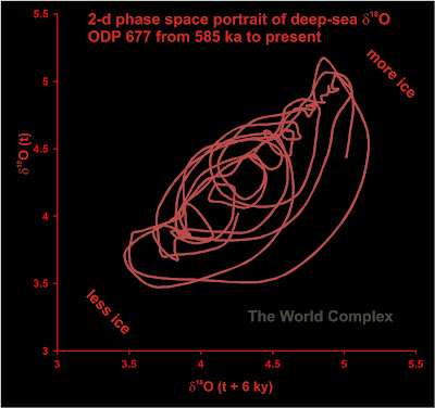
Reconstructing the phase space over the past 585,000 years (since 585 ka in the figure below), using a delay of 6000 years (noted as 6 ky below), gives us the following.
Now we need to decide what sort of system this graph describes. Is it like this?
Or more like this one?
There are a lot of loops in our reconstructed phase space portrait. Are there any areas of Lyapunov stability? It is not too easy to see directly from the portrait.
To simplify it, we can divide up the data into bins and contour the density of data in each bin. I have called these "probability density plots" in previous posts. With sufficient data, you may be able to use a Gaussian kernel estimator--as many commonly used mathematical software packages contain such a feature (you may have to create your own subroutines to work in two or more dimensions).
The probability density plot (modified from the Paleoceanography paper) is a lot easier to interpret than the original phase space portrait (second figure from top). The peaks in probability density (labelled A2 through A5) are interpreted as areas of Lyapunov stability. Global ice volume over the past 750 thousand years (and much more) is characterized by multistability--there are multiple equilibria. At any given interval, only one equilibrium is "in play"; but the equilibrium point is subject to abrupt change from, say, A5 to A2, over very short intervals.
The above image was constructed from a "window" (a shorter section of the record) of 750 thousand years. The entire record might be studied in a series of three such windows. Windows of lesser duration offer a higher-resolution characterization of the system dynamics.
Creating a probability density plot is a robust method of limited computational difficulty which can simplify your interpretations of the dynamics from long, complex data sets.
The proxy I will be looking at today is the ca. 2-million-year-long record of deep-sea d18O (difference in concentration of O-18 from some standard) from ODP 677.
The record is actually inverted, as it is a proxy for ice volume. In the figure above, the curve is near the top of the graph at times of low ice volume (i.e., interglacials) and near the bottom during glacial maxima.
Reconstructing the phase space over the past 585,000 years (since 585 ka in the figure below), using a delay of 6000 years (noted as 6 ky below), gives us the following.
Now we need to decide what sort of system this graph describes. Is it like this?
Or more like this one?
There are a lot of loops in our reconstructed phase space portrait. Are there any areas of Lyapunov stability? It is not too easy to see directly from the portrait.
To simplify it, we can divide up the data into bins and contour the density of data in each bin. I have called these "probability density plots" in previous posts. With sufficient data, you may be able to use a Gaussian kernel estimator--as many commonly used mathematical software packages contain such a feature (you may have to create your own subroutines to work in two or more dimensions).
The probability density plot (modified from the Paleoceanography paper) is a lot easier to interpret than the original phase space portrait (second figure from top). The peaks in probability density (labelled A2 through A5) are interpreted as areas of Lyapunov stability. Global ice volume over the past 750 thousand years (and much more) is characterized by multistability--there are multiple equilibria. At any given interval, only one equilibrium is "in play"; but the equilibrium point is subject to abrupt change from, say, A5 to A2, over very short intervals.
The above image was constructed from a "window" (a shorter section of the record) of 750 thousand years. The entire record might be studied in a series of three such windows. Windows of lesser duration offer a higher-resolution characterization of the system dynamics.
Same data set, shorter window.
Creating a probability density plot is a robust method of limited computational difficulty which can simplify your interpretations of the dynamics from long, complex data sets.


No comments:
Post a Comment