Wednesday, December 11, 2019

A year of deflation was pretty good for gold miners

I have been showing the long-term graph of US dollar index vs gold for some time, arguing that the last twelve years have, on average, been deflationary.


Since early 2008, the gold price has risen from ~900USD per oz to nearly 1500 USD/oz, whereas the US dollar index has risen from about 72 to nearly 98. Richard Russell seems to have been right, with his bet of 50% gold and 50% US dollars.

Now, here's a thought. If the graph trending upward and to the right is deflation, how does inflation plot?

Down and to the right (rising gold, falling dollar). Deflation and inflation are not opposites . . . they are perpendicular.

In the above graph, even though the trend has been deflationary, there are inflationary and disinflationary intervals as well.


From about mid September last year until the end of August, we had pretty steady deflation. But on much shorter timescales, individual actions are on the inflation-disinflation axis. (I have not decided what to call the opposite of deflation - perhaps #$!?@!?).

My thesis of the past several years is that deflation is good for the price of gold companies. So let's see how one did.


Franco Nevada is a royalty streaming company with about 80% of its revenues coming from precious metals production. This company is a good one to test the hypothesis as it is more likely to be affected by economic factors such as the price of gold and less affected by company-specific factors as would be the case for a mid-tier producer.

From late September 2018 to about the end of August of this year, Franco Nevada embarked on a powerful price advance from about $80/share to $130/share--a 62% gain. This gain corresponded with the period of deflation, where both gold and the US dollar index were rising.

Similarly, a quick look at other companies including SSR Mining, Wheaton Precious Metals, Wesdome, Semafo, and even a small exploration company like Bravada showed strong gains over the same period.

Sunday, December 8, 2019

Gold x USDX has a convincing breakout in phase space

I'm getting back into the swing of phase space reconstructions in preparation for next month's presentation in Washington

Something we have been going through for some time.

Gold x USDX (the product of gold the gold price and the US dollar index) broke out in the summer of 2019 (similar to this post) in most convincing fashion. As we speak, the trajectory of the system has moved away from any of the previous areas of Lyapunov stability.


Generally speaking, the bigger this product, the better for mining companies. So economically, they ought to be doing pretty well right now. Unfortunately, that number seems set to decline for the near future, but we'll see how things go going forward. Trump seems determined to drive down the value of the US dollar

Note that the current excursion is much more substantive than the one we had in 2011, when the gold price ran to $1800/oz.

Thursday, November 28, 2019

Help me cross the square

The wind rises, and the days grow short.

In a trench is a group of men. They sit together, but each is alone in his thoughts.

Happier times in the public market? Performing on the sports field? Father swinging the scythe in the wheatfield? Your wife? Your children?

You are going to die. You know this. You are among the last holdouts as the Bolsheviks destroy all resistance throughout Russia. Your position is surrounded, and the Bolsheviks are ready to crush you beneath the weight of their guns and armour. All of you are going to die, in today's battle or another that will soon follow.

This is not the worst. Your family are class enemies. They will die too. Your only hope may be that your children are young enough to be spared and adopted into a new family. Maybe you have sung enough to them that they will hear your voice, see your face--in dreams.

They have made no secret of their plans. The churches will be destroyed, the Men of Cloth--all will be gone. Every cultural touchstone that has given your life meaning will soon be wiped from the earth.

Someone begins to sing.

A song of a blind, dying man, who is asking for help to cross the tumult of the public square so he can die in peace in the fields of his youth. (Spoiler - he doesn't make it)

You join in.

Friday, October 18, 2019

The church-sale indicator tells me that silver is at a significant low

Every spring and fall the neighbourhood church has a rummage sale. Parishioners donate used goods, which are sold to benefit the church (although this year, the beneficiary seems to be a separate charity). In past years I have bought books and games for the kids, books for me, and once some jigsaw puzzles when my wife's aunt came for a long visit from Singapore.

About twenty years ago, I had started to buy silver. At that time, there was a lot of silver jewellery available at the church sale. Nobody was interested in it. I bought a really fascinating piece from the opium era in China for probably about $5. I remember getting a pair of art deco silver earrings for $2, that my wife wore a lot and said were her favourite pair (at that time). And lots of other things--generally jewellery and utensils.

The price of silver rose, and the clientele abruptly changed. Gangs of young men would show up, line up early, and buy up all the silver within minutes of the doors opening. It was very difficult to get anything unless you too were willing to line up for a few hours in advance. As a result, I stopped looking for silver there, choosing to shop for books and music instead.

This year I arrived at the sale quite late, and the crowd was already thinning out. After picking up some books, I thought of taking a look at the jewellery, since that section wasn't jammed with people. Surprisingly, there was quite a bit of silver jewellery available, and numerous sterling spoons (more plate, too, of course). I bought a few sterling silver teaspoons for my collection.

This points to a lack of interest in silver among not only the general public, but among the type that research the topic and buy accordingly. This suggests to me that the silver price is at an important low.

Sunday, October 6, 2019

Abstract accepted to Chapman conference on the Evolution of the Monsoon

https://www.agu.org/chapmans-asian-monsoons

So I'll be going to Washington in the New Year.

No word yet on the format of the presentation.

I've never taken part in a Chapman conference before, but I gather they are rather more collaborative than typical conferences

Friday, September 27, 2019

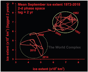
We have passed this year's Arctic sea ice minimum

and what do we see?

This site informs us that we have tied with 2007 and 2016 for the second lowest sea ice extent in the satellite era--4.15 million sq km.

This gives us the wherewithal to update our phase space reconstruction of the sea ice extent.


We are near the middle of the same area of metastability we have been in since 2007. There is no way to tell how long we shall continue in this region of metastability; nor do we know if we will return to the higher region of stability occupied prior to 2004, or drop to another lower region of stability or fall to zero (as many disaster models predict).

All we can do is keep watch.

Friday, August 9, 2019

Human ingenuity and gold

I saw the figure below on this website, and felt compelled to comment.


No attribution was given, so I will assume it was put together by the site operator.

At first glance, it tells a simple (if somewhat horrifying) story of currency destruction. But I think there is another story it tells, which is a little more hopeful.

The picture as presented is a little misleading because it shows what an ounce of gold will buy now. (Gold was $20/oz in 1932, but there was a little less than an ounce of gold in the double eagle. But let's pretend it is an ounce of gold and look at what that $20 coin would buy you in 1932.

According to this site, a gallon of gas cost $0.18 in 1932. Accordingly, your $20 coin would buy you 111 gallons of gas.

According to this site, a gallon of milk cost $0.26 in 1930 and $0.47 in 1935. The reason for the price rise was due to the government introducing programs to help farmers during the Depression. Not knowing when exactly the program started, it's a little difficult to be sure what the price was in 1932. So let's go with $0.33, meaning $20 would get you 60 gallons.

According to this site, a dozen eggs cost $0.36 in 1937. I'll estimate $0.33 for the price in 1932, netting us 60 dozen eggs for $20.

This old New York Times article tells us that a first-class postage stamp in the US cost $0.03 in 1932. Your $20 coin would allow you to mail 666 letters and have 2 cents left to put in them.

All of which is a lot more than $20 buys you now. But notably, it is much less than an ounce of gold will buy you now.

Gas: 111 gallons vs 482 gallons
Milk: 60 gallons vs 427 gallons
Eggs: 60 dozen vs 675 dozen
Stamps: 666 vs 2700

These increases are the result of capital investment and human ingenuity, and are a reflection of real increases in productivity.

So let's not overlook the happy side of the story. A big hand for human ingenuity!

Monday, July 22, 2019

The changing face of deflation

As noted previously, the shared global economic system has been dominated by deflation for the past eleven years. Evidence for this can be seen in the chart of US dollar index vs gold price since 2008 (below).


Since 2008, the US dollar has risen about 35%, whereas the gold price (in US dollars) has risen over 50%. At the current level, where goldxUSDX approaches the 1400 isoquant, non-US gold mining companies are getting more for their gold than they were in August 2011, when the gold price was $1848/oz. This speaks of deflation. But if you look at shorter timescales, you mostly see the expected inverse relationship between gold and the dollar.

Do you hear of deflation? Most people worry about inflation--it's the banks that worry about deflation. And it's not hard to see why. In a deflation, people seek to hold real money--which for most people nowadays means cash. But the graph shows that two things are viewed--nearly equally--as cash: gold and the US dollar. They have been rising for ten years because of an undercurrent of urgent purchases. Banks don't like people removing cash from the system because it impedes their ability to lend. Removing cash from the banking system and hoarding it (or using it to buy gold) short circuits the "wealth-creating engine" of the past few decades, which has been responsible for the growing wealth inequality since the 1980s.

But if we look at the relationship between the US dollar index and the gold price over the last year, we see a change--perhaps an important one--in the style of deflation we are experiencing.


In the past year, gold has risen about 20% in price (in US dollars), whereas the US dollar has only increased about 2% over the same timeframe. My interpretation is that this suggests a shift in deflation protection from purchasing a mix of gold and US dollars to just gold. After all, President Trump is signalling he wants to drive the US dollar down in price, and we all know that governments have many tools they can use to destroy their own currency!

Monday, July 1, 2019

The chickens come home to roost

Back when I first started going to Africa, I was annoyed to discover that the practice of charging foreigners (the only time I have ever been lumped together with the white men) higher prices (often much higher prices) for pretty much everything. Initially I tried to take this in good humour and the various assistants that I had travelling with me from time to time were inconsistent in the efforts they expended to ensure that I paid the same price for things as any African.

One stands out in particular--Kofi the Lion, drunken con artist though he was, fought hard on my behalf. I remember once being held up taking a boat across a river because the ferryman wanted to charge me double the trivial price that everyone else had to pay. Now this river was so narrow you could almost run and jump across it, and it probably took about 10 s to cross it (plus another minute or so getting into the docking space). Kofi fought with him, holding up the boat for at least 20 minutes until finally winning his point.

Another time when I was buying some carvings from a local artist, he spent a good bit of time in a lengthy argument over pricing with the artist. And when an agreement was reached, he suddenly demanded a commission from the artist. He pointed out that he had brought me to this man's store, but we could have gone to any other. Reluctantly, the artist agreed. As soon as we left the store, Kofi gave me his commission. I gathered that he was still unhappy with the price, but did his best to reduce my costs at every turn. And that is how shopping is in Ghana--you need to be prepared to fight for every advantage.


A rare photo of Kofi Jatah, at left.

With time, our staffing situation improved, and a consistent group of characters coalesced around us and our nascent project. And my thinking on the subject of higher prices for foreigners changed as well. Instead of having our local staff resist this policy as an act of altruism, I realized that it was in their interest as well.

They used to complain that if they helped me too much, they were criticized by the various shopkeepers I understand the impulse of sticking together and helping your fellow Ghanaians prosper by taking advantage of foreigners. But I pointed out that if they allow us to pay a higher price, that is the price that they and all other Ghanaians will soon pay as well.

The reason was that more and more foreigners were coming to Ghana because of varied business opportunities. Vendors will soon realize they could sell all of their product to foreigners. If the foreigners are paying a higher price than the locals, why sell anything to the locals? So my mantra became "whatever you allow to happen to others will eventually happen to you."

Tailings and troubles

Canadian mining companies do not have the best reputation overseas, especially in impoverished areas of the world (Latin America in particular). Human rights violations have resulted from conflict between mining companies and local inhabitants throughout Latin America over potential environmental impacts, and the economic problem of wealth extraction from impoverished areas without economic compensation.

These problems are poorly reported in Canada, so Canadians may have some excuse for largely being unaware of these issues. But one issue that is harder to claim ignorance about is the multiple examples of tailings dam failures. Tailings pond failures in Canada have a long history, and Canadian companies have been implicated in a few overseas collapses as well. So it isn't unlikely to find the local population very interested in the parameters of a tailings pond that will soon appear in their locale.

And here we come to the nub of it. Canada has allowed its mining companies to abuse protesters at overseas mining (and potential mining sites) for generations. So it is inevitable that such behaviour would eventually come home, as may have begun recently in Nova Scotia. Use of local/national police forces against such protesters - check. Government deciding not to investigate use of force - check.

Sunday, June 23, 2019

USDX vs gold in new territory

Again.


The last deflationary move has carried the system out of the immense head that has been building for the past four-and-a-half years. We are in new territory, with the possibility of continuation along the deflationary trend that as been operating for over ten years, or a switch to an inflationary trend, which could potentially result in another big runaway reaction as begain in 2011.

The isoquants in the above figure are lines of constant product of the gold price and the USDX. They represent the apparent gold price to a company that is mining gold outside of the US, and are the theoretical trajectory that the system would show if the only factor affecting gold price was the US dollar.


If we just look at the last 14 months, we see three distinct behaviours in the system. From April until mid June 2018, the system followed the 1200 isoquant, showing an almost perfect inverse relationship between the gold price and USDX.  From mid-June to late September, there was a sharp fall in the gold price with a nearly constant value for the USDX index. This phase was bad for gold companies. Since September, we have seen both rising gold and rising USDX, which this space interprets as a deflationary indicator. This is the sweet spot for mining companies, especially those outside the US, who get more dollars per ounce produced, and also see the value of the dollars rise. This improvement in fundamentals is well reflected in the GDX index, as seen below.


Wednesday, June 12, 2019

Image of recrystallization of niobium minerals in a carbonatite

From a location that will remain secret for now.

Every so often I get out of my hospital bed and look at some rocks. This image comes from a rock slab I took down to the SEM lab in the Geology Department at the University of Toronto last month some time.

Most people have some idea of how a scanning electron microscope works. Fewer will know about an attachment that many of them have--an energy-dispersive X-ray analysis detector. This device allows for estimation of the elemental composition of a point on a mineral (or a section of whole rock) in a non-destructive fashion.

Blasting a sample with electrons (how the SEM works) ionizes the target area--when it recaptures an electron it releases a quantum of energy in the X-ray spectrum that is characteristic of the element that has been ionized. This allows for the specific elements to be identified and their relative amount quantified.

A second method of analysis involves back-scattered electrons, which create a grey-scale image that results is grey scale, with lighter coloured grains containing heavier elements.


The backscattered electron image above tells me that the white grains have the heaviest elements in them. The X-ray spectrum (not shown) tells me that the heavy element present is niobium. The mineralogy work previously done suggested that the principal niobium-bearing mineral present is pyrochlore--but the x-ray spectrum suggests that many of these grains are actually ferro-columbite (as columbite, but Fe>>Nb), pseudomorphed from pyrochlore.

The gangue minerals are represented by two different regions of grey. The light grey can be shown to be phosphates (mainly apatite) and the darker grey is carbonate (mainly dolomite).

The image above captures something interesting. The columbite grains have begun to lose their distinction from the gangue minerals. Niobium and other heavy elements are being shifted around (the bright white "tendrils" surrounded by black [=silica]) by some late-stage fluid reaction. The x-ray spectrum shows that in addition to Nb, there are rare earth elements present (mainly cerium). This suggests alteration of the columbite to possibly fersmite--although I haven't isolated grains well enough to establish the crystal structure yet.

I wanted to share this because I think this is a spectacular image--from a scientific perspective. From a metallurgical perspective, we would prefer not to see all of those little unrecoverable tendrils of Nb and Ce locked in silica.

Friday, March 29, 2019

How hard is it really to discover gold?

The question of peak gold has been on my mind lately.  I have looked at this problem in the past and  don't have a complete answer, although I am biased towards us being well short of peak gold..


Data from S&P Global Markets
Inflation adjustments calculated from here.

I would like to discuss this diagram. It seems reasonable to assume that an increase in exploration budgets should translate into gold discoveries. A glance at the above graph shows peaks in discoveries associated with the first two peaks in exploration expenses. The last peak in exploration expenses, around 2012, appears to be correlated with a spectacular lack of success on the exploration front, leading to the argument that we have reached (or passed) the time of peak gold.

The devil, however, may be in the details.

There are two confounding details that could change the interpretation of this diagram. The notes on the figure in the original diagram suggest that any new gold discovered on a project is attributed to the year in which the project was discovered. For instance, a junior miner might have discovered a 2 Moz deposit in 1994; and the project is developed over a number of years, probably changing hands in the process. In 2012, the major that now controls it embarks on an exploration program to expand the resource, and discovers a further 3 Moz. That 3 Moz discovery is attributed to 1994, as that is the year the project was discovered (see below).


This is the original version of the figure at the top of this post. The dark blue bars represent gold discovered in 2017, much of which is being attributed earlier years, as those years represent the time of the initial discovery of the projects on which this new gold is found. The small amount of gold attributed to the year 2017 represents new discoveries. If all gold found in 2017 had been attributed to 2017, it would look like a lot more gold was discovered that year--almost 150 Moz, as opposed to the 20-something Moz that appears on the graph instead. Now remember, that this is also true for 2016, and 2015, and 2014, and . . .

This is not an effect that can be easily removed. If it were, we would probably find that a lot of gold was indeed found in the past few years, and the discrepancy between the amount of gold discovered and the money spent on exploration might disappear.

So this graph cannot be used to make the argument that gold is much harder to find than it used to be. It may be used to make the argument that it is harder to find new gold deposits than it used to be, although unless you subtract out the money being spent by majors boosting the resources of existing projects, the graph is still misleading.

And there is another confounding detail that makes even this conclusion difficult to support.

The world of exploration has changed over the last two decades, particularly when it comes to resource definition. It was a lot easier to drill a few holes in 1990 and announce you had a 1 Moz deposit than it is now. It is also a lot easier to expand an existing resource than to define an entirely new one. For this reason, it seems to me that the economic incentives favour spending money on increasing existing resources rather than discovering new ones. At some point in the future this will probably no longer be the case, but it is difficult to predict when that will be; but at that point, there will be a lot more appetite for greenfields exploration again.

In conclusion, I don't consider this graph convincing evidence that gold is in increasingly short supply. It may be running low at a given price, but higher prices will liberate more. I still favour my earlier conclusion of up to 400 deposits in the 1-3 Moz category still to be discovered--and that doesn't include areas like the unexplored parts of Greenland, Antarctica, and the deep ocean.