Dust flux, Vostok ice core

Dust flux, Vostok ice core
Two dimensional phase space reconstruction of dust flux from the Vostok core over the period 186-4 ka using the time derivative method. Dust flux on the x-axis, rate of change is on the y-axis. From Gipp (2001).

Wednesday, August 5, 2020

The inflationary hyperloop and other tales from the near future

Last time we looked at the recent transition from deflation to inflation as revealed in the USDX vs gold chart. This time I would like to put this into a somewhat larger perspective.


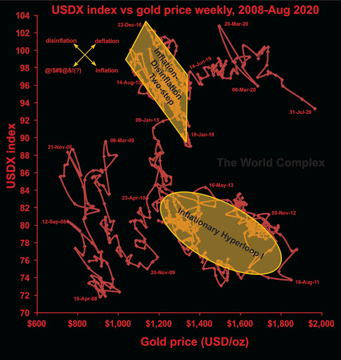
This chart compares the US dollar index with the gold price over the last 12+ years. The overall effect has been one of deflation (both gold and the dollar index have risen over that period), but the effect has not been steady. Much of the deflationary "progress" has been made through cycles of inflation and disinflation, although there have been substantial periods of "pure" deflation, mainly in early 2010, late 2014 to early 2015, and the longest stretch covering nearly all of 2019 into May 2020.

The question of inflation, disinflation, deflation, etc. are not just theoretical--they potentially affect the balance sheets and investors' perception of gold and silver stocks as investments (or, perhaps, speculations). During deflation, when both the US dollar price of gold and the US dollar index are increasing, the balance sheets of non-US-based gold miners (companies with mining operations outside of the US) improve markedly. The effect is not as strong for US-based gold miners, however they do benefit from inflation. During inflation, the non-US-based gold miners don't really benefit much (from the accounting perspective), however this tends to be the time when their perception of value increases the most in the minds of investors. Since it is also likely to be a time for US operations to increase in profitability, it improves the financial conditions of the Nevada-based producers (and California, Arizona, etc.).

Also take note of the effects of deflation on silver. It isn't pretty. The switch from deflation to inflation makes puts silver in play. The important thing to remember is to leave the party when the inflation turns to disinflation or deflation, which can happen suddenly. 

In May, the situation switched from deflation to inflation. That may suggest that American-based producers and silver companies are right in the sweet spot.

One feature that stands out is the "inflationary hyperloop" highlighted in gold. It represents a fairly long period of inflation followed a similar period of disinflation, the total lasting about four years. For gold and silver investors, only the first half or so was much fun. Now that we have entered into an inflationary period, are we going to experience another such loop? It seems plausible. 

But there is at least one significant differences in the current inflationary run and the beginning of the inflationary hyperloop--and that is battle. Almost the entire way around the loop there was a real struggle between bear and bull forces. That struggle on the way up is important, as it tends to lead to resistance on the way back down. Now observe our current smooth inflationary stretch since May. Where are the struggles?

One approach is to assume that the current situation will mimic the inflationary loop. If so, we might get two years of fun and about $600 of price out of this. Some approaches suggest magnitude and time increase due to [central bank-fueled liquidity; higher price levels; Mars is in conjunction with Apollo; your reason here]. But the reality is that this is a dynamical system, and in state space, once the system breaks out of a mode of stability, it can move rapidly to another. The new area of stability may be nearby, or it may be far afield, but in either case, without any previous observations of its existence, its location in phase space is unknowable. This is just a roundabout way of saying we can't know how high the gold price will go (or how low the gold-silver ratio will fall) during this period of inflation.

I just thought of this. Youtube here

Monday, July 27, 2020

A sharp transition from deflation to inflation

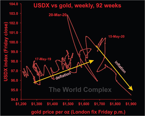
Today's chart is the US dollar index vs gold over the last two years (actually the last 94 weeks, which is not quite two years).


We have discussed why deflation and inflation are not opposites on this graph previously.

Here we see a sharp transition from deflation to inflation, occurring within a week of May 15 (two months ago). 

Note that deflation is the best condition for gold companies, in terms of improving fundamental strength. It is possible, however, that many market participants believe that inflationary conditions are better. So strength may continue. Past history shows that inflation may give and take away. When the gold price has risen strongly, governments have often applied "windfall taxes", reducing the real gain experienced by the company. And if gold is rising, while the US dollar is falling, and you are a mining company outside of the US banking US dollars for your gold, what is happening to your real income?

In at least one previous article, we have also discussed why silver is a dog during deflation, but outperforms gold during inflation.

And, as in all cases, let the buyer beware!

Sunday, May 31, 2020

A global pandemic is too dangerous to leave the experts in charge, part 1

As I write I have been in some form of lockdown for about two months, having resisted it for the first couple of weeks. I kept commuting into the office until the very end of March, before retreating to Newmarket and hanging out there for the past couple of months.

I still have had to use public transit to commute to my dialysis centre. The lengthy commute increases my risk level, but I am fortunate to still be well. 

Today's comment is about pandemic control. I haven't seen a lot of it, apart from the shutdowns. Unfortunately, we have almost no information allowing us to see the effects the lockdown has had on the spread of the virus, because there has been no organized process of random sampling. 

Random sampling is the only way for us to get a handle on the true number of viral cases. For instance, in Ontario, the government is reporting on sample results that are now beginning to reach about 20,000 per day. At the same time, the number of new cases verified through testing is generally between 300 and 400 each day. Given that the sampling numbers are typically around 16-17,000 per day, we may be looking at an infection rate of a little over 2%, which if reflective of the population at large would suggest about 350,000 cases in Ontario--far more than the number of cases that has been identified by testing.

However, we can't extrapolate reliably, because none of the samples are random--they are self-selected for either being at high risk, or because they may have symptoms. It would be useful for us to know the true incidence among the population, because if the number of cases is indeed around 350,000, and the hospital load and death rate have been as we have observed, then this virus is a lot less dangerous than supposed. 

We also have no idea of the true trend in the general infection rate--information that would help us assess the effectiveness of the lockdown. In the absence of random sampling, such information will not be forthcoming. What the Ontario Ministry of Health needs are mobile sampling teams that can carry out a randomized sampling program, possibly by going to pre-selected addresses, or possibly some other scheme (a lot of thought has already gone in to taking random samples of Ontario's population--but not by the government).

This is one of the first things that anyone would learn when becoming involved in setting public policy (or marketing public policy). The experts do not appear to have proposed such a program. One has to wonder why. 

Saturday, May 16, 2020

The gold-copper ratio and the real economy

A couple of months ago when the turmoil began, I had one of these articles in Zerohedge, and I referred to the how the gold-copper ratio reflected what was going on in the real economy. Of course, commenters rose to the bait, asking what I meant by the real economy.

So today's post is an annotated graph of the weekly gold-copper ratio plotted against its smoothed rate of change, over the past three years (actually, about 34 months). The recent excitement is noted on the right side of the graph.

I normally view a high gold-copper ratio (say, over 450) as a bad sign for the economy. The current values are not quite unprecedented, but you have to go back to the early 1980s (not a great time, economically) to see something similar.


When I think of the real economy, the example in my mind is a factory making refrigerators. The annotations above are the thoughts and actions of the factory owner.

Tuesday, March 24, 2020

Violence! Death! Blood! Gold! Copper!

Let's check on the chaos in the market.


The chaos is proceeding splendidly. It will be some time before order can be restored.

First of all. I have to rescind my predictions of this post. As I stated in the post, it was early to make a prognostication, but the violence of the earlier move convinced me to make one anyway. That move has reversed sharply, blasting out of the deflationary channel in a disinflationary direction.

The graph of the gold-copper ratio shows the rapid deterioration of the real economy--by which I mean the part that buys copper and builds refrigerators. Typically the gold-copper ratio increases when the economy goes bad, which in our second graph would appear as a move to the right--something still underway.

In fact, the current situation is even worse than it appears, because in order to calculate the rate of change, I have to subtract the two calculated gold-copper ratios, and I avoid using trailing averages. So the above chart is one week behind reality, where the current ratio is closing in on 700. This is higher than any weekly closing GCR in the past ten years. Looking at monthly closing ratios, only twice since 1977 has the ratio been higher: in September 1980 (717); and in September 1986 (711).

What I think we may see going forward is more chaos. I think we are in a bear market, and the work of a bear market is to make the biggest downward move dragging the most money down with it. Money on the sidelines needs to be drawn in bit by bit until it is all destroyed.

In the long term, The World Complex is a fan of gold. It's always worth buying, but it's important to avoid leverage and keep cash available, because the cash calls always happen at the most inopportune moment.


Friday, March 20, 2020

New charts - northern hemisphere Arctic sea ice maxima

A recent publication has highlighted the importance of the maximum extent of seasonal ice cover in the Arctic Ocean to the stability of the over all sea-ice system. So I have acquired data from NOAA of the daily sea ice extent since 1979, which I have used to find the maximum annual extent and the date (expressed as a Julian Day - so March 1, 2019 would be day 60, but March 1, 2020 would be day 61). These data sets will be studied in the usual manner, if appropriate. (I used the five-day trailing average, by the way).


The maximum sea-ice coverage has declined since 1979

The graph suggests that the maximum extent of ice coverage has declined more or less constantly over the observation period. There are a few ups and downs. In fact, something popped out at me. In the graph above, what do 1998, 2001, 2008, 2012, and 2020 have in common? They all represent years where sea ice extent increased - presumably due to cooling. They were also years with somewhat trying economic circumstances, at least for some people. Coincidence? Probably--but maybe it means there was an agricultural trigger to some of the economic crises of the past few decades.


There has been an idea that as global warming proceeds, the timing of certain important events will change, becoming either earlier or later. Investigating the above graph for a trend in the timing of the ice extent maximum each year tells me . . . nothing. If there is a trend, it is very weak.

Below we have the 2-d reconstructed state space portrait of the annual maxima sea ice extent, using the time-delay method with a 2-year lag. 


The state space reconstruction shows three regions of stability. The S1 and S2 correspond roughly to the major area of stability in the sea-ice minima phase space, which may actually be two separate such regions, one larger than the other. S3 corresponds with the most recent low-area sea-ice minima.

As with the sea-ice minima plots, there is not enough data to determine the long-term future of this system. It is possible we are in a declining phase of a century-scale cyclical system. Alternatively, we could be on a decline to zero. We may even be in a biased cycle, where the natural cycle is being influenced by global warming. The problem is that the data are not sufficient to tell us which is the correct interpretation.

Monday, March 16, 2020

Journal of the Plague Year - part 1: Chinese ex-girlfriend oracle says "Situation cloudy"

Here I am, watching myself for Covid-19 symptoms, having braved the crowds of PDAC earlier in the month. I only went on the Sunday, but there were plenty of opportunities for mingling with crowds, particularly during the reception at the Peruvian exhibit, the Argentinian exhibit, the Chilean exhibit, and the Brasilien exhibit (not to mention repeatedly visiting their coffee machine, which was on the fritz). The crowds at those events were quite close.

News of course came a few days later that someone who had been at the convention later showed symptoms--and a Kinross exec claims to have gotten the virus there. Seeing as there were over 20,000 people there, I'm sure that won't be the end of it.

- - - - - - - - - - - - - - - - - - - - - -


Roadblock in one of Jiaozuo's many villages

I contacted a couple of ex-gfs in China to ask about the progress of covid-19. It isn't easy to get accurate information otherwise, as I never know whether or not to believe news about China that is reported here, but I also don't completely believe Xinhua news or equivalents. Somewhere in there, there may be some truth.

And last night, a third ex-gf contacted me to ask how the virus was proceeding in Canada. She even asked if I had masks! I told her no, we don't believe in those here.

Anyway: Ex#1 is originally from the Wuhan area, and is currently working in Zhengzhou, the capital of Henan province. She had been in her village last month, but it never seemed to be completely isolated from the rest of Hubei province. She tells me she is back at work in Zhengzhou now, and when I asked about activity in businesses around her, she told me that as far as she can tell, businesses and institutions are nearly back to normal.


There she is - at left, on her bicycle in Wuhan about three years ago - at right, how the government sees her.

All the stories floating around over here, about hundreds of thousands of people left to die in Wuhan apartments; massive numbers of corpses burned in crematoria around the country; even the story about the disease either originating in a Chinese bioweapon lab or an American lab and inflicted on the Chinese--should all be rejected as fake. In her case, if there were huge numbers of deaths in Wuhan, she would probably know it through relatives and relatives of friends. As for the combustion signals, remember that the Chinese have had to destroy nearly a hundred million pigs due to pig ebola

The other two exes are having different experiences. They are both from a city near Zhengzhou called Jiaozuo--but are both from different villages. Both of them are still trapped in their respective villages. One of them is from the village with all the roadblocks that I posted on twitter last month. She manages a restaurant in Zhengzhou, where I imagine business isn't too good. She did remind me that I should drop in at the restaurant upon my return to Zhengzhou. Then she immediately posted our conversation on social media and boasted about her English. The second one tells me she doesn't know what is happening. There is a rumour that there are still two people in her village with the virus, and the whole place is locked down. She doesn't know when she will return to Zhengzhou.

So, depending on where you are in China, things are close to normal, or not.

PS - I just checked, and the top picture I posted on Feb. 5. So poor Pan Pan has been trapped in her village for six weeks! I would add that her village is not the most interesting village in China

Wednesday, March 11, 2020

The possible coexistence of inflation and deflation

One comment came up a lot in the recent posting. Well, the comments were all on Zerohedge. Which was to dispute my conclusion of a switch to an inflationary setting.

In the biggest picture, we have had deflation for at least the past twelve years.


Sorry, haven't updated this one in the past few months. But on this scale, very little has changed. The long-term trend of rising gold price and rising USDX index that has been active for the past twelve years would still look the same as in this graph.

I remember Richard Russel, long before 2008, advocated for deflation, saying that the way to play it was 50% gold, 50% US dollar. So the deflation isn't really a surprise--it's a reflection of the excess levels of debt, and will remain until the debts disappear.

Yet on a year-by-year basis, we don't have continuous deflation at all. There have been year+ long cycles of inflation and disinflation which have resulted in deflation (the first year or so,  2011 to 2013, and 2016-2018). For this reason, it can be difficult to remain invested for deflation for the whole last twelve (and more) years.

The inflationary impulse that we may have embarked on (it will be safer to call this in a few weeks, assuming it continues) could be another event like we witnessed in 2011, which saw gold fall just short of $1900, with the US dollar falling sharply. And this was followed by the 2013-2013 period which saw sharp drops in the price of gold. 

Going forward, I think the next decade will be dominated by deflation (a rise to the upper right in the graph). But in the next year, we may see inflation (falling down and to the right in the graph) before disinflation (rising to the left) possibly ending up a little higher and to the right of our current position.

What's a prudent investor to do? Well, I'm not offering any advice. We may be starting an inflationary cycle. But then, I've thought that, and been wrong, before.

Saturday, March 7, 2020

Brace for impact

What a week we just had in the precious metals market.

From a huge drop last Friday--which in the past would have presaged further declines the following week--to a significant rebound in the gold price, coupled this time with a major drop in the US dollar--which I will argue may be the signal for a switch to inflationary conditions.

First the chart


We see the nice deflationary trend of the past 18 months looks to have been decisively broken by last week's action. Although it will be a few weeks before we can be absolutely sure, last week suggests that we are about to embark on another bout of inflation, no doubt as carefully calibrated by the Masters of the Universe as they can fill a shot-glass of whiskey from a pool of liquidity the size of a football field. Either, like a small child pouring very carefully, they have poured only too much, or they have sloshed out enough whiskey to fill a large swimming pool, and we are about to see what happens when it all lands in a shot glass.

Now, why the need for some liquidity?

Another chart:


This graph plots the gold-copper ratio against its rate of change. I typically interpret this ratio as an indicator of the real world preference between bricks and mortar and financials. When the ratio is low, it's a sign that people would rather make refrigerators than chase derivatives. Rate of change is the vertical axis. Near the top of the chart means that the plot is shifting towards the right at high speed. Currently, the system is moving toward the right (ratio is increasing) at the fastest rate in the last couple of years. To me, this means the real economy is degrading very quickly.

Thus the Fed may feel pressured to pump out some liquidity.

If we are moving into an inflationary cycle, then one consequence, according to this recent post, is a decrease in the gold-silver ratio. Given that moves tend to get larger as liquidity sloshes around the system, the gold-silver ratio could hit a significant low, implying a new all-time high for the silver price (in fiat terms).

Normally I would wait a few weeks to have greater certainty, but if there is a swimming pool full of whiskey heading for a shot glass I want to get as close to ground zero as possible with a bucket.

Monday, February 24, 2020

I read the news today, oh boy

Things are happening quickly, but I've been tied up with various health maintenance issues and have not been able to keep up. It would help if I could sleep, but that has been beyond my reach for most of the past week. Since multistability is in the purview of this blog, we may consider consciousness to have several metastable equilibrium states, some of which lie in the realm of sleep, and some of which lie in the realm of wakefulness. I am stuck in the one best characterized as "tired and wired". To go to sleep I have to leave one metastable equilibrium and migrate to one in the sleep portion of state space. Unfortunately, it is as if I have forgotten how.

Two stories that are of interest to me and (I think) are somewhat related are the decision by Teck Resources to withdraw its application for development of its proposed Frontier Mine oilsands project.
The company cites the inability of government (Canada) to square the circle with its stated objectives of mitigating climate change and supporting resource development.

The government had been preparing to announce a decision about the project shortly. Now it seems they no longer need to.

Coincidentally, this morning police moved in to disperse protesters around the rail blockade in Tyendinaga. The RCMP also moved in on Unist'ot'en territory in northern BC, presumably to disperse protestors there as well. I haven't seen statements by the protestors and their allies about the reason for this move, but I suspect it has to do with the Canadian government's inability to square the circle with its stated objective of native reconciliation and a (subtly) unstated objective of ensuring corporate profitability.

This move, to me, looks like it was to signal the government's intention to approve the project. Until Teck decided to discontinue the project

The Teck decision, I think, is based on rather more than has been stated. Years ago I owned a pile of shares in an entity called Fording Coal, which in its brief life made a respectable amount of money, no doubt leading Teck to buy out Fording's stake in the Elk Valley project. In reflecting on Teck's assets--a lot of coal, oil, and oilsands projects--and I couldn't help wondering whether somebody in management might be thinking about a need to scale back on carbon-intensive energy products. That perhaps someone in management might be thinking that it is better to sell off these components of the company, because their value may shortly begin to fall, and the longer they wait, the less they will get for them. I think this viewpoint must still be a minority viewpoint within the company, but it is there nonetheless.

From an economic standpoint, the rise of e-cars (much of which is going to be legislated), means lower sales of oil products going forward. Is now the time to be developing large oil sands mines--especially given the political uncertainty around developing pipelines to take the stuff to market?

Friday, February 14, 2020

The Gold-Silver Ratio

For Valentine's Day, a little something for you who love silver.

Or gold

A couple of weeks ago, Wheaton Precious Metals released a very useful study on the gold-silver ratio. Today I would like to take a look at some of its implications.

The most important implication is one that everyone needs a little time to absorb. That is that there is no characteristic value for the gold-silver ratio.

That means that there is no "true north", or no mythic value (16, for instance) to which it is attracted, and to which it would return if only the world stopped manipulating its price.

The Wheaton conclusions are quite definite. The gold-silver rises during deflationary periods and disinflationary periods (we'll look at this distinction shortly). The gold-silver ratio falls during inflationary periods.


What is unclear is whether a rising GSR causes deflation, or deflation causes a rising GSR. I know which one I believe.

Let's test this against some measures I've used for deflation/inflation. I'll use the weekly chart of USDX vs gold price, weekly, going back to the beginning of 2008.


It is a busy visual, but what we want to do is look at longer-scale variations. Intervals when both the USDX index and the gold price rise are considered deflationary. If gold rises and the US dollar index falls, we have inflation (hence inflation and deflation are not opposites). Gold falling and the dollar rising will be disinflation, and I suppose that if both gold and the US dollar fall, we must have disdeflation, although I have never seen that word anywhere. It's a little hard to say, so it might be best to leave it nameless, and remember that if it ever happens, you should be shorting gold stocks.

Through most of 2008, the graph above suggests we were experiencing disinflation, and over that interval, GSR rises from 55.7 to 77.1

Much of 2009 was characterized by inflation, and the GSR fell from 77.1 to 63.3.

Until the middle of 2010, we had disinflation, and the GSR rose slightly.

The big inflationary pulse into late 2011 saw the GSR falling to 40.8. The final blow-off in the gold price did not see any movement in the US dollar index, so it technically lies between inflation and deflation, but I don't know what to call it. The GSR actually rose during that interval, which makes some sense as the gold price rose over $200 in that time.

The following disinflationary episode that lasted through 2013 saw the GSR rise to 65.9.

Since then, the dominant trend has been deflationary, although realistically there have only been two deflationary pulses--through early 2015 (GSR 74.5) and over the past 18 months (GSR at 88.6). Most of the time has been consumed by short inflation-disinflation cycles, with slight rises and falls of the GSR without significant trend.

Over the entire chart (twelve years) the big picture is deflation, but most of that has been accommodated through cycles of inflation and disinflation.

So long as deflationary conditions persist, the GSR may rise without limit. As long as debts are created beyond any ability to repay them, deflationary conditions will rule. Under such conditions, despite the GSR being pretty much the highest in history, gold remains a better investment than silver.

However, as much of the actual deflationary effect is brought about by cycles of inflation and disinflation, there are  brief intervals where silver makes a better investment than gold. But rather than using the level of the GSR as your selection criterion, you need to look closely at monetary policy instead.

Wednesday, February 5, 2020

The colour is blue at the Aga Khan Museum

The Aga Khan is the head of a small, but wealthy, subset of Shia Islam.

He is known for charitable works around the world. Today's topic is about one of these, the Aga Khan Museum in Toronto. I had decided to visit late last year when I became aware of an exhibit based on trade in West Africa during the Medieval Era. I had been interested in this topic since the company I worked for at the time drew on the history of gold caravans in West Africa for promotional reasons back when it first began working in the area. During field work in different parts of Ghana, we discovered traces of the historical economic development of the region, some of which has been described previously.

I also took a tour of the museum, which detailed many of the architectural details which might otherwise go unappreciated. For instance, the theme of the museum was light, and the dominant colour for the exterior walls was to be white. Normally this would mean marble, but it was rejected because a study had shown that marble broke down too quickly for a building which is meant to last for hundreds of years. Instead, a white granite was located from a quarry in South America


White granite exterior walls, guaranteed to last

In keeping with the theme of light, most of the interior of the museum is bathed in light from various windows. Elaborate patterned shutters on the windows throw an ever-changing series of patterned shadows across the interior walls of the building as the day proceeds.


Pattern on most of the windows. Material is cast zinc


A Persian symbol for nothingness

Symbology is important in the museum. Apart from the above symbol for nothingess (as everything was created out of nothing, there must be a little bit of "nothing" in everything), there are hexagonal and more complex repeating motifs in the windows and vents, and even the drain in the centre of the courtyard.

Blue seems to be another common theme in the museum. Especially lapis.


The Dancer. A mosaic of lapis


Hexagonal staircase to the auditorium. Terrazzo from Italy


Looking straight up the centre of the spiral stair


Bar made from matching slabs of lapis


The auditorium. It's actually bluer than this


The dome of the auditorium


Shutter for the Bellerive Room in the museum

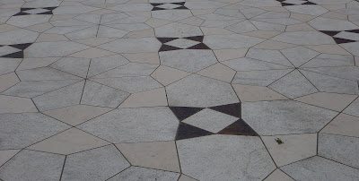
The principal symmetry element for the interior is a 1 m x 1 m square. All of the major features in the building line  up with the edge of the squares, or else with 2 m x 2 m squares. All of the double doorways are 2 m across, and the edge of the doorway lines up with the edges of the floor tiles (which are 1 m x 1 m). Even the tiling in the courtyard lines up with the outer edges of 2 m x 2 m squares (the straight segments in the tiles below)


Stone floor of the central courtyard, composed of the same white 
granite as the exterior walls, pink limestone from France, and 
blue lapis


A look at the surrounding grounds (the dark squares are reflecting 
pools in the summer) and the Ismaili Centre.


Nearby, the Toronto skyline says "Hello" 

Monday, January 20, 2020

Another exciting adventure in the US medical system

Well, perhaps not so exciting.

I was in Washington a couple of weeks ago for the AGU Chapman conference on the East Asian Monsoon. My trip there was long enough that I needed a dialysis session, which I had tentatively arranged through Fresenius. I had identified a clinic near the conference, and had received word that they would schedule me in for either the Tuesday or the Wednesday that I was there. Unfortunately, my phone was not working properly, so I needed to have them contact me via the hotel. There was also a brief hang-up over the transfer of necessary medical records from Canada, but everything seemed to be in order by lunchtime Tuesday--I had been introduced to my coordinator and was advised to wait for their call.

This meant that I had to run back to the hotel lobby during every break (of which there were several) to see if the clinic had called. Making matters worse, I was never given any direct number to call the clinic directly, so I had to go through the company's national switchboard each time, and deal with a different operator who had to locate my file and see how things were going. Every time I was advised to await their call.

It was the same thing on Wednesday. Await their call. And by evening, it seemed clear I was not going to get dialysis--I was flying back on Thursday afternoon, and would have a session in Toronto on the Friday. No explanation, or indeed any attempt a communication, seems to have been made. I have to add that the situation at the hotel was mildly chaotic as well, as the hotel had just been bought by a new operator and was undergoing transformation to a European-style hostel, and their phone system was a little bit erratic. It was impossible to call out, for instance. I thought it possible that a call from the clinic might have been missed . . . except whenever I called, they told me they hadn't called yet.

By Thursday, the fluid levels were high enough that I had a little trouble breathing, but luckily my potassium levels stayed below the point where it triggers heart attacks (the main worry of the nurses back home) and I was able to survive until Friday.

I don't officially know the reason I was ultimately rejected for dialysis. I suspect it was that I may have triggered a poverty alert--no phone, and staying at a hostel (it wasn't actually a hostel yet, but the hotel was listing itself as such). I gather that under the US rules, if a poor person somehow tricks a medical clinic into providing some medical care, and then can't afford to pay, the clinic has no real recourse. Having a national operator is one more way of heading off poor people before they get in the door. They were willing to let me die because they thought I might not be able to pay a $200 bill.


It's a mad, mad, mad world


Saturday, January 18, 2020

The History of the East Asia Monsoon

So I went to Washington DC last week for the AGU Chapman Conference on the East Asian monsoon. I found it to be a very rewarding conference, and even learned a bit about navigating around Washington on transit, as I was on a limited budget.

The conference was in AGU headquarters, which is near to Dupont Circle.


Not all that far from the Mall, although I didn't visit this time.


Speaking of scientists . . .

I was speaking during the opening session, which was about climate dynamics (and its role on the changes in monsoonal strengths through geologic history). A major dynamic role has been the rise of the Himalayan mountains and the Tibetan Plateau during the period of interest, and there is still a lot of debate about the importance of these tectonic events on the development of the monsoon. Some of the modeling studies suggest that the mountains only change the specific location of the rainfall, and that monsoon behaviour may occur even if there were no continents at all.

My work was based on analysis of global to regional proxy data sets, and has been summarized in all these places. Unfortunately, due to limited time, after working through the phase space reconstructions, I had to rush through the statistical computation part, and wasn't certain whether any of the message made it to the audience ungarbled. Fortunately, I was able to learn that at least some members of the audience understood the message.

The afternoon sessions were all about paleoceanographic records of the monsoon. Over the past decade, the International Ocean Discovery Program (IODP, formerly ODP and DSDP) has put down a number of boreholes in the Indus and Bengal Fans, and other boreholes in the Huang He fan and the Sea of Japan also provide useful records of at least some parts of the monsoon. The records I studied were generally global in scope--these other records allow for regional variations to be studied.

The next day's sessions dealt with continental environments (a common issue was the change in photosynthetic pathways of plants in response to environmental change during the Miocene) and records of continental erosion. Erosion is important because either rising mountains or increased rainfall will lead to increased erosion.

The last session was on modeling the effects of tectonic uplift as well as changes in the timing of the uplift, because there is still some disagreement about when the Tibetan Plateau was formed. I mean disagreement between it being less than 10 million years ago to more than 40 million years ago, which is a significant difference of opinion for something so recent.

The last portion of the conference was to break up into groups for focussed discussions on topics of interest leading to the testing of several hypotheses proposed at the start of the conference. I started off in the wrong room, so I was  with the tectonic modeling people rather than the climate modeling people, but was still able to ask about whether anyone had successfully had chaos appear in their model output. Results were inconclusive.

For the second group meeting I joined the combined discussion between the climate modelers and the paleoceanographic records group. Over the course of the discussion I eventually managed to come up with a proposal. See if the modelers observe chaos, and see if they can tell which style of chaos they have. Such chaos will be manifested as spatial variability in some climate effects, such as the location of the maximum rainfall. The models may have the type of spatial variability modeled correctly, but the specific timing of variations will be incorrect. That spatial variability will be recorded in the widely spaced paleoceanographic records which already exist. They type of chaos observed in the models will tell us what to look for in the cores; from the cores we can obtain the correct timing of the modeled chaotic spatial variations of the monsoon system.


Exiting the Metro Station at Dupont Circle

I wasn't sure how the last part of the conference would go--early on, many of the old hands were of the opinion that nothing ever comes from these things. But I thought it was pretty rewarding, particularly as it was during these sessions that I came to realize that people felt that whatever I was doing was worthwhile.

Alone in my corner of the world, I had never been sure.


Night flight back to Toronto