Dust flux, Vostok ice core

Dust flux, Vostok ice core
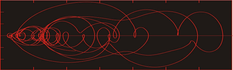
Two dimensional phase space reconstruction of dust flux from the Vostok core over the period 186-4 ka using the time derivative method. Dust flux on the x-axis, rate of change is on the y-axis. From Gipp (2001).

Sunday, December 15, 2013

Gold-USDX breaks down

Last time we looked at a chart showing the decline of both gold and the US dollar in tandem. Today we consider their product (that is, USDX x gold price) as a possible driving factor for the performance of gold equities. For a gold producer outside the US, this product reflects the value of its product.

And there are a surprising number number of countries in which the US dollar is not the official currency.

If, as is commonly thought, the US dollar and gold are inversely correlated, there will be no major change in this product through time. This chart shows us otherwise.


Gold-USDX rose from lows in late 2008 to gold's spike top of over $1800 in late 2011, remained consistently high until late 2012 then dropped off a cliff in April, bouncing off the bottom in July and October.

GDX, which I am using as a proxy for gold producers, rose in tandem with Gold-USDX from late 2008 until early 2011, slowly declined to late 2012 (when gold-USDX was stable), and fell quite sharply until the bounce in gold-USDX in mid 2013.

One note about the bounce--I'm not a big fan of simple TA, but will note that the level at which the bounces occurred is exactly 1000. And unfortunately, as of last week, the gold-USDX penetrated the 1000 level to the downside. Merry Christmas!

Thursday, December 12, 2013

Gold's decline is doubly painful

Once again we compare gold to the USDX for the last year, and we will see why the last seven months have been especially painful for gold investors. You might also consider its effect on the companies that mine the stuff.


We can divide the chart into roughly half at Mother's Day. Prior to Mother's Day, gold declined as the USDX rose, but since Mother's Day the trend has been for both to fall.

This second trend is doubly painful for gold holders. Not only are you getting fewer US dollars per ounce, but your US dollars are themselves losing value. This is precisely the opposite of what happened from late 2009 to mid 2010. Back in those halcyon days, it was a great thing to be long gold.


On the bright side, the gold/USDX state still lies along the advance line it took a couple of years ago that carried it to $1800+. On the down side, I still own some, so WTFDIK?

Tuesday, December 10, 2013

The rise of the virtual economy, part 2--retail consumption indicators

I recently received some publications from Dr. Ray Huffaker, who studies reconstructed phase space portraits from agricultural cycles. There are some interesting data sets presented in these papers which echo some of the themes I've argued in earlier postings.


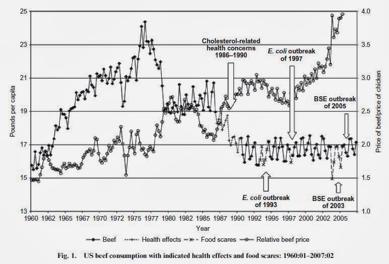
The above figure shows retail beef consumption per capita. Data comes from the USDA, the figure is snipped from McCullough et al. (2012). Notice the large decline in the late 1970s. Perhaps you think that decline was due to changing preferences in meat--perhaps more Americans chose to eat pork instead.


Data and figure as above--notice there is also a decline in per capita pork consumption at the same time. Not as marked as the decline in beef, but still present.


Comparison of metal usage to global GDP. Chart from 
Handselbanken Capital Markets.

As posted before, something appears to have happened to the economy in the late 1970s, which puts the lie to the reported GDP growth figures. Would the government exaggerate these numbers? Perhaps to tell you that the economy is doing fine, and if you happen to be experiencing a drop in your standard of living, well, you just need to work harder. Or go buy something with no money down and no payments for three years.

One last figure. Perhaps the decline in beef consumption was due to the "cholesterol scare".


In this figure from McCullough et al. (2013), we see that the cholesterol scare happened after the major decline in beef consumption. Furthermore, the major declines in beef consumption both correlate to increases in the relative price of beef (the beef/chicken ratio on the right axis).

Some comments on previous articles suggested that the decline in copper and zinc production was due to replacement with plastics or aluminum. My counter to that was that copper cannot be replaced in most of its applications, and the decline in copper consumption speaks to a real decline in economic activity--one which was not reflected in reported GDP numbers. The simultaneous per-capita decline in beef and pork consumption supports this conclusion.

References:

McCullough, M. P., Huffaker, R., and Marsh, T. L., 2012. Endogenously determined cycles: Empirical evidence from livestock industries. Nonlinear Dynamics, Psychology, and Life Sciences, 16: 205-231.

McCullough, M. P., Marsh, T. L., and Huffaker, R., 2013. Reconstructing market reactions to consumption harms. Applied Economics Letters, 20: 173-179. doi: 10.1080/13504851.2012.687091.

Wednesday, December 4, 2013

There's no terror like state terror

. . . we study the frequency and severity of terrorist attacks since 1968. We show that these events are uniformly characterized by the phenomenon of scale invariance, i.e., the frequency scales as an inverse power of the severity, . . .
                                             Clauset et al., 2007 (pdf)

As we enter this season of peace, I find myself reflecting on war. And scale invariance.

The work cited above is old, and has been digested for some time. To recap, the frequency of terrorist events varies inversely as the square of the severity (typically measured in casualties)--and this relationship is independent of time selected, targets, weapon type, or responsible group. Even massive attacks, such as the September 11 attacks do not represent outliers, but form part of the statistical continuum of "normal" terrorism.


I've extended this graph to include a few other events.


In this chart, D represents recent estimates of the deaths during the Dresden firebombing, N1 represents deaths from the nuclear bombing at Nagasaki, T represents deaths during one particular firebombing raid of Tokyo, H represents deaths from the nuclear attack of Hiroshima, and N represents deaths during the massacre of Nanking.

We commonly carry out similar analyses for the purposes of risk assessments for natural hazards such as earthquakes. If we know the recurrence interval for small events, we can estimate the recurrence interval of very large events, provided the size-frequency distribution is characterized by scale invariance. We can carry out a similar assessment here. Unfortunately, we don't really know the recurrence interval of an event like the September 11 attack--but let us assume here that September 11 represents the largest terror attack one would expect in any 25-year period.

If so, then the recurrence interval for a Dresden would be 2500 years; for Nagasaki, it would be about 7500 years; for Tokyo, about 10,000 years, Hiroshima 15,000 years; and Nanking, about 50,000 years. I note that all of these events happened in the last century.

It seems likely that these state-sponsored events happen on their own frequency curve, which goes to show that nobody can do terror like the modern State.