
This is the third part of a series about applying analytical methods developed for dynamic systems (like climate) to the stock market.
In our last installment, we were looking at the recent price history of the stock of a company called Nautilus Minerals Inc. and I presented a phase space portrait in two dimensions of the price action over the last four months (note that phase space and state space are often used interchangeably).

2-dimensional phase space portrait of the share price of Nautilus Minerals Inc. from April to August 2010. Look at those rabbit ears! That's what you get from a singular spike in the data. It would be worse in three dimensions. There would be a third spike coming right out of the screen.
The plot above begins in April (the curve starts at the little tail sticking out beside the "April" label above. It actually remains in the grey area (a Lyapunov-stable area, or LSA) near the middle of the plot through most of April making small straight side-to-side and up-and-down motions with a magnitude of about 10 p.
At the end of April, the price state drops out of the upper LSA and meanders its way through phase space towards the lower LSA, in the 100 p range, which is reached in late-May. The price state remains within this lower LSA until about mid-June, then abruptly rises, and by the beginning of July, it appears to be headed back to the upper LSA.
Then comes the sudden price spike. The price state veers up, down, then sharply right, and back left, veers around the upper LSA before plunging into it at the end of July and it has remained until the end of the analysis, which ended early in August.
The price spike seems to have simply resulted in a short-term (one month) detour around the higher price state areas of phase space, but probably did not have any effect on the ultimate destination. Of course, for those who were unfortunate enough to buy at the top of the spike, well . . . sorry about that.
It is extremely rare to see the rabbit-ear formation in these charts, in natural functions. I have seen it only once in some marine core data. Spikes like that are rare in nature, which is hard--so far as we know ;) -- to manipulate.
What actually is interesting is the drop from the upper LSA to the lower LSA and the subsequent return. What happened in that interval? Was there really a change in the perceived value of the company between April and June (and then again between June and August)? Was this a seasonal junior gold fluctuation?
Let's compare NUS against HUI. It isn't entirely a fair comparison, as NUS is not in commercial production. But we may be able to use HUI to get an idea of the mentality of the gold stock market. It might be better to use gold, or possibly BMO's new junior ETF, but I have numbers for HUI.
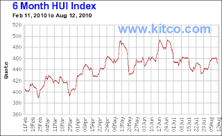
HUI chart for six months prior to the writing of this blog entry. There's no link through because I don't want the chart to update. An updated chart is available here.
The reconstructed phase space portrait for the HUI index is presented below. The graph isn't perfect, because I digitized the plot from the above graph, but I believe it will prove to be a reasonable construct.
 The HUI reconstructed phase portrait from February until early August looks a little complicated. I have coloured different segments of the curve in different colours so it is a little easier to interpret.
There are two obvious areas of concentration--the area in phase space bounded by about 440 and 460 on both axes, and the area bounded by about 400 and 420 on both axes. Both of these might be considered to be LSAs. There may be a third above 480 on both axes but would need to see more time spent there first.
The system occupies the lower-priced LSA in the early part of the graph, and moves up to the higher-priced LSA at the end of April and remains there except for a few excursions to still higher prices in mid-May and late June.
So where Nautilus showed a steady decline through May, HUI was confined to the higher-priced LSA. When NUS began to rise in late June, this was in tandem with a similar rise in HUI. The spike in NUS was unique to itself.
The behaviour of NUS in May and June may be related to company news. In May, NUS announced that it had demobilized one drilling vessel and was seeking bids on another. Shareholders may have interpreted that this would be some time before there were to be any new results, leading to a drop in share price. The announcement in mid June that a drilling contract was signed suggested that activity would be renewed, which led to the rise in price towards the higher LSA.
One other note about phase space portraits, which I have not previously emphasized. There is no mathematical magic. The phase space is just a different presentation of the data. What appears as a cluster of scribbles in a LSA appears as a discontinuous series of price fluctuations in the original data series--what analysts might call a resistance level (which later becomes support after the price rises through it). Compare the higher-priced LSA in the HUI phase space to the original HUI plot. There are a lot fluctuations between 440 and 460, and these are manifested as that tangle of curves in the area between 440 and 460 in phase space. Later on we will see how the dynamics of a complex system manifests itself in similar areas of "resistance" and "support" even in natural time series.
In our last installment, we were looking at the recent price history of the stock of a company called Nautilus Minerals Inc. and I presented a phase space portrait in two dimensions of the price action over the last four months (note that phase space and state space are often used interchangeably).

2-dimensional phase space portrait of the share price of Nautilus Minerals Inc. from April to August 2010. Look at those rabbit ears! That's what you get from a singular spike in the data. It would be worse in three dimensions. There would be a third spike coming right out of the screen.
The plot above begins in April (the curve starts at the little tail sticking out beside the "April" label above. It actually remains in the grey area (a Lyapunov-stable area, or LSA) near the middle of the plot through most of April making small straight side-to-side and up-and-down motions with a magnitude of about 10 p.
At the end of April, the price state drops out of the upper LSA and meanders its way through phase space towards the lower LSA, in the 100 p range, which is reached in late-May. The price state remains within this lower LSA until about mid-June, then abruptly rises, and by the beginning of July, it appears to be headed back to the upper LSA.
Then comes the sudden price spike. The price state veers up, down, then sharply right, and back left, veers around the upper LSA before plunging into it at the end of July and it has remained until the end of the analysis, which ended early in August.
The price spike seems to have simply resulted in a short-term (one month) detour around the higher price state areas of phase space, but probably did not have any effect on the ultimate destination. Of course, for those who were unfortunate enough to buy at the top of the spike, well . . . sorry about that.
It is extremely rare to see the rabbit-ear formation in these charts, in natural functions. I have seen it only once in some marine core data. Spikes like that are rare in nature, which is hard--so far as we know ;) -- to manipulate.
What actually is interesting is the drop from the upper LSA to the lower LSA and the subsequent return. What happened in that interval? Was there really a change in the perceived value of the company between April and June (and then again between June and August)? Was this a seasonal junior gold fluctuation?
Let's compare NUS against HUI. It isn't entirely a fair comparison, as NUS is not in commercial production. But we may be able to use HUI to get an idea of the mentality of the gold stock market. It might be better to use gold, or possibly BMO's new junior ETF, but I have numbers for HUI.

HUI chart for six months prior to the writing of this blog entry. There's no link through because I don't want the chart to update. An updated chart is available here.
The reconstructed phase space portrait for the HUI index is presented below. The graph isn't perfect, because I digitized the plot from the above graph, but I believe it will prove to be a reasonable construct.

There are two obvious areas of concentration--the area in phase space bounded by about 440 and 460 on both axes, and the area bounded by about 400 and 420 on both axes. Both of these might be considered to be LSAs. There may be a third above 480 on both axes but would need to see more time spent there first.
The system occupies the lower-priced LSA in the early part of the graph, and moves up to the higher-priced LSA at the end of April and remains there except for a few excursions to still higher prices in mid-May and late June.
So where Nautilus showed a steady decline through May, HUI was confined to the higher-priced LSA. When NUS began to rise in late June, this was in tandem with a similar rise in HUI. The spike in NUS was unique to itself.
The behaviour of NUS in May and June may be related to company news. In May, NUS announced that it had demobilized one drilling vessel and was seeking bids on another. Shareholders may have interpreted that this would be some time before there were to be any new results, leading to a drop in share price. The announcement in mid June that a drilling contract was signed suggested that activity would be renewed, which led to the rise in price towards the higher LSA.
One other note about phase space portraits, which I have not previously emphasized. There is no mathematical magic. The phase space is just a different presentation of the data. What appears as a cluster of scribbles in a LSA appears as a discontinuous series of price fluctuations in the original data series--what analysts might call a resistance level (which later becomes support after the price rises through it). Compare the higher-priced LSA in the HUI phase space to the original HUI plot. There are a lot fluctuations between 440 and 460, and these are manifested as that tangle of curves in the area between 440 and 460 in phase space. Later on we will see how the dynamics of a complex system manifests itself in similar areas of "resistance" and "support" even in natural time series.
Good question: how do the dynamics of complex decentralized nodal systems compare with those of complex centralized nodal systems? I submit the simple thesis, indeed axiom, that the former is inherently more stable than the latter, and directly relates to consolidation of nodal strength of consolidating financial institutions and phenomenology thereof.
ReplyDelete"This paper is an investigation into the development of a novel control technique termed market-based control (MBC) for application to structural control systems. In market-based control, the complex dynamic system is modeled as a market whose operation is akin to financial markets. A scarce system resource is identified and is optimally distributed in a decentralized manner." (J.P. Lynch, K.H. Law, 2002)
I have big fan of your blog , because your post always so good .Epic Research give effected tips in stock market .
ReplyDelete