
The reconstructed phase space portrait is one tool that can be used to gain insight into the dynamics of complex systems, whether these systems be natural or man-made.
Today we will use these tools to look at precious metals.


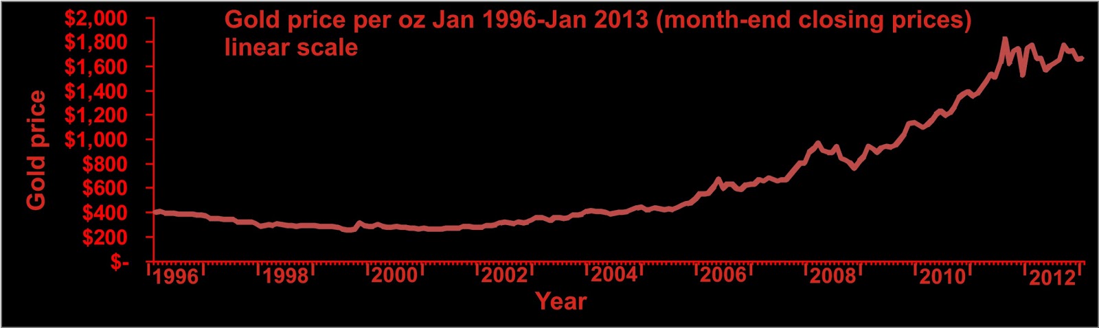
The near-constant slope over long stretches of this plot tells us that gold is already increasing in price exponentially. So don't say that gold price will increase exponentially during a financial crisis. It is already doing so, and has been since early 2001 (notwithstanding the recent turmoil).
The break in slope in late 2005 tells us that the gold price suddenly began to increase more rapidly. I don't know if anything unusual happened in late 2005, but there was a bland warning by the ECB issued in December 2005 about growing global financial imbalances.
Reconstructing phase space portraits normally requires two or more time series, sampled at equivalent intervals. You can simply plot one series against the other (a scatter plot). If you are using excel or a similar program, this is remarkably easy.

Looks impressive--the gold line represents a gold:silver ratio of about 60. Deviations from that line represent deviations in this ratio. Silver's rise to nearly $50 in 2011 causes the funny looking nose on the graph at upper right. The curve represents the time evolution of the system, which moved in herky-jerky fashion from the lower left (in January 2000) towards the upper right of the graph (a little while ago). Each plotted point represents the state at the end of each month until roughly the present.
For graphs covering at least an order of magnitude, it may be worth using logarithmic axes.

The problem with these graphs is the presence of the US dollar. Most of the action in the plot is due to the declining value of the US dollar. To remove it, let us consider only the gold:silver ratio itself.

There are a number of long-accepted methods for projecting a single data series into a state space of more than one dimension. The intuitively obvious approach is to plot the data against its first (and higher, if desired) time derivatives. The approach I have used most commonly in these pages is a time delay plot, in which the respective observations are plotted against another, older observation. The lag is the number of time steps between the two observations, and there are prescribed methods for establishing an ideal lag.
Taking the month-end ratio of the gold price to the silver price, plotting it against a lagged copy of itself (delayed by one year), we see the following.

We are presently near where we started (just before the last financial crisis, and currently following a trajectory similar to that which we followed in the summer of 2008 (the yellow dot represents where we would be if April ends at today's prices). Given what we've recently experienced in the metals markets and stocks, it is extremely worrisome to consider we are only at the equivalent of mid-summer 2008!
There is more to the story--plotting phase space in only two dimensions can be a little risky because the third dimension may convey a lot of information. To create the third dimension, we apply a second lag equal to the first--so that the third axis represents an observation two lag periods behind the observation plotted on the first axis.

In the above graph, the red curve represents the 2-d projection shown above plotted on a reference plane (z=55)--and the green curve represents the 3-dimensional phase space portrait shown relative to the reference. Where there are green dashed lines between the 3-d and 2-d plots, the 3-d plot is above the reference plane, and where there are red dashed lines, the 3-d plot lies below the reference plane.
In the 3-d plot, we see that the current trajectory (near the bottom of the graph) is quite a bit below the trajectory during the crisis of 2008. It may be that the 2008 financial crisis was one of financial institution solvency, whereas our current crisis is starting to look like one of financial system failure. If this is the explanation for the differing trajectories then my projection is that we are going to see something we haven't seen before.
The gold-silver ratio has the potential to rise to heights never before seen. The reason is that major crises encourage hoarding and flight; and it is much easier to flee with a million dollars in gold than a million dollars in silver.
Today we will use these tools to look at precious metals.

The near-constant slope over long stretches of this plot tells us that gold is already increasing in price exponentially. So don't say that gold price will increase exponentially during a financial crisis. It is already doing so, and has been since early 2001 (notwithstanding the recent turmoil).
The break in slope in late 2005 tells us that the gold price suddenly began to increase more rapidly. I don't know if anything unusual happened in late 2005, but there was a bland warning by the ECB issued in December 2005 about growing global financial imbalances.
Reconstructing phase space portraits normally requires two or more time series, sampled at equivalent intervals. You can simply plot one series against the other (a scatter plot). If you are using excel or a similar program, this is remarkably easy.

Looks impressive--the gold line represents a gold:silver ratio of about 60. Deviations from that line represent deviations in this ratio. Silver's rise to nearly $50 in 2011 causes the funny looking nose on the graph at upper right. The curve represents the time evolution of the system, which moved in herky-jerky fashion from the lower left (in January 2000) towards the upper right of the graph (a little while ago). Each plotted point represents the state at the end of each month until roughly the present.
For graphs covering at least an order of magnitude, it may be worth using logarithmic axes.

The problem with these graphs is the presence of the US dollar. Most of the action in the plot is due to the declining value of the US dollar. To remove it, let us consider only the gold:silver ratio itself.

There are a number of long-accepted methods for projecting a single data series into a state space of more than one dimension. The intuitively obvious approach is to plot the data against its first (and higher, if desired) time derivatives. The approach I have used most commonly in these pages is a time delay plot, in which the respective observations are plotted against another, older observation. The lag is the number of time steps between the two observations, and there are prescribed methods for establishing an ideal lag.
Taking the month-end ratio of the gold price to the silver price, plotting it against a lagged copy of itself (delayed by one year), we see the following.

We are presently near where we started (just before the last financial crisis, and currently following a trajectory similar to that which we followed in the summer of 2008 (the yellow dot represents where we would be if April ends at today's prices). Given what we've recently experienced in the metals markets and stocks, it is extremely worrisome to consider we are only at the equivalent of mid-summer 2008!
There is more to the story--plotting phase space in only two dimensions can be a little risky because the third dimension may convey a lot of information. To create the third dimension, we apply a second lag equal to the first--so that the third axis represents an observation two lag periods behind the observation plotted on the first axis.

In the above graph, the red curve represents the 2-d projection shown above plotted on a reference plane (z=55)--and the green curve represents the 3-dimensional phase space portrait shown relative to the reference. Where there are green dashed lines between the 3-d and 2-d plots, the 3-d plot is above the reference plane, and where there are red dashed lines, the 3-d plot lies below the reference plane.
In the 3-d plot, we see that the current trajectory (near the bottom of the graph) is quite a bit below the trajectory during the crisis of 2008. It may be that the 2008 financial crisis was one of financial institution solvency, whereas our current crisis is starting to look like one of financial system failure. If this is the explanation for the differing trajectories then my projection is that we are going to see something we haven't seen before.
The gold-silver ratio has the potential to rise to heights never before seen. The reason is that major crises encourage hoarding and flight; and it is much easier to flee with a million dollars in gold than a million dollars in silver.

