Dust flux, Vostok ice core

Dust flux, Vostok ice core
Two dimensional phase space reconstruction of dust flux from the Vostok core over the period 186-4 ka using the time derivative method. Dust flux on the x-axis, rate of change is on the y-axis. From Gipp (2001).

Friday, April 27, 2012

USGS presents projections of future discoveries of oil and natural gas

The United States Geological Survey (USGS) has released its estimates for remaining undiscovered oil and natural gas resources in the world exclusive of the United States (pdf). The US estimates have been done as separate documents, one of which is here.

The estimates are probabilistic. The headline numbers: 565 billion barrels of conventional oil and 5,606 trillion cubic feet of natural gas, is enough for about 20 years of global consumption for oil--and somewhat more for gas, and have a probability of about 50% of being achieved. Maybe there will be more--maybe there will be less.

That 20 years of current consumption assumes that all the Africans, Chinese, and Indians who want cars but don't have them remain unable to get them.

Underneath the headline numbers we can limit the variability by considering the F95 (95% likely to exceed) and F5 (5% likely to exceed) from which we see a 90% likelihood of extracting between 200 billion and 1.2 trillion barrels of conventional oil and 90% chance of finding between about 2,000 trillion and 12,100 trillion cubic feet.

What is economic depends on price, so if price goes high enough we will probably be able to extract the F5 levels; which is promising, but even then is still only about 50 years of oil at current levels of consumption (although consumption should also fall if real price rises).

Also: these are conventional numbers, and don't include solving such problems as harvesting gas hydrates from continental slopes.

Thursday, April 26, 2012

Evolution of the US trade deficit in phase space

As is well known, the US has run a trade deficit since about 1970. Why this is so has been attributed to everything from the offshoring of US manufacturing to the idea that as the US dollar became the global currency, it was necessary for the US to run a trade deficit for dollars to circulate in the international setting.

We may look at this in two ways--one, the alarmist view, is that the US is unable to pay anything and is thus about to fall into poverty. The second is that the rest of the world is sending tribute to the US--which hardly seems worrying. Apart from the question of whether pieces of paper with pictures of dead presidents can be considered as payment, a critical question is whether the US trade deficit will continue to increase without limit , or will it decline going forward.


Trade deficit data for the US back to 1960 are available here. The technical picture could be interpreted as a megaphone bottom, which suggests that the trend is about to reverse.

For the reconstructed phase space, let's start by looking at the cyclicity in the trade surplus/deficit. For the first portion of the chart, there appears to be a cyclicity with a period of about five years. The period looks longer in the latter part of the graph. I have created a phase space plot using a time delay of three years.


Well, ok, I can't make out anything. I'll try detrending it and looking at it later.
  - - - - - - - - - - - - - - - - - - - - - - - - - - - - - - - - - - - - - - - - - - - - -

I have been experimenting with different methods of displaying probability density diagrams, including one that involves all windows viewed simultaneously. Unfortunately I haven't figured out how to display it here.

Wednesday, April 25, 2012

Natural and Keynesian disasters

It seems that every week we are treated to a breathless dissertation of some natural disaster or other that is going to doom us. A few months ago I commented on one such impending crisis. Every so often I like to look at my stock portfolio, and it gets me thinking about disasters again.

It isn't a new phenomenon.

A common theme is a possible causative role for human activity. Indeed, there are reasonable physical mechanisms by which human activities may contribute to natural disasters. We have altered the composition of the atmosphere to measurable effect, and some believe that some component of recent climate variability is due to this action.


Human activity and earthquakes

Does human activity cause earthquakes?

We have known for a long time that injection of liquids into areas where there are tectonic stresses may reduce friction enough to trigger earthquakes--and direct relationships between (thus far, small) swarms of earthquakes and fluid injections at depth by the oil industry has been demonstrated in southwestern Ontario (Mereu et al., 1986), Colorado (Major and Simon, 1969), and other places--although no connection has ever been established between such action and large earthquakes.

The construction of large hydroelectric projects, which fills vast reservoirs with water, changes local mass balance and fluid pressures at depth, which has been suggested as a trigger for large earthquakes, such as the large Gujarat earthquake in January 2001. This mechanism has not been positively established as a trigger.

Given the amount of human activity, we might expect that there are more earthquakes now than in the past. It certainly seems that way reading the papers. Agencies like USGS (United States Geological Survey) and BGS (British Geological Survey) are valuable sources for data on geophysical disasters so that we may determine whether there is any correlation between catastrophes and human activities.

NUMBER OF EARTHQUAKES PER YEAR MAGNITUDE 7.0 OR GREATER
1900 - 1999

1900 13 1930 13    1960   22 1990     13
1901 14 1931 26    1961   18 1991 10
1902      8 1932 13    1962   15 1992N 23
1903 10 1933   14   1963   20 1993M 16
1904    16 1934   22   1964   15 1994     15
1905    26 1935   24   1965   22 1995E   25
1906    32 1936   21   1966   19      1996     22
1907    27 1937   22   1967   16      1997     20
1908    18 1938   26   1968   30      1998     16
1909    32 1939   21   1969   27      1999     23
1910    36 1940   23   1970 29
1911    24 1941   24    1971   23
1912    22 1942   27    1972   20
1913    23 1943* 41   1973   16
1914    22 1944   31   1974   21
1915    18 1945   27   1975   21
1916    25 1946   35   1976$ 25
1917    21 1947   26   1977   16
1918    21 1948   28   1978   18
1919    14 1949   36   1979   15
1920     8 1950   39   1980   18
1921    11 1951   21   1981   14
1922    14 1952   17   1982  10
1923    23 1953   22   1983   15
1924    18 1954   17   1984   8
1925    17 1955   19   1985   15
1926    19 1956   15   1986#  6
1927    20 1957   34   1987   11
1928    22 1958   10   1988    8
1929    19 1959   15   1989    7

Total 1900-1997 = 1960 events = 20 per year

* Most active year since 1900
# Least active year since 1900
$ Year with most people killed since 1900 (295,000 - 699,000;
 dominated by the Tangshan quake with casualty estimate from
 255,000 - 655,000)
N First full year of operation on NSN/digital recording system
M Year moment magnitude quotes were introduced
E Year energy magnitude quotes were introduced

Statistics were compiled from the Earthquake Data Base System of the
U.S. Geological Survey, National Earthquake Information Center, Golden CO

The table above used to appear on the USGS website years ago--but I can no longer find it. Part of it appears here.

Magnitude 7 quakes are pretty large, and it is reasonable to assume that we would be aware of them anywhere in the world going back to the beginning of the last century. We could not do the same sort of study for small earthquakes, as a those in remote settings would go undetected.

The maximum number of large earthquakes in the last hundred or so years occurred in 1943. There is no detectable correlation between large earthquakes on a global scale and human activity, although local correlations may exist which have not yet been established.

Human activity and catastrophe

However as we peruse the Munich Re statistics, we note that the economic costs of natural disasters do correlate with human activity. This correlation is due to the rapid spread of occupation of previously marginal lands, and the greater concentrations of wealth and developed property in geologically dangerous areas.

Comparison of distribution of insurable losses worldwide in 2011 and from 1980 to 2011. Figures from Munich Re annual report.

For instance, we note that there has been a remarkable increase in the fraction of insured losses due to natural catastrophes in Asia. From 1980 to 2011, Asia was responsible for 13% of insured losses worldwide. But in 2011 alone, the fraction of worldwide losses in Asia spiked to 44%. A lot of this was due to the damage done by the Tohoku earthquake and tsunami, but this was only responsible for 30% of Asia's insurable losses. This increase in importance is a reflection of the rapid growth of property values in Asia.


Data source here; graphic from Munich Re annual report.

We see a steady climb in the number of US Federal disaster declarations over the past sixty years. Are we to conclude that there have been more disasters? Or is it simply that more people have been impacted by them? If so, why?


Over the last 25 years it looks like US tornado activity is up, but worldwide hurricane activity is down. Global earthquakes, as we saw above, don't really have a trend. But there has been a definite increase in the number of declared disasters in the US. These have not been caused by an increase in the number of disasters. What we are seeing is the effect of the growth of suburbs and the expansion of expensive coastal properties in hurricane-prone areas of the United States.


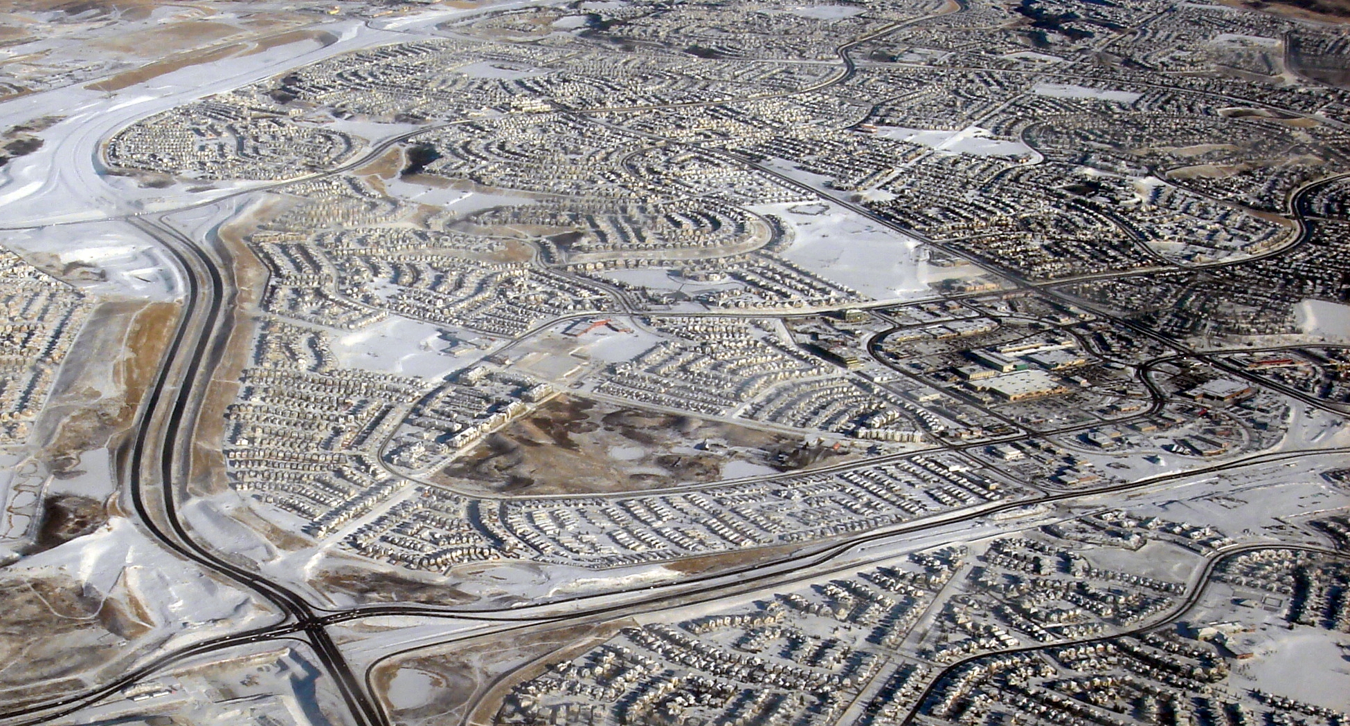
In tornado-prone areas, sprawl like that depicted above greatly increases the chances that houses are impacted by tornadoes. Similarly, sprawl into forested areas increases the likelihood of forest fires consuming the neighbourhood; sprawl up the sides of hills increases the likely impacts of landslides, etc.

Keynesianism and the growth of suburbs

The symbiosis between the Keynesian expansion of the economy and the growth of suburbs in US cities has been ably discussed by Beauregard (2006). Sprawl was driven by the flow of money, the "American dream" of owning a home in the suburbs, and facilitated by the widespread ownership of cars. The suburbs were designed with cars in mind.

The growth of suburbs fulfilled two roles. Lots of houses were available for new buyers, which kept prices down; and city governments discovered that developer's fees and the new land taxes initially exceeded the maintenance cost of the new roads and infrastructure built to support them,. Unfortunately, as time passed and the infrastructure aged, soon maintenance costs exceeded tax revenues, necessitating another round of growth. Suburbs were able to maintain the required level of growth for a few decades, but we are reaching the point everywhere (it seems) where there cannot be enough new growth to maintain our crumbling infrastructure.

The mindset of the "ownership society" really drove demand for housing, and the best places to expand were in the southwest, so that cities like Phoenix and Las Vegas really grew. Low interest rates plus easy money led to a bubble in house prices and an explosion of sprawl.

The Austrian school of economics teaches us that easy money leads to malinvestment. Suburban growth certainly seems to qualify. Our urban sprawl malinvestment has left us with the interwoven problems of unlivable cities, financial crisis, and increased death and destruction from natural disasters.

References

Beauregard, R. A., 2006. When America became suburban. University of Minnesota Press, Minneapolis, 271 p.

Major, M. W. and R. B. Simon, 1968. A Seismic Study of the Denver (Derby) Earthquakes, 63 Q. Colo. School Mines 9.

Mereu, R. F., J. Brunet, K. Morissey, B. Price & A. Yapp, 1986. A study of Microearthquakes of the Gobles Oil Field Area of Southwestern Ontario, 76 Bull. Seismol. Soc. Am. 1215.

Nicholson, C. and R. L. Wesson, 1990.  Earthquake Hazard Associated with Deep Well Injection--A Report to the U.S. Environmental Protection Agency, U.S. Geol. Surv. Bull. #1951.

Wednesday, April 18, 2012

US real interest rates falling--unemployment too. Is Bernanke right?

Nah.

First the graph.


This graph of unemployment rate against real interest rate should not exist in this form, according to generally accepted Keynesian theory, which tells us that at low interest rates, there is one equilibrium state for unemployment--and that is low.

Unfortunately reality seems to be painting a different picture--that of multistability. Many natural systems have more than one equilibrium point, and one's ability to choose which equilibrium is manifested in a complex system is limited. Which equilibrium appears is a function of the entire history of the system, so that simply hammering it with low interest rates won't necessarily give you the desired result, Ben.

In the last couple of months, real interest rates have swung sharply negative, in response to rising inflation (as reported on the BLS website). In my graph above I have used the annualized rate of the CPI for all urban consumers, calculated monthly. I have used a three-point moving average for the real interest rate to reduce the volatility.

Unemployment has fallen, but not because a lot of people are finding work. Instead BLS has eliminated a lot of "discouraged workers" from the work force.

If you can't force reality to conform to your economic models, at least you can fudge the data.

Monday, April 16, 2012

Gold silver ratio update--a new breakout?

It has been awhile since we last checked on the phase space of the month-end gold-silver ratio. Here it is as of the end of March (I am using a three-point moving average and because of my past training I plot the result at the midpoint of the mav, which is why the last point is labelled 0212 instead of 0312).


It is premature to call this a breakout, but I am looking for any reason to be optimistic about silver right now.

If there is no decrease in the gold-silver ratio, then the current "breakout" will be short-lived, and will resemble the little excursion we had last year, which lasted all of ten months.

Friday, April 13, 2012

Celebrating the debasement of our coinage (once again)

. . . with full-page colour ads in major newspapers.

The Toronto Star today had a two-page spread right in the centre of the news section. The Royal Canadian Mint is boldly announcing that the loonie ($1 coin) and toonie ($2 coin) will now be made of glorious steel ("multi-ply plated steel"), as opposed to nickel, as has been the case until now.

I always thought debasing the coinage was something governments did surreptitiously. One can't imagine Septimus Severus boasting about wonderful new plating technology covering coins manufactured by Rome's greatest leadsmiths. Of course in those days people actually thought about money.

Tuesday, April 10, 2012

New area of stability shaping up in commodities

As we have seen before, for most of the last sixteen years, the state space defined by the plot of the gold/copper ratio against the silver/rough-rice ratio has been confined to one area (the yellow oval below), with the exception of a few short events: the crash in commodities in 2008/2009 (lasting four months) and 2006-7 when both silver and copper climbed strongly (nearly two years).


What now appears to be the longest and most extensive excursion in phase space has occurred in the last two years. Since the breakout from the yellow area in early 2010, the state has meandered towards the right. Both gold and copper have risen, as has silver. It is looking more and more like some form of transition rather than a simple excursion.

Friday, April 6, 2012

The fall begins--an updated phase space reconstruction of Case-Shiller index

It has been some time since we last looked at US housing.

The bubble continues to deflate. With the last two quarters of data for 2011 now posted (look for the link to the excel data in the third paragraph from the bottom) we have an additional point on our two-d reconstructed phase space portrait of the Case-Shiller index.


For this graph I have taken the average of the four quarterly values of the Case-Shiller index as the value for the year. Quarterly data have been available since 1953. The method of constructing the plot from the data series have been previously described here and here.

Last time I inferred that the housing price system would return to one of the two highlighted areas of Lyapunov stability at the lower left of the graph. In 2011 the system began to move in that direction. Further motion in that direction is virtually guaranteed as the index value for 2011 was about 118, which means that the curve will "fall" to that level (on the vertical axis) in 2015.


Recall that the plot is constructed by plotting the "current" value of the index against the lagged value--in this case, the value of four years previous. Hence the coordinates of the state for 2011 are the present index value (on the x-axis) against the index value in 2007 (on the y-axis). In 2015, the state will plot at coordinates given by the value of the index in 2015 on the x-axis (we don't know what that value will be) against the index value in 2011 on the y-axis (which is 118.1). While we don't know exactly where the point will plot, it will be somewhere on the yellow horizontal line added to the above figure.

Where on the yellow line depends on whether house prices rise, fall, or stay relatively constant between now and 2015. For your amusement I have three scenarios plotted on the above figure (please note that the Case-Shiller index is adjusted for inflation, so a rising price has to occur in real, not just nominal, terms).

Balance the three scenarios against their relative probability. The likelihood of rising house prices seems unlikely given the expected increase in foreclosures about to strike the US housing market.

Thursday, April 5, 2012

Global warming and oil reserves: A potentially beautiful symbiosis

A recent publication in Geophysical Research Letters concludes that a past episode of global warming (during the Eocene epoch) resulted in higher rates of petroleum formation.

Thus one of our serious problems--global warming--could help mitigate a very serious problem--petroleum depletion. Ongoing warming (anthropogenic or not) may lead to rapid (well, geologically speaking) replenishment of oil fields (say on a ten-million year timescale, for those of you who can wait).

Wednesday, April 4, 2012

US looks to Syria

There is an opinion published in today's Washington Post by Richard Cohen arguing on similarities between the unfolding Syrian situation (sign-up may be required) and the run-up to the Bosnian conflict.
We are coming up on a melancholy anniversary. On April 5, 1992, Suada
Dilberovic and Olga Sucic were shot and killed. They were attending a
peace rally in Sarajevo when Serbian snipers opened fire. The two
women were the first of more than 100,000 people killed over the next
few years. The Bosnian war had begun.

This is also an instructive anniversary. Much of what characterized
the Bosnian war, including hideous barbarity, is now occurring in
Syria. Once again, we are seeing sectarian butchery. Once again, we
are confronted with a travelogue of peoples, religions, sects, tribes
and clans. Once again, we are being warned of the daunting challenges
of topography — the Syrian desert, the Syrian mountains, the Syrian
cities. Once again we are being told that arming the opposition would
exacerbate the killing.
It already appears that arming the opposition has exacerbated the killing, as was the case in Libya. America is psyching itself up for another intervention. Cohen's conclusion:
It is a mess. But it is always a mess. It is up to the United States
to help establish a leadership. There is an art to these things, and
the State Department knows how to do it. There is also an inevitable
progression to such wars, and Bosnia shows the way. The Syrian war
will worsen. Many more people will be killed and, finally, the United
States will have to show Turkey and Saudi Arabia how these things are
done.
Why exactly is it up to the United States to help establish leadership? Why is anything up the United States?

As happened in Libya, and Bosnia, and countries going back to Viet Nam, Korea, and France--in the western way of warfare, mass civilian deaths are not a bug, they are a feature. They are a feature of a form of war-fighting that is based on air power and minimizing the risk to boots on the ground. The newest feature of western war-fighting appears to be an increasing role for local proxies to do the heavy lifting, while the west drops bombs on "targets".

Update: US has already been intervening in Syria for some time.