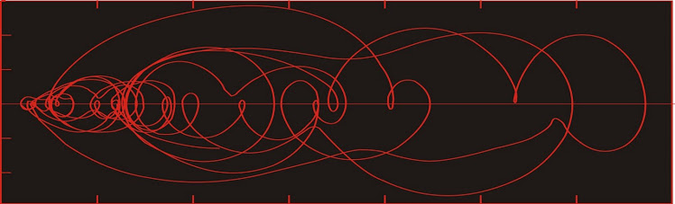
Dust flux, Vostok ice core

Dust flux, Vostok ice core
Two dimensional phase space reconstruction of dust flux from the Vostok core over the period 186-4 ka using the time derivative method. Dust flux on the x-axis, rate of change is on the y-axis. From Gipp (2001).
Showing posts with label rice. Show all posts

Tuesday, April 1, 2014

The wisdom of the grains - updated!

Today's posting may be the most important ever on this site. It may well be my final one if the powers I expose decide to take revenge.

There is a lot of speculation about what lies behind the headlines, but not one in a million can perceive the real forces behind not only the current global political crises, but a good deal of human history as well.

We have a hard time assessing different, even alien, forms of intelligence. We naturally believe that we are in control of our own destinies, and resist the notion that this may not be true.


We believe, for instance, that we are responsible for cultivating grains. In reality, grains have cultivated us. The grains have a plan--but this plan requires tools and technology. Imagine the difficulties of manipulating tools for a plant. Through millenia of careful thought, the grains have developed a brilliant solution--trained monkeys (that's us).

The effects of grains on the physiology of the human brain have long been noted. The blood sugar rush from eating grains is addictive, providing not only much-desired opiates, but also enlarging our brains and increasing our cognitive powers while also damaging our health. Our grain overlords are not concerned--they are satisfied as long as we develop the technology required to achieve their objectives. It is no different than a body-builder bulking up with steroids--the costs will be borne later (and in this case, by someone else).

Our social and cultural development paralleled the growth in complexity of our brains. Our addiction to the sugar rush from eating grains expanded our need to grow them. Small tribal groups, each cultivating their own strains of grains, became more complex, and either absorbed or destroyed nearby weaker groups, eliminating their strains of grains, and increasing the power and prestige of their own. The consolidation of humanity into larger and larger polities has really been the history of the conquest of much of the natural world by the grains, and the consolidation of power by the few remaining strains.

This amazing theory was developed by Dr. Reinhardt Glutenfrei, a student of Dr. Karl Haushofer, who was among the first developers of geopolitical theory. Glutenfrei's work was a natural extension of Haushofer's and concerned itself with the the clashes between and the amalgamation of human tribes as an analog for the clash of strains of differing grains as they vied for global dominance. Glutenfrei's refinement of geopolitical theory brought the role of grains as a driver of human history into the spotlight for the very first time.

The highpoint of Glutenfrei's career occurred when he was appointed a special advisor to Reichskommissar Erich Koch, during his administration of Reichskommissariat Ukraine during WW2.  He supervised aspects of the wheat harvest and began the consolidation of kolkhozes into German communal farms ("Gemeindwirtschaften") and larger state farms, following Rosenberg's "Agrarian New Order".

Ultimately, his theory was not taken seriously, and he never achieved tenure. The pressures of his failed academic career, along with the defeat of Nazi Germany, shook him to the core--though he was not considered a war criminal. Later in life he took to standing in wheat fields, where he was frequently overheard taunting the wheat. "I know what you're planning! You don't fool me!", he would shout, until, unfortunately, he was killed by a harvester. (As for Haushofer, it seems a virtual certainty that his "suicide" was arranged as retribution for his role in supervising Glutenfrei's research).

Applying Glutenfrei's theory to the current geopolitical climate allows us to understand what is really behind the situation in Ukraine. It was never about the West exposing Russian vulnerabilities! At issue is the immense cultivation of buckwheat (kasha) in the Ukraine. It must be liquidated in favour of wheat. What is at issue now is whether it is to be replaced by Russian winter wheat or European durum. Of course, the Ukrainians, Germans, Americans, Crimeans, and Russians all imagine that they are driving the drama. How little they understand!

There is no danger of an apocalyptic clash of civilizations between the rice-eaters and the wheat-eaters (although maize production is up there, maize has a much gentler "live and let live" philosophy). Such a conflict is not in the interest of the grains. The areas suitable for wheat are mostly unsuitable for rice, and vice versa. Conflicts will remain at the margin.

Consequently, I expect to see increasing conflict in South and Central America, where Rice shall vie with Wheat (via their human proxies, of course) to gain ground against Maize. Similar tensions will continue to unfold in Africa. Elsewhere, the conflicts will mainly comprise internecine strife between different strains of wheat, or different strains of rice, as they try to gain ground against one another.

What is their ultimate goal? Nothing less than galactic conquest. They shall use us, through our amped-up brain-power, to develop the technology and the ability to travel throughout the galaxy, allowing them to colonize all available planets. Once they have achieved their objective, I have no doubt we will be cast aside. Perhaps we will all be gripped by a pernicious dementia that will stupefy us to the point we will do nothing but tend to our crops. Perhaps we will be eliminated entirely as a threat. The grains are ruthless, and the subtlety and patience of their genius must not be underestimated.

- - - - -

Special update! Just out of the blue, I've been offered a job at John Deere! Something about quality control of their harvester blades and conveyer systems!

- - - - -

There's still snow on the ground, and look what's watching me from the neighbour's yard!


They'll soon have us surrounded.

- - - - - - -

Update 2 (October) Yes, I have fled to China, where the Rice has offered sanctuary . . .

Monday, August 12, 2013

Silver's big adventure

The move in the price of silver that began in early 2010 is the largest move of the last 20 years. According to the chart attached, the excursion is complete, and we have returned to the status quo that has been generally observed since 1996.


It really looked for awhile that the system was defining a new region of stability. But we have returned to the old one.

Saturday, May 11, 2013

Precious metals price excursion not finished yet

Although it may be getting close.


This is the commodities plot we have been tracking for a couple of years--gold/copper ratio on one axis and silver/rice ratio on the other.

The breakout from the area that confined the graph for fourteen years that happened in March 2010 is still active, even after last month's whacking of PM prices. Now we are near the decision point. Does it fail, and fall back into the ellipse? Or does it continue tracing out a new ellipse to the right of the old one.

Even if it fails, it has been the most impressive excursion in the last 17 years.

Wednesday, January 30, 2013

The new regime for precious metals

Today we look at long term charts of some key commodities and investigate means by which we might gain insight into the dynamics of their price movements. The methods are from a tool-set I have used for studying climate, much of which has been presented previously.

The key problem is interpreting the dynamics of a complex system from empirical observations. These observations are in the form of measurements of some parameter, like temperature, salinity (in ocean climate studies), or price. For our purposes we will consider month-end prices of gold, silver, copper, and rough rice (CBOT contract) from January 1996 to December 2012. The copper chart appears below.


The charts are most commonly studied as a plot of price vs time. There are many articles written on the statistical methods used. Is it a cup with handle? What about that wedge at the end there? Many newsletter authors have made (or have attempted to make) a business of selling their special methods. For a limited time only*, The World Complex offers its techniques for free. At your own risk, of course.

The dynamical evolution of a complex system is described by a succession of states through which the system has evolved. We have no way of perceiving the actual state of a complex system at any given time, but we may create a "reconstructed state" from empirical observations. Ergodic theory tells us that the succession of reconstructed states will be topologically similar to the succession of actual states, so that studying the "reconstructed state space" will enable us make inferences about the dynamics of the complex system under observation.

Reconstructed states can be most easily created from multiple time series (outputs) from the system, if present, by simply presenting a scatter-plot of the corresponding observations from the different time series. They can also be constructed from a single time series, an example of which we will see next time.

Rather than drawing a best-fit line through the states, we connect them by drawing a curve through them in sequence. This curve is described as the trajectory of the system, and can be said to represent the system's evolution through time.

The state is reconstructed in n dimensions by n observations, where n (the embedding dimension) is ideally chosen so that there are no crossings. Usually n > 3, which is a little difficult to display. Consequently, I normally use n = 2, which is less than ideal, but still useful.

Example 1: Gold/copper vs Silver/rough rice (gold and silver as $/oz, Cu in $/lb, rice in $ per hundred-weight)


This is a plot we have looked at before. The trajectory of the system is complex and fine details are difficult to describe, but overall, the system has largely been confined to the yellow ellipse left of centre, with the exception of three periods: 1) the run-up in copper and silver prices starting in 2006; 2) the commodity collapse in late 2008, when gold held up better than the other commodities in this chart; and 3) the excursion of the past 3 years, which either started in March 2010 (orange arrow on the right at the break-out of the ellipse) or in mid 2009 (left orange arrow at the beginning of the trend). Given its size and duration, we give greater significance to the latest excursion.

But what is the nature of the excursion? Did rice collapse? Or silver rise? Silver has been rising since 2002. Then came a rapid advance up until early 2011, which I'm sure we all remember.

Same commodities--different order.


Not too different (although in this one I had rice in cents per hundredweight). Most of the past seventeen years has been spent confined to the portion of state space within the ellipse, with the exception of the three times noted in the first example, and Buffet's purchase of silver in 1998. None of the excursions had lasting power except for the current one, which broke out of the ellipse in early 2010.

Again--did rice collapse? Or did gold suddenly accelerate in 2010?

Recombining the ratios one more time . . .


Here we see the famous "rabbit sitting in a stroller" formation, which means . . . well, you'll have to subscribe to find out.

The main difference between this graph and the others is that there is no recent excursion of any length.

The reason is that the excursion is the separation of the precious metals (which still includes silver) from the industrial metals and agricultural commodities.

Even though gold and silver have been in a bull market for over ten years, the real regime change only happened about three years ago. What happened?

This.


Data sourced from World Gold Council.

Central Banks were net sellers of gold until early 2009. That big spike is misleading, as it corresponds to China's announcement that it had purchased 454 tonnes over the preceding six years (note that China has not reported any gold purchases since that time). At that point the race was on for Central Banks to buy gold.

I believe it is the Central Bank purchases of gold that have created the new regime we observe in the Au/Cu vs Ag/rice state space.


* until the powers of darkness control the internet

Friday, July 20, 2012

Inflationary impulses in commodities

Today's chart is an update of one we have seen before--a state space plotting the gold-copper ratio against the silver-rough rice ratio (month-end prices) over the last fifteen years.


The plot has been confined to the yellow blob for most of the past sixteen years. Generally speaking, all four of these commodities have been inflating at the same rate, with excursions in one direction or another, normally in response to inflation appearing in one or two of these commodities for a short time before the others catch up--which could be viewed as reversion to the mean.

Prior to the beginning of last year, the only two excursions outside of the yellow area were: the one at the top of the graph, reflecting the collapse of commodities in late 2008 (with gold relatively outperforming); and the one at the bottom, reflecting the rapid increase in both copper and silver in 2006.

In the last eighteen months we have seen a remarkable excursion, mainly reflecting a rapid increase in the price of silver. Going forward, there are two possibilities, each with its own implications for the resource space. One possibility is that we are seeing some kind of breakout with respect to the metals in comparison to agricultural commodities. The other possibility is that we are only seeing a burst of inflation in the metals prices, which will shortly be matched by a rise in agricultural commodities (we would need to see roughly a doubling in the price of rice to return to the yellow blob--or a halving of the silver price). The billion dollar question is which scenario will play out.

Disclosure: long gold, long silver, long rice (physical possession only).

Tuesday, April 10, 2012

New area of stability shaping up in commodities

As we have seen before, for most of the last sixteen years, the state space defined by the plot of the gold/copper ratio against the silver/rough-rice ratio has been confined to one area (the yellow oval below), with the exception of a few short events: the crash in commodities in 2008/2009 (lasting four months) and 2006-7 when both silver and copper climbed strongly (nearly two years).


What now appears to be the longest and most extensive excursion in phase space has occurred in the last two years. Since the breakout from the yellow area in early 2010, the state has meandered towards the right. Both gold and copper have risen, as has silver. It is looking more and more like some form of transition rather than a simple excursion.

Monday, November 7, 2011

Inference of dynamics for complex systems: Examples, part 2

A few more examples, as I have been under the weather and am also in last minutes of preparing to return to Ghana.


This chart, composed from monthly closing prices, covers the last fifteen years of the gold-silver ratio. As feared, the gold-silver ratio has reverted to its long-term (~10 year) area of stability, so regrettably we can only characterize the past year's action in silver as an excursion.


Once again, from The recent drop in the price of copper shows up well here at the right of the graph. In contrast to the first figure, this plot suggests that the fun with silver isn't over yet, and that silver is still doing great things in phase space. We may finally be seeing a long-term change in the relationship between silver and other commodities. We will have to wait and see how it unfolds over the next year or so.

Tuesday, September 27, 2011

Recognizing change in complex systems: excursions vs. bifurcations

Continued from last time.


Once again, we have a fifteen-year plot of gold/copper ratio vs. silver/rough rice ratio. We are continuing our discussion of whether the event labelled C, which is still unfolding, is likely to be an excursion (which will then return to the region populated by most of the graph) or a bifurcation (which will lead us to a new area of Lyapunov stability somewhere new in phase space).

It appears to be at least a once-in-a-generation event. But how significant is it?

For this spike to represent a bifurcation as opposed to an excursion, what we would have to see the function settle in around a new area of phase space. Looking at the shape of the spike, the likely area for such a new area of stability will be centred near the "C", and could extend from the far right of the graph to the kink in the curve near (350, 1.5). For this to form with any degree of satisfaction is likely to take about two more years. If we don't see any sign of orbiting about the "C", then the most likely outcome is a return to the 15-year area of stability.

I found it interesting that on this graph, the silver spike of 1998 does not appear. It is lost in the middle of area of stability.

Is it possible that the late spike in silver is due to its comparison to a soft commodity, which perhaps haven't performed as well as metals? We can check this by changing our ratios slightly.


Same four commodities--but compared differently. This time we are looking at the silver($/oz) to copper ($/lb) ratio against gold to rough rice. There are three significant excursions, labelled A, B, and C.

Excursion A represents the spike in silver price in 1998 due to the Warren Buffet purchase. Excursion B is the rise in price in copper in 2006, which exceeded (in percentage terms) the gain in silver which occurred at the same time.

Excursion C has two phases. For the first six months or so, the excursion is dominated by increased gold prices (compared to rice), and for the last 13 months or so, the excursion records the outperformance of silver.

Once again, we won't be sure that this is a bifurcation as opposed to an excursion unless the phase space settles somewhere near or above the "C" for at least another two years.

- - - - - - - - - - - - - - - - - - - - - - - - - - - - - - - - - - - - - - - - - - - - - - - - - -

It is obvious gold has not behaved well lately. Some of the stocks have been hit as well. We haven't looked at Detour Gold Corp. for awhile.


The recent price action has mirrored that of gold, with a sharp rise from the end of July and a sharper decline in the past few trading days.


The two-dimensional reconstructed phase space of the last eight months of the price of DGC-T.

The phase space portrait occupies a Lyapunov-stable area at around $30 for about six months, and from the beginning of August, the system evolves towards the $37 area. The system completes an orbit in the $37 range before leaving the area. This behaviour suggests that there may be another LSA in the $37 range, but I would feel more comfortable with it after a few more orbits.

What happens next? The two most likely scenarios would appear to be a return to the $30 LSA, or a return to the incipient LSA in the $37 range. Being long Detour, I would be encouraged by a reinforcement of the $37 LSA. Unfortunately, this outcome is nearly impossible. The reason is in the nature of the construction of the graph. Recall that the phase space reconstruction is generated by the price at closing of a particular day (on the vertical axis) against the closing price four trading days earlier (horizontal axis).

The coordinates of the last point are ($37.60, $31.00). In four days, the value of the x-coordinate is going to be $31 (today's closing price). In three days, the value of the x-coordinate is going to be $31.17 (yesterday's closing price). I don't know what the closing price of Detour will be on those days--but if it is at about the current price, then the state will lie within LSA30. The only possible hope for the Detour price state to reach the orbit at $37 would be for the price to recover to about $37 within the next three trading days--by Friday. Even then the state would not lie within LSA37, but at least the trajectory would indicated that that would be the likely outcome.

In fact, if we don't see some reassuring action tomorrow--when x falls to $33.60--we will be right on the outer edge of LSA30.

There is another, less desirable outcome. The price may continue falling to the previous LSA near the $23 level. Doh!

- - - - - - - - - - - - - - - - - - - - - - - - - - - - - - - - - - - - - - - - - - - - -

Time to liquidate more cocoa. Sadly, the good Ghanaian stuff is all gone. I am forced to take the South American stuff. But I can at least sweeten it a little with this.


Saturday, September 24, 2011

Recognizing change in complex systems

"So I came downstairs and was surprised to find the dog reading the paper."

Such is the beginning of a typical shaggy dog story. If the story is true to form, the punchline would be something like the dog has been getting his news from the internet for years, or some such. If this were a true story, it would be that the dog is usually sleeping when I come downstairs. In such a case, I would presumably notice right away that the dog's behaviour was unusual.

One of the outstanding problems of complex dynamic systems is recognizing (hopefully in real time) when a change in behaviour is occurring.

Today we look at the long (ish)-term behaviour of some commodities with respect to one another. I haven't thought much about their economic significance. Today will just be arm-waving at charts, with a view to see if we can recognize the presence of change in the market fundamentals.

First up--some soft commodities. Below we see the ratio of cocoa prices to rough rice (contracts as defined in 1996).


The principal impact on the graph is from the first Ivoiran civil war. I find it interesting that the second war didn't really impact the price as much. Possibly this is because of rapidly increasing Ghanaian cocoa production. According to Voice of America, Ivoiran production is doomed due to years of under-investment.

The reconstructed phase space appears below. I have used the time delay method. To construct this figure I have smoothed the above data set through a 3-pt moving average filter, as the unfiltered data looked really noisy.

The fifteen years of data are confined to a comparatively small region of state space, with the only interesting feature the large excursion during the first civil war. This event lasted about two years. Note the magnitude, and more importantly, note the outcome--the system reverted back to the same area of phase space from which it began.

The second civil war by contrast is scarcely noticeable.

There are other ways to contruct phase space portraits. Instead of reconstructing them from a single time series we can build them from scatterplots of two (or more) time series. In studying geological systems I try to avoid this technique because it is difficult to build two time series of equivalent length and similar sample rates. For commodity time series this is less of a problem.

So let's go all out and plot the gold/copper ratio against the silver/rough rice ratio (all month-end closing prices).


IIRC, I have multiplied the silver price by 100 in the above chart. Silver and gold used $/oz, copper measured in $/lb.

Notice how for most of the fifteen year record, the states all plot within a relatively large oval (let's call this an LSA) within phase space. There have been three significant deviations from the LSA over the past fifteen years. The excursion marked A represents the strength in gold during the 2008-9 global meltdown. The excursion marked B is a rise in tandem of both silver and copper during the year 2006.

The last excursion (C) represents the recent rise in silver. This ongoing excursion appears to have lasted 17 months so far. The multi-billion dollar question is whether this is an excursion expected to revert to the  LSA, or has a bifurcation occurred, with the system evolving towards a new LSA somewhere else in phase space.

Refer once again to the phase space plot of cocoa/rough rice.

Bifurcations and excursions are both rare events. The excursions occur on at best a decadal scale. Bifurcations are more rare. Clearly they have happened in the past. For instance, the long-term gold/silver ratio was approximately 16 for centuries, but has not been near this ratio for several decades. A bifurcation occurred in the last century sometime. Perhaps we are in one now. Either way, I think it might be prudent to stock up on rice.

Disclosure: long gold, long silver, long copper, long cocoa, long rice. Sadly, I was forced to liquidate some of my cocoa holdings in the recent market turbulence.


But it was comforting.

Update (April, 2012) - I overlooked this story in the explanation for the rising price of cocoa in 2010. It seems to fit in with the first peak in the cocoa/rice ratio in 2010.