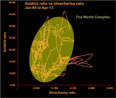
I've pulled together a few longer time series for commodity prices, now going back to 1984. As done before I've plotted two ratios against each other--in this case I've used the gold-oil ratio (gold in $/oz, oil in $/barrel) and the silver-barley ratio (silver in $/oz, barley in $/tonne). I haven't found a consistent rough rice price series going back that far.
The first thing to notice is that the data are all pretty much confined to an ellipse, the main exception being the recent large excursion in silver two years ago. The second thing to notice is that the observations do not all occur throughout the ellipse, but seem to be confined to its edge. Almost as if the system were tracing out a large cycle (or series of cycles).
The direction and rate of change of the cycles can be seen by plotting the dates of observations on the scatterplot.
Starting at the lower right in 1984, the observations follow the outer edge of the above ellipse in a counter-clockwise direction, completing the upper half in about five years. The trajectory is not smooth, but very noisy, with some backtracking.
The trajectory is much noisier after 1990. The trajectory is confined into four areas in sequence outlined by ellipses in the above figure. The overall rate of evolution along the elliptical trajectory has slowed dramatically, as it has taken nearly 25 years to complete the lower half of the big orbit.
Interestingly, the direction of the orbit is the opposite to what I had supposed it would be when I first graphed the scatterplot. I had assumed we would see higher silver (industrial activity) followed by higher oil price, leading to higher food prices, which I thought would scare people into gold. But what we observe since 1984 is the opposite--higher silver prices leads to higher gold prices leading to higher food prices (anticipating inflation?) followed by higher oil.
The peak in the Au/oil ratio in 1988 is a reflection of low oil price rather than high gold. Perhaps the high silver/barley ratio is a reflection of low food prices, which allows more savings in India and China which translate into gold demand, raising the price of gold first, and food prices secondly due to increased demand.
I'm not sure what to make of the increased noise since 1990. It may have to do with the increasing amounts of easy money in the system encouraging more participants in the commodities markets. Maybe it was just that I was broke in 1990 and hung around with more broke people--but I don't recall anyone ever talking about investing in commodities back then. Not like today. I wouldn't ascribe it to central bank interference--if you were a CB, where is the sweet spot in the above plot?


No comments:
Post a Comment