First the bad news.
That pop-up I talked about last month in the phase space portrait of gold x USDX has gone the same way as last year's. Back into the increasingly significant area of Lyapunov stability near the centre of the above plot.
- - - - - - - - - - - - - - - - - - - -
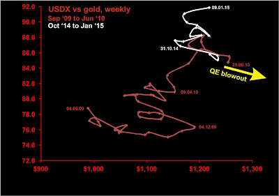
The plot of USDX index vs gold price over the past decade has shown extreme variability in the specific relationship between gold price and the US dollar index. Conventionally, one might assume that gold and the US dollar strength are inversely related. If so, on the graph below, the plot would trace out a single hyperbola. Instead, we see that while there is a general inverse relationship between the two variables most of the time, the relationship is not simple. Furthermore, there are intervals when both rise together.
This impossible trend represents the increasing demand/value of real money, and is interpreted as an indicator of deflation. From September '09 until June '10 and from October '14 to late January '15, we saw a deflationary reaction in USDX vs gold. Interestingly one such trend began at the endpoint of the previous reaction.
Of course, it helped that major bond purchases by the Fed supposedly ended in October 2014.
For the last year, USDX vs gold has been confined to a relatively small area of phase space, with most of the action showing an inverse relationship between the two variables. In the last four months, however, the state of the plot has shifted from the upper left to the upper right of the following plot, bringing us very close to the endpoint of the last deflationary impulse.
Presently, with other deflationary indicators perking up (Au/Cu), we see the system evolving to the end of the last deflationary impulse. In conjunction with the breaking of the world, buckle up for another deflationary move. We just need a policy trigger. End to NIRP, anybody?


No comments:
Post a Comment