Dust flux, Vostok ice core

Dust flux, Vostok ice core
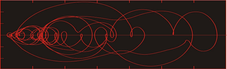
Two dimensional phase space reconstruction of dust flux from the Vostok core over the period 186-4 ka using the time derivative method. Dust flux on the x-axis, rate of change is on the y-axis. From Gipp (2001).

Thursday, May 9, 2013

Atlantis redux

This story is drawing a lot of attention to this post. (and why is that map upside-down?)

I won't say whether or not Atlantis exists. The topic isn't of great interest to me. But before you get too excited, be aware there are other means for large chunks of granite to find their way to the seafloor.

First of all, it is not clear whether the granite is embedded in the oceanic crust or is a clast (which we sometimes call a "raft"). It seems a long way offshore, but debris flows can go a long way.

Let's see where it is. According to the description, it is about 1500 km SW of Rio de Janeiro.


From the description of the location, I would place it somewhere near the red star. That sits on what does indeed seem to be a geologically interesting feature.

See all those roughly horizontal lines at the right of the image? Those are fracture zones. You can trace those all the way across the Atlantic to the find the corresponding point on the African coast where the two continents were attached prior to the opening of the Atlantic Ocean. The green on the left is part of South America. The light blue next to the green is the shallow water of the continental shelf, which we also consider to be part of the continent. The water depths of the continental shelf are generally no more than about 200 m.

The dark blue section between the continental shelf and the abyssal deeps where we see the fracture zones is  the continental slope, which is characterized by an increase in water depth from 200 m or so to about 4000 m. We normally consider this also to be part of the continent. It is covered by sediments and crap that have fallen off the continent (and is colonized by various organisms living on the seafloor).

The feature appears to be a relatively shallow area.


If we zoom in a bit, we can see what looks like a canyon running through the feature--whatever it is. Canyons on the continental slope are like the lower stretches of great river systems. They funnel flows of material from a tremendous area, all of which is higher up the slope. The flows through these canyons can be enormous, especially after earthquakes.

The Brazilian margin is tectonically similar to the site of the 1929 Grand Banks earthquake. If 180 cubic km of material got remobilized down the Brazilian slope by an earthquake sometime in the past, it would not surprise me if it contained some pretty impressive chunks of granite.

The feature looks like something that has come down the Brazilian slope. Google Earth images are insufficient for us to establish the age of the event--but that will probably come as more work is done on the feature.

Sunday, May 5, 2013

Break in generational employment trend

It's been awhile since we last revisited unemployment. I have largely abandoned its study because of the distortions that have been built into its present calculation. These distortions become clear in looking at the labor force participation rate, which is the proportion of the adult population engaged in full time employment, and which is readily available at the Bureau of Labor Statistics.

The website gives you monthly data going back to 1948.


Available data are monthly, but I have only used the year-end numbers in the above graph.

The profile of employment across the United States was no doubt greatly different in 1948 than at present. In 1948 it was a lot less common to see both parents fully employed than was the case in 2000. Assuming that all families have at least one parent working full time, the peak value of about 67% in the late 1990s would  suggest that 34% of families had two full-time working parents. Part-time workers are not counted in this statistic, and no doubt they were many.

The increase in participation from the early 1960s to the late 1990s reflects a major change in the structure of employment over the past two generations, with more married women entering the workforce.


In the lagged phase space we see two areas of attraction--the first in the 59% participation, and the second more recently, around 67%. We also note that the system has recently moved out of the higher area of attraction. The relative number of fully employed people is falling. How low can it go?

Below we see a topologically equivalent phase space constructed using the time-derivative method--plotting the participation rate against its rate of change, averaged over four years.


The same two areas of attraction appear, with what might be a third at around 64%. The current trajectory looks like it is heading there--so it doesn't appear that labor force participation will shrink much going forward.

Labor force participation increased during the period of falling interest rates after Volcker raised them so high in 1980. Their subsequent drop ignited a stock market bubble, which finally popped in the year 2000. The participation rate appeared to be heading lower--but intervention in interest rates inflated a bubble in real estate prices, "creating" lots of jobs in sales and construction--until it, too popped.

Based on the above graph, it looks as though most of the damage to employment of the bubble popping is over . . . unless . . .

Unless there is another bubble which we haven't considered. One that has been inflating since the early 1960s. One built on expansion of credit which has funded wars and expanded the economy to accommodate influxes of workers from family farms and young women wanting to take control of their own affairs.

Is this really logical? Did millions of jobs suddenly appear because there was this generation of young women who wanted to work?

One of the key features of a bubble is a story--a story that justifies the expansion, and which tells you that this time the expansion is not the inflation of a bubble. It looks to me that the happy story of women entering the workforce may be such a story--and there are still many millions more to leave the full-time labor force.

Wednesday, April 24, 2013

Gold-silver ratio in phase space

The reconstructed phase space portrait is one tool that can be used to gain insight into the dynamics of complex systems, whether these systems be natural or man-made.

Today we will use these tools to look at precious metals.


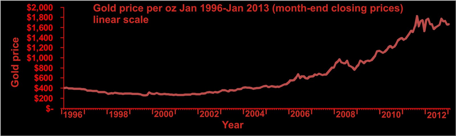
The near-constant slope over long stretches of this plot tells us that gold is already increasing in price exponentially. So don't say that gold price will increase exponentially during a financial crisis. It is already doing so, and has been since early 2001 (notwithstanding the recent turmoil).

The break in slope in late 2005 tells us that the gold price suddenly began to increase more rapidly. I don't know if anything unusual happened in late 2005, but there was a bland warning by the ECB issued in December 2005 about growing global financial imbalances.

Reconstructing phase space portraits normally requires two or more time series, sampled at equivalent intervals. You can simply plot one series against the other (a scatter plot). If you are using excel or a similar program, this is remarkably easy.


Looks impressive--the gold line represents a gold:silver ratio of about 60. Deviations from that line represent deviations in this ratio. Silver's rise to nearly $50 in 2011 causes the funny looking nose on the graph at upper right. The curve represents the time evolution of the system, which moved in herky-jerky fashion from the lower left (in January 2000) towards the upper right of the graph (a little while ago). Each plotted point represents the state at the end of each month until roughly the present.

For graphs covering at least an order of magnitude, it may be worth using logarithmic axes.


The problem with these graphs is the presence of the US dollar. Most of the action in the plot is due to the declining value of the US dollar. To remove it, let us consider only the gold:silver ratio itself.


There are a number of long-accepted methods for projecting a single data series into a state space of more than one dimension. The intuitively obvious approach is to plot the data against its first (and higher, if desired) time derivatives. The approach I have used most commonly in these pages is a time delay plot, in which the respective observations are plotted against another, older observation. The lag is the number of time steps between the two observations, and there are prescribed methods for establishing an ideal lag.

Taking the month-end ratio of the gold price to the silver price, plotting it against a lagged copy of itself (delayed by one year), we see the following.


We are presently near where we started (just before the last financial crisis, and currently following a trajectory similar to that which we followed in the summer of 2008 (the yellow dot represents where we would be if April ends at today's prices). Given what we've recently experienced in the metals markets and stocks, it is extremely worrisome to consider we are only at the equivalent of mid-summer 2008!

There is more to the story--plotting phase space in only two dimensions can be a little risky because the third dimension may convey a lot of information. To create the third dimension, we apply a second lag equal to the first--so that the third axis represents an observation two lag periods behind the observation plotted on the first axis.


In the above graph, the red curve represents the 2-d projection shown above plotted on a reference plane (z=55)--and the green curve represents the 3-dimensional phase space portrait shown relative to the reference. Where there are green dashed lines between the 3-d and 2-d plots, the 3-d plot is above the reference plane, and where there are red dashed lines, the 3-d plot lies below the reference plane.

In the 3-d plot, we see that the current trajectory (near the bottom of the graph) is quite a bit below the trajectory during the crisis of 2008. It may be that the 2008 financial crisis was one of financial institution solvency, whereas our current crisis is starting to look like one of financial system failure. If this is the explanation for the differing trajectories then my projection is that we are going to see something we haven't seen before.

The gold-silver ratio has the potential to rise to heights never before seen. The reason is that major crises encourage hoarding and flight; and it is much easier to flee with a million dollars in gold than a million dollars in silver.

Sunday, April 21, 2013

Size distribution of global deposits redux

Same idea as last time, but working from an updated database of 439 gold deposits of one million ounces or more.

Size distribution of global gold deposits on log-log scale. Data from NRH.

The chart is a graph of the number of gold deposits larger than a certain size, with both axes plotted on a logarithmic scale. The point at the upper right tells us that there is one deposit (in this case, the Pebble Deposit) larger than 88.1 M oz (which is the size of the number 2 deposit, Grasberg). The point at the far left tells us there are 438 deposits larger than 1 M oz.

In an ideal scale-invariant system, the points would line up on a straight line. We don't expect to see this completely here for two reasons: 1) not all gold deposits have been discovered; and 2) we don't really have a consistent definition for a deposit. Some deposits are so large that in settings where concessions would be smaller, they might count as several separate deposits. One might argue that all of the gold deposited in a geological province during one ore-forming event should count as a single deposit. If so, then the number of deposits on our chart above would be much smaller, and their average size would potentially be larger.

There is a noticeable break in the slope at about the 2,000,000 ounce size--the number of smaller deposits falls off more rapidly than would be expected given the number of deposits greater than 2 M oz. This may be a reflection of a bias towards larger deposits. In financing discussions over the past few years it has been made clear to me that there is not a lot of interest in deposits smaller than 2 M oz.


We are grateful to Natural Resource Holdings for taking the time and effort to put this list together.
The line in the above plot would suggest that there are still at least 500 deposits of 1 million oz or more still to be discovered. This would suggest that we have discovered only about half of the total gold deposits > 1 M oz in size that there are to be discovered. I would contend that we have a lot more to discover.


As above, with last year's reported distribution in blue.

In the last year, NRH added 200 deposits to their list. These were not all newly discovered or bumped up to this level--clearly, the majority of these additions had been missed the first time. It is reasonable to assume that there are still some deposits in this category that have been missed in the 2012 report, so that the 2013 report will have more deposits, but probably not 200 more. What I don't think will change significantly is the above estimate--that our present discoveries are less than half of what gold remains to be discovered.

Monday, April 15, 2013

You can stop now, thank you

I think we have had about the level of selling we needed.

It's lasted longer than I thought it would, but sometimes it takes a long time to cool a bullish ardour. I thought that people would have thrown in the towel after only a year or so. Really it's been nearly two years, and the drop has been about 30%.

Hard to say if the margin calls going forward will precipitate much more selling. But it certainly feels like we are in the midst of a washout.