Dust flux, Vostok ice core

Dust flux, Vostok ice core
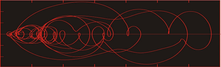
Two dimensional phase space reconstruction of dust flux from the Vostok core over the period 186-4 ka using the time derivative method. Dust flux on the x-axis, rate of change is on the y-axis. From Gipp (2001).

Saturday, July 13, 2013

Gold production: exploration ratios and the future of discovery

Every so often we take a look at relative importance of gold exploration relative to copper or other industrial minerals. According to according to Wilburn et al. (2013), gold exploration accounted for just under 50% of all exploration for non-fuel minerals commodities.

Today I've decided to look at something a little different. What is the relationship between money spent on gold exploration and the value of gold production? I've expressed the value of production as a multiple of the amount spent on gold exploration (data cribbed from the USGS and Minex Consulting - h/t Otto). I had to correct the expenditures for inflation as they were presented in 2012 dollars).


To interpret--the value of gold produced in 1980 was about 90x the amount spent on gold exploration. More recently, that number is about 20x.

This jibes with my overall impression--in the late '70s there wasn't a lot of exploration compared to the value of production--probably because South Africa was pretty much entrenched as the dominant gold producer and they had (and still have) a lot of gold. After the spike in 1980, exploration effort increased; but I think this was more of an investment phenomenon (more money available for investment) than a fear that the South African deposits were running out.

Even though the value of produced gold has ramped up tremendously, this has been approximately matched by exploration effort (if dollars spent can be equated to 'effort'). This again reflects the flood of money in the capital markets.


Here I have inverted the ratio and expressed it as a percentage (so exploration expenditures in 1997 were about 12% of global gold production).

Wow--that head and shoulders formation. If it hadn't bounced off the neckline in 2009, I would have said it was going to zero. And who knows--with investors as depressed as they are, it may well head in that direction (Minex does forecast a decline in exploration in the coming years, although the basis for their assertion is unclear).

Are we exploring enough? I haven't graphed discoveries, which hopefully mirror exploration effort, albeit with a lag. I wonder how much of the right shoulder is due to increased reporting costs as opposed to real exploration.

If this money is not all being wasted, then there should be a lot of discovery coming down the pipeline--enough to put at least another big peak in production (number V if you're counting) to the Muller and Frimmel historical production curve.

Friday, July 12, 2013

Friday OT

Siouxsie tells us of the terror she experienced her first time on a merry-go-round.


Wednesday, July 10, 2013

Gold's changing anticorrelation to the dollar

This article posted a few days ago struck me as interesting, as it seemed so counter-intuitive that I thought it worth a look.

On the basis of weekly charts of gold and the US dollar index over the past five years, Charles Hugh Smith concludes there is no correlation. And at first glance, there seems much to support his view.

The principal argument (as I have never been a believer in peaks and troughs) is his second point--that there are at least three significant intervals where gold and the US dollar rose in tandem since late 2008.

Over the past few years I have attempted to show that most economic data are nonlinear and best studied by methods suitable for complex systems. Such systems are not easily analyzed using methods like linear regression or fourier analysis. In fact I would go so far as to say that such methods can lead you to the wrong conclusions.

The world's situation is complex and changing. Change can drive unpredictable variations in market preferences--so while it would seem logical that people's preference for US dollars and gold might normally vary inversely, perhaps there are some circumstances when the market equally seeks both.

We consider a scatter plot of USDX vs gold (weekly) from January 2007 to the end of last month.


There are a few segments suggesting correlation. From early 2007 until late 2009, the two data series appear to be negatively correlated. From late 2009 until about mid-2010, they appear positively correlated (they rise in tandem). Since mid-2010, they appear to be negatively correlated.

The gold price appears to be far more sensitive to the USDX in the second phase of negative correlation compared to the first phase; by which I mean that a small change in USDX correlates to a much larger change in gold price presently than was the case before mid-2009.

From a dynamics perspective, I would argue that the three areas of the graph represent different "states" of the (US? world?) economy. Finding the triggers for changing from one operational state to another is of key importance.

QE1 occurred during the V, from the top of the first negatively correlated segment through the positively correlated segment. QE2 occurred during the advance (lower line) in the second negatively correlated segment. QE3 occurred during the period of decline (upper line) in the second negatively correlated segment.  This all may be coincidental.

I expect we will continue to see relatively large fluctuations in the price of gold relative to changes in the USDX.

It looks like the system will have to drop down to the lower line before a steady advance in the gold price. If so, we would see a small, sharp drop in USDX without movement in the gold price, prior to a major move in gold (up) and the USDX (down).

Tuesday, July 9, 2013

Will flood mud stick to the Harper government?

Past decisions have a way of coming back to haunt you. Just ask Stephen Harper.

The past several weeks have seen a series of events which, while not his fault, can be used by critics to attack his policies.

The first event was the Senate expense scandal, in which several Harper appointees were caught with their fingers in the till making inappropriate expense claims. The scandal is evolving, with one member of the Prime Minister's Office stepping down after it was revealed that he advanced one of the offending senators a cheque to cover his expense repayment. Although the senior aide in question resigned, and claimed that the PM had no knowledge of this event, Harper's history of micromanagement makes this claim rather dubious.

The second event was the massive flooding in Calgary. Though Harper was born in Toronto, this inconvenient fact is often glossed over in his appeals to his power base in Alberta. Especially Calgary.


Downtown Calgary showing the Stampede Grounds in foreground. Via

The event was driven by record intense thunderstorms across southern Alberta. Some areas received about half their average annual rainfall in less than two days. Many were quick to jump to the conclusion that this was a form of natural payback for Harper's push to develop the oil sands at the expense of any reduction in greenhouse gas emissions; however, Canada's muzzled environmental scientists were not among the critics.

(As an aside, it is impossible to ascribe a single event to global warming--although one can acknowledge the rising probability of such an event).

Before the floodwaters subsided, a near-crisis occurred--a train carrying petroleum distillates across a bridge derailed as the swiftly flowing Bow River scoured around the bridge foundations. It was mere foreshadowing for a major event.

Then came the apocalyptic train accident at Lac Megantic, which happened early Saturday morning. As is by now well known, a train hauling cars of oil for refining out east somehow slipped out of park and derailed and exploded in the centre of town, with what looks to be great loss of life.

Again, this is not Harper's fault--but critics are commenting on the tremendous increase in oil shipped by train in just the past four years. The amount of oil shipped by train has increased 28,000% in that time. I don't ever recall having a debate about the advisability of such an increase.

Perhaps this is not something that Harper has directed. But it has happened on his watch.

This brings us back to Toronto, Harper's real hometown. There was a surprising burst of rain, leading to a surprising amount of flooding. Unusual amounts of rain fell in a short time (about a month's worth in 6 hours). Not as bad as Calgary, and the results weren't as bad either. But notable.


This is my route to work. Via.

We were blacked out for about five hours. Some had it worse, with blackouts in Toronto ongoing today. Once again, there were critics blaming the flooding on Harper's energy/greenhouse-gas policies. Once again--this particular event can't be tied to it (although the probability of such events may well increase).

There is a lot of mud flying around. Eventually some of this mud may stick.

- - - - - - - - - - - - - -

Without any electronics, the kids were desperately bored. I shut down the laptops and unplugged them--we lost one due to a lightning strike last year. I finally engaged Jacob in a game of Shogi--he can play Chess and Chinese chess too (although he has a hard time finding credible opponents because I keep getting the pieces mixed up).

Thursday, July 4, 2013

Confounding factors in US GDP growth--a partial criticism of Dawson and Seater (2013)

A recently published paper in Journal of Economic Growth has generated some interest over its claim that US GDP would be about 3.5 times greater than it currently is if the level of regulation had remained at 1949 levels (or a reduction in growth by an average of 2% per year).

The thesis is intuitively compelling, and has captured the interest of a few economics websites. Personally, I don't doubt that regulation does stifle growth--I have seen first-hand too many examples, not to mention the change in economic environment from the 1970s to the current day. But this is anecdotal.

The first question--how to quantify regulation? The authors use the measure of the number of pages of the Code of Federal Regulations, which is as good a measure as one can use in a reasonable amount of time.

Regulation and its growth over time. From Dawson and Seater (2013).

I admire the authors for their ability to work through the statistics in their study. Statistics is one of my least favourite topics--even though I have to do it on occasion. It's like the vegetables on your plate that your parents insist you have to eat--or in my case, journal editors and sometimes regulators. (e.g. "We're not publishing this without some statistics." "Doesn't the beauty of the calculus compel you to publish it?" "No." " . . . grumble . . .")

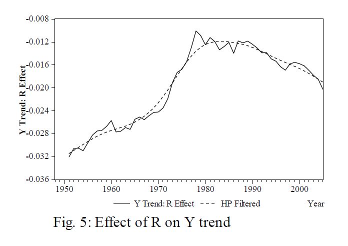
Effect of regulations on trend of total economic output. From Dawson and Seater (2013).
Effect of regulations on total factor productivity, which is like output with the 
effects of capital investment and labour removed. From Dawson and Seater (2013).

From the above graphs, the authors conclude that the effect of regulation suddenly became more pronounced in the late 1970s, despite the observation that the growth of regulation has been relatively low since 1980 (which would show better if figure 1 were on a log scale rather than linear). The authors have inferred that the response is nonlinear--as if a tipping point were suddenly reached in 1980, beyond which the economy began to contract terribly in response to the (relatively small) increases in regulation.

The trouble with this sort of statistical study is the possibility of overlooking confounding factors. In this case, there are two--energy availability/costs, and the impact of excessive credit in the system.

An article I encountered today looks at energy use in the US through its history. The major figure appears below.


Energy consumption in the US. Another graph that would be better 
displayed on a log scale. Source.

Look at the spectacular growth, especially from about 1930 to the early 1970s (the first energy crisis). Growth in energy usage has been nowhere near as great since then. Total energy use peaked in 2005. 

The main takeaway here is that the rate of growth in US energy usage after 1980 is much smaller than was the case before.

Energy is critical for a manufacturing economy. If the US economy could be viewed as a plant, the plant has three inputs--energy (sun), physical commodities (fertilizer), and credit (water). Until about 1974, there was an abundance of energy and physical inputs, so the immense credit poured into the economy resulted in spectacular growth. 

Since then, however, it's been quite cloudy, and the soil is a little depleted of nutrients. But all the government can do is water. And that's what they've been doing--and they are shocked to find that they aren't getting the same result they did in the 1960s. Instead they risk drowning the plant entirely.

There is something else, the government can do--and that is regulation. Regulation is like pruning--if done carefully, it can really benefit the plant. Unfortunately, much regulation that exists today more resembles the job done by a maniac with a machete.

I don't wish to negate the conclusions of the authors--there is no doubt in my mind that the crazed hacking perpetrated by the government has reduced the size of the economy. But the reckless overwatering given the loss of sunlight has also played an important role.


Dawson, J. W., and Seater, J. J., 2013, Federal Regulation and Aggregate Growth, Journal of Economic Growth, 18 (2), 137-177, doi: 10.1007/s10877-013-9088-y