Dust flux, Vostok ice core

Dust flux, Vostok ice core
Two dimensional phase space reconstruction of dust flux from the Vostok core over the period 186-4 ka using the time derivative method. Dust flux on the x-axis, rate of change is on the y-axis. From Gipp (2001).

Saturday, November 29, 2014

The love trade is going in circles

It has been years since I looked at diamond prices--the same as true for cocoa.

Here in China, Single's Day has just passed--and it may be time to start thinking about Valentine's Day. With this in mind, let's consider diamonds and chocolate--two of the enduring commodities in the love trade.

Below I present a chart comparing the cocoa price (US$/tonne) against the RAPI index for 1-ct diamonds (or at least my best guess of it given the information at hand).


Since 2010, we have seen a big cycle, with our current position not far from where we started, with chocolate being relatively expensive, and diamonds relatively cheap*.

The cocoa price seems to be rising of late. There's no civil war in Cote d'Ivoire--this time, the culprit is the long-term lack of investment in cocoa plantations, combined with a fungus that has already killed about 30% of this year's global production.


Because of the coming chocolate shortage, I've been stocking up.


It's slow going though. The local chocolate is pretty bad, and the foreign stuff only comes in a bit at a time.

* As always, you should not view this as investment advice. Especially if you are buying for a special someone.

Thursday, November 27, 2014

False confidence rising in the US

A recent article argues that the increasing demand for consumer credit is an indicator of increasing consumer confidence. The argument seems reasonable due to the way it is presented--there is an entirely different conclusion one would draw were the argument presented differently.

If you had a very low income, and few assets, yet people kept lending you money--money that greatly exceeded your assets--would that not suggest that these lenders had confidence in you? It may be that this confidence is unjustified--but we can infer its existence by the continued willingness of others to lend you money despite the fact that you appear to be ruined.

In just the same manner, we can infer the confidence that lenders have in a country by computing the ratio of a nation's debt to its actual holdings of real money. A high ratio suggests great confidence--even though it could just as easily be a measure of ruin. In the case of the US, we have used the ratio of its official debt to its official gold holdings. For other countries, we would have to include foreign currency holdings as "wealth".


Confidence in the US hit an all-time high in September 2001. Then something happened, and confidence in the US fell steadily until the end of 2012. The falling confidence level occurrred because the value of the US gold holdings rose faster than its debt (which itself was increasing at the greatest rate ever). In other words, the US dollar was losing value (relative to gold) faster than the US gov't could spend it.

Confidence increased in 2013, as the gold price fell while debt continued to increase. But is this real confidence?

The ratio of debt to gold can only be considered a measure of confidence if foreign entities are willfully buying the debt. If, on the other hand, the government simply monetizes the debt itself, or orders its vassal states to purchase the debt, then it wouldn't be correct to look at this ratio to be a measure of confidence. It is a measure of ruin--and faked confidence.

We have also seen that higher confidence correlates to periods of lower unemployment. The correlation appears to have continued into 2013, but with all the shenanigans involved in reporting unemployment, I have to caution that I have no confidence in the reported unemployment rate. However, it appears that goosing confidence may be a fore-runner to improved employment, and reiterate that there are only three ways governments and central banks can bring about such a result--increase debt (without the gold price falling); sell gold; or pray for the gold price to fall. Pray hard. Very, very hard.


The second chart really shows faked confidence compared to faked unemployment numbers (particularly the last couple of years). But at least it shows that things are getting "better" in the US.

Wednesday, November 26, 2014

Black Day in July (or November)

The riots in Ferguson recall earlier times.


If you are American, you may never have heard this song--it was banned for years throughout the US

Sunday, November 23, 2014

Do you like Canadian miners?

Do you thrill to read about brave little companies with their gold showings in the romantic Yukon, or Nunavut, or Saskatchewan?

Are you a geologist? Do you know what it takes to make a mine? Do you understand the economics of mining?

If not, then before you invest, you might want to consider the handy table below.

Gold reserves by province and territory, as of December 31, 2011 (tonnes)

  N.L     N.S.    N. B.   P. Q.     ON     MB      SK     BC      Yukon     NWT      Nun

  13        0          0       667     1,101    72       13       96         14            0        69

Source: Natural Resources Canada, Information Bulletin, March 2014, available here

It seems to be very difficult to build reserves anywhere but Ontario and Quebec. And no, I don't know why Alberta isn't on the list.

I get it. I lived in Newfoundland for nearly four years, and I loved the place. I love reading about gold discoveries on the Island (or in Labrador). But I don't invest.

Friday, November 21, 2014

Decision time

Last month we saw this chart--in which the swings in the GoldxUSDX index had formed a triangle going back over a year. At that time we were quite close to the apex.


The last few weeks have been eventful. We saw a clear break below the lower trendline, followed by a bounce up above the upper trendline. It appears a decision has been made.


Barring further smashdowns, it seems we are moving out of the triangle and into a climb. Supporting this is the action of the last few weeks in the chart of USDX vs gold price.


In the last two weeks, we are seeing the impossible--a rise in the gold price and the US dollar.

This isn't as impossible as it seems--we've seen this before, from late 2009 to about mid-2010. It was a good time to be invested in gold equities.


Our current position on the chart is given by the yellow arrow. We are virtually in the same position as we were in late May of 2010. The yellow ellipse covers the area of the move of the last three months. Now is the time to be long gold and gold miners.

Notice that during the impossible trend in the past, gold and USDX never rose together for more than two consecutive weeks. The move was seemed to be a series of cycles and countercycles, over which both parameters increased.

As I've argued previously, rising gold and US dollar is the most economically favourable environment for gold equities--particularly those with production. If the number of dollars you receive per unit of gold increases, and at the same time the value of those dollars increases, your revenue increase will reflect both inputs.

Saturday, November 15, 2014

In Kaifeng

. . . cosplay is very popular.


. . . real women wear six-inch heels when they cross steep, uneven wooden bridges. In the rain.


(This is the bridge)


. . . there's lots to eat


(warm polenta with dried fruit slices)


(soup-filled dumplings)


. . . your soul can be weighed (and found wanting)


. . . statues play chess


. . . you can get a lot of inspiration for the next water feature you install in your yard


. . . there seem to be a lot of Hakka running around


(Hakka were a nomadic group in China--stereotyped as having ugly women, because they didn't practice foot-binding).

Thursday, November 13, 2014

Estimating final global production of resources, part 1

This post was going to be about copper, which is not my favourite metal, but at least it has character (i.e., is not grey).

Apparently there is lots of the stuff around---so much that, unlike gold, it is difficult to see the end of mining it. This is great--I need a new fridge.

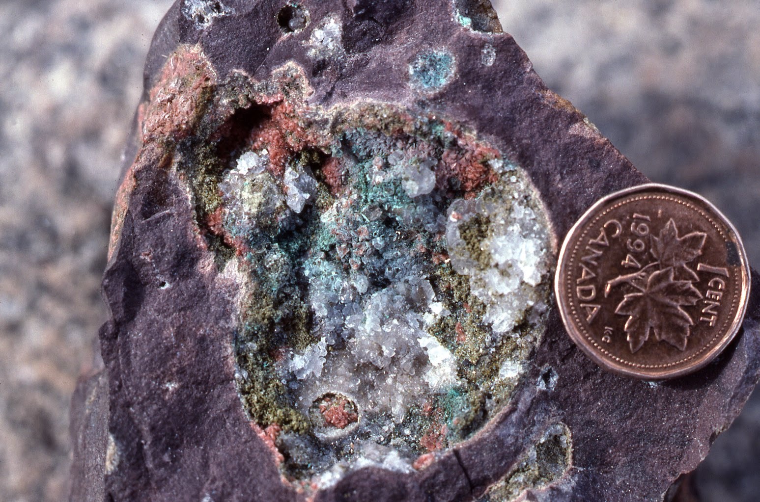
I have a copper nugget somewhere among my personal effects in Canada. I had thought I had a photo of it to post here, but no such luck--just a copper coin.


This is the best I can come up with--a smashed open vesicle from a basalt I found in the Rae-Richardson river system ages ago, filled in with what might be a copper mineral. The penny is copper, too.

My interest today concerns long-term forecasts of metal production. In an earlier posting, I discussed estimates of the total amount of gold remaining to be mined (on Earth). My comments today concern Hubbert linearization in the application to forecasting the amounts of oil, gold, copper, and other minerals that have yet to be found.

The linearization approach can be viewed as a technical approach whereby in the graph of annual production/cumulative production vs cumulative production, the extension of the linear line towards the cumulative production axis gives the maximum cumulative production. Alternatively, one can attempt to plot the logistic curve, of P vs Q, and look to fit the total plot to a parabola, where annual production falls to zero when the total amount of the resource has been extracted.


P/Q linearization for US oil production. Data from EIA.

Oil was a classic example--but in the graph above we see a little wrinkle in the plot. The current fracking phenomenon in oil shales has caused the US to re-enter the climbing production phase (for as long as it lasts). If this climbing phase is no more than a small blip, then it will only result in a small change in the final estimate of total oil production (somewhat shy of 250 billion barrels). If it continues, however, then we can make no estimate of final production.

Copper, for instance, is still in the climbing production phase, so it turns out to be impossible to use this method to estimate the total amount to be mined. The problem is that the current slope of the graph is positive, so the line will not extrapolate to the cumulative production axis.

Scanning around the interwebpipes for estimates of the total amount of gold expected to be mined here on Earth leads to estimates ranging from about 250,000 t to around 390,000 t (much larger amounts considered possible mainly by lunatics).

But perhaps I am among them. The method by which these estimates turns out to be highly sensitive to estimates of historical production (generally prior to 1850, for which records are incomplete) but is also highly influenced by the recent historical production. In particular, where relative production is declining, we can use Hubbert linearization to predict a final cumulative resource.

But for this method to give a reasonable estimate, the history of production has to be relatively smooth. And this is something we do not see. Mining tends to occur in cycles--gold for instance.


For gold, some of these cycles are tied to discoveries--South Africa, for instance, or California, and the Yukon, are all visible on the chart. Large cycles may also be driven by finance, especially the current cycle, which is the result of the rise in price through the late 1970s into 1980.

Permitting of mines is taking a long time, and it would not be unreasonable to assume that another peak in production may occur in response to the rise in gold prices since 2000. Any resulting increase in production will have a sharp impact on the estimate of the total amount of gold to be mined in future.

Another potential cause of production increase is technological change. Such change can lower the price of extracting resources, making otherwise uneconomic deposits economic. More importantly, technological change can reduce the energy cost, which may greatly increase the resources that may be extracted.

As an example, the relatively recent development of heap leaching has made a host of near-surface, low-grade deposits mineable. What would a miner in 1885 think if you told him we would one day mine gold deposits with grades of 0.01 oz/ton?

Saturday, November 8, 2014

The Old Ways (in Zhengzhou)

Zhengzhou has an old city wall--not as impressive as the one at Xi'an. Compressed earth and loess.


The wall surrounds ruins dating from the Shang Dynasty, which all appear to have been removed to make way for a park and apartment complex.


And they still have cock fights.


Why gamble on stocks when you can gamble on roosters?

Thursday, November 6, 2014

S&P 500 and oil follow-up

This could be another Hallowe'en special.


The monthly chart shows a noticeable break, caused by the breakdown in oil price. How far it will fall is anyone's guess. Probably it will take the S&P 500 down with it at some point--maybe through losses in all those oil companies that are heavily dependent on fracking and a high oil price.

Once we reach bottom though, we ought to have a pretty nice bull run in both oil and the broader market.

I can hear your objections. Someone will point out that those waves of "growth" over the past ten+ years are just the result of Fed inflation. Furthermore, that someone will say that the Fed has shot all of its bolts and they will never be able to engineer inflation again. These statements will be amplified with opinions about Fed incompetence. It's a story I've heard a lot over the last ten (and more) years. I've even voiced similar opinions myself. I've come to realize that they are competent--the reason they seem incompetent is because what they are really doing is different from what they say they are doing.