Interweaving threads from science, politics, economics, and history.
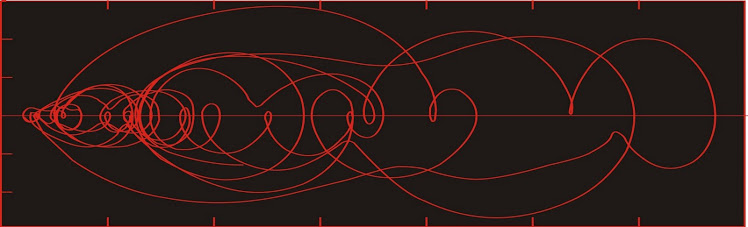
Dust flux, Vostok ice core
Two dimensional phase space reconstruction of dust flux from the Vostok core over the period 186-4 ka using the time derivative method. Dust flux on the x-axis, rate of change is on the y-axis. From Gipp (2001).
There is considerable excitement over the damaged nuclear reactors in Japan after the earthquake and tsunami.
The explosion at the Fukushima nuclear power plant looks bad at the surface. What's behind it?
As soon as the earthquake occurred, the power plants shut down automatically. The control rods enter the core to stop the nuclear reaction. There is a great deal of residual heat, which is handled by the plant's normal cooling system. But the earthquake damage was severe enough to knock out power to the plants, so the cooling system had to be run off backup diesel generators.
The backups have failed because diesel generators don't run well underwater.
So the Japanese have to run around on their destroyed infrastructure and bring power to these plants.
Notably, the power plants were designed to withstand a magnitude 8.2 earthquake, so they have done well to be still there after the 8.9.
However, the sequence of events since Friday does not appear to have been anticipated by the engineers.
Friday's earthquake off the coast of Japan reminds us of the power of water.
But first, a little animation of a model of the tsunami.
Here is a model of amplitude of wave height as posted by NOAA.
This model is constructed first from knowledge of the motion of the earthquake, which can be seen here.
The beachballs in the figure above give you a sense of the motion of the earthquake. To interpret them, imagine a beachball divided into four longitudinal quadrants. One pair of opposing quadrants is black, the other pair is white. The black refers to the portion of the globe where the first motion of the ground after the earthquake is compressive (i.e., the ground is pushed away from the focal point). The white areas represent the areas on the globe where the first motion is extensional (i.e., the ground is pulled toward the focal point).
In order to divide the beachball into four quadrants, you have two intersecting planes. In the diagram above, we can see that of the two planes, one must be approximately vertical, and the other is nearly horizontal. One of these planes is the fault plane--the plane along which the earth has broken. In the diagram above, we are not given enough information to tell which one it is, but additional information on the USGS website allows us to tell it was the nearly horizontal plane.
The other plane is perpendicular to the direction of motion along the fault plane. Knowing that the nearly horizontal plane is the fault plane, we can tell that the direction of motion is perpendicular to the nearly vertical plane, which is oriented approximately NNE-SSW. The direction of motion is therefore either north of west, or south of east. Since the compressive motion is on the west side, we know the motion was towards the west.
Notice the thin arc of white around the Harv and CPPT solutions. The ground in the black has moved upward/outward from the focal point, and the white areas have moved toward the focal point. Hence Japan, to the west of the fault has moved towards it, but much of the seafloor between Japan and the focus has moved upwards, spawning the tsunami.
The tsunami starts off from the earthquake epicentre and flows outwards. In order to model what happens next, you need a model of the topography of the ocean basin.
The velocity of the tsunami is a function of water depth--the deeper the water the faster it goes. When the wave hits shallower water it slows down, and piles up as the faster moving water behind it catches up to it All of those little and islands and seamounts will diffract some of the energy (in doing so they act like new, but smaller sources of radial waves). Either the islands or the topography may act to focus the energy of the wave along some portions of the wave front, explaining how central California was hit by higher waves than areas either north or south of it.
The key to the energy transmission on a global scale is the geometry of the source. If you throw a pebble into a pond, the ripples you get have the form of a series of expanding circles.
Consider the portion of the ripple outlined in red (between the two yellow lines). Let us say that the quantity of energy represented in that portion of the ripple is a. As the ripple expands, the amount of energy in the ripple remains the same (it actually declines due to friction and internal factors). However as the length of the red arc increases as the ripple expands, the amount of energy per unit length of the wave declines with distance travelled (in addition to friction and other losses).
An earthquake occurs along a plane. The motion does not occur along the plane everywhere at once, but propogates at a finite speed.
Diagram showing both magnitude of motion along the fault (colours) and the length
of time before motion was initiated at points along the fault (contours). Source here.
Thus instead of a point source for the wave, you have a line source (we are only considering the ocean surface at this point). The effect of a line source makes a tremendous difference in energy propagation.
Note here that as the waves propagate, the lengths of the red arcs stay constant. Thus there is no loss of energy to expansion of the wavefront over parts of the tsunami (not the case at the ends in the diagram above). There are still losses due to friction and internal dissipation.
Here is a screen capture of the NOAA model (from the model above).
Right at the moment of this capture, the wavefront heading towards South America is nearly linear, meaning there is little loss of energy as the wave flows. Where the front is curved, energy is declining dramatically.
The plot shows the unemployment rate (the same data as used here, here, and here) plotted against the rate of annualized growth of weekly non M1 M2 money (data previously used here).
The result is a two dimensional state space. The system state has spent most of the time since early 2000 in the lower part of the graph. The dates of a few of the points have been labelled.
First observation is that there does not appear to be any systematic relationship between the rate of money creation and the unemployment rate. The caution here is that these are official statistics, which may have been altered to make them more palatable.
Secondly, prior to October 2008, the rate of money creation oscillated widely without any observable correlation to unemployment, which varied between about 4 and 6%. After October 2008, the unemployment rate rapidly rose to 10%, and it has been varying between 10 and 11% since.
Ergodic theory suggests that a dynamic system will visit all possible areas in state space given sufficient time. So we need to wait to see what the limits of behaviour of this dynamic system are.
The internet is a wonderful source of data. For instance, we can find estimates for M2 (a form of money supply) here.
I present for your edification or amusement charts of non-M1 M2 data since November 1980.
There are two charts--the upper chart simply shows the growth of non M1 M2 money in the US economy going back to November 1980.
Historical data exists prior to this date, but there was a change in the way the number was calculated--apparently new forms of money were included after November 1980 which were not counted before, making comparison before and after this date problematic.
The lower graph is a chart of the data, but with the exponential trend removed. The exact method I used after tabulating the data was to take the natural logarithm of the reported number, use a linear detrend on the logarithms, and then calculated e^(detrended ln) to obtain the logarithmic detrended data. The resultant graph shows the periods where monetary growth was faster than average over the past 30 years (upward sloping sections) and periods where monetary growth was slower than average over that period (downward sloping sections).
This is not to suggest that the average rate of monetary growth over the past 30 years is the correct one. To my knowledge, there is no "correct" rate of monetary growth (perhaps we could try 0?).
In the larger scheme we see faster than average monetary growth from '81 to '85, average monetary growth from '85 to '91, and slower growth (and even actual shrinkage) from '91 to '95 (the era of the "strong dollar policy"?), more rapid growth to about '03, followed by roughly average growth into the spike of '09, followed by slower than average growth (the data I have used ends in mid-January 2011).
Working from memory, there was a bit of a housing bubble collapse in the early '90s. There was something of a recession after '01 perhaps into '03. It's possible that there are connections between asset values and monetary growth. This will be investigated at a later date.
Now we will consider the impact of monetary growth on unemployment. One common argument of the Keynesians is that increasing the amounts of money in circulation is a requirement of maintaining acceptably low unemployment. Let us test this notion. We use the monthly unemployment figures from the BLS website which we have previously discussed here and here.
Below is a scatter plot showing official unemployment rate plotted against the detrended non-M1 M2 data discussed above. I have only unemployment data going back to January 2000, so here is unemployment vs money from Jan-00 to Feb-08 (before the amazing change in state).
I always supposed that more money was supposed to decrease unemployment. However this chart shows just the opposite. More money = more unemployment. So--who really benefits from money creation?
But the story gets better. Let's add the part where the unemployment data drop into the black hole (up to Dec 2010).
Yow! So now reversing the money growth machine doesn't reverse the rise in unemployment! Talk about a Keynesian nightmare!
This type of behaviour in a natural system would be described as "irreversible". Climate scientists frequently fret about the possiblity of irreversible changes in climate due to human or natural activities. What we observe above may be an actual observation of an irreversible change in a dynamic system brought about by human activity. How exciting! Bernanke et al. are making history! If any of the eight or so of you who read this know him, why not drop him a line to tell him how he's doing?
In the natural world, the behaviour is not completely irreversible, because if the driving force in reversed long enough, eventually the system does return to its previous state. But the system usually displays hysteresis, meaning the way back to the previous state may be long and arduous. I fear the same may be true for the unemployed in America.
I use the term regulatory creep to describe the process by which regulations in an industry are expanded through time to increase the level and scope of control through casual application rather than by formal change. Apparently there is debate over whether this process is inevitable (it is in our current "everyone must be safe" regime). I intend this to describe a process, not the individuals responsible.
Last year I wrote an NI 43-101 qualifying report for some properties held by a client. The report went to the securities commission for approval. The client wished to float another company with the goal of exploring the properties described in the report. The report was reviewed by the commission, and came back with a deficiency--the client had not spent the requisite amount ($100,000) on the property.
This was a surprise, because according to the budget filed with the commission, the client had spent considerably more than $100,000 on the property. However the commission had disallowed a number of expenses without explanation leaving a final amount of approximately $90,000 spent on the properties. Good grief!
This result was so perverse that I had the urge to laugh when I saw it, despite the immediate impact on my livelihood.
The intent of that rule was not to exclude properties that had fallen $200 short of the $100,000 limit. The intent of that rule was to prevent people from digging a couple of holes in their backyards, spending $200 on assays, and then bringing that property to market. It was not meant to exclude properties which have previously been the subject of extensive soil and trench geochemical surveys coupled with significant drilling program which admittedly failed to define a resource--but evidently the properties were good enough that public companies had attempted to define a resource in the past.