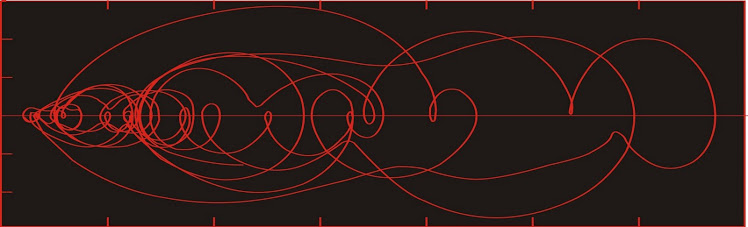
Dust flux, Vostok ice core

Dust flux, Vostok ice core
Two dimensional phase space reconstruction of dust flux from the Vostok core over the period 186-4 ka using the time derivative method. Dust flux on the x-axis, rate of change is on the y-axis. From Gipp (2001).

Monday, June 3, 2013

Gold-silver ratio at its lowest area of stability

I've been working on extending some of my commodity price time series farther back in time and will be reporting on them as I go. Currently I've pushed rice, copper, silver, and gold monthly closes back to 1988 (mainly having trouble finding a consistent record for copper beyond that).

Today we'll look at the gold-silver ratio from January 1988 to the present.


Hopefully this looks bigger if you click on it.

To investigate the dynamics I'll construct a time-derivative phase space portrait. This is a scatterplot of the GSR vs its rate of change (averaged over five months).


Looking at the time-derivative phase space portrait, we can see there have been five areas of stability for the gold-silver ratio in the past 30 years. Those ratios are at approximately 53, 61, 65, 73, and a weak one near 88.

For those who tell me that the proper gold-silver ratio is 15--or maybe 16--my answer is "show me".

It was true historically--but the present system operates on a different dynamic. It seems pretty reasonable to assume that the last 30 years describes the current dynamics of the gold and silver markets. The gold-silver ratio has been nowhere near 16 in that time.

The only way to return to a ratio of 15 or 16 is to return to a time when the gold and silver prices are defined by central financial powers--which is to say, a political solution. Perhaps such a political change is coming. I'm not in a position to say, as Messrs Bernanke and Obama still haven't invited me for a round of golf.

Provided no such political change comes, any decrease in the gold-silver ratio is likely to be a short-lived spike, but long periods with a much higher ratio are possible.

Looking at the above graph, when we are at the far right it is time to buy silver, and when we are at the left it is time to buy gold. Presently we are closer to the left than the right.

Sunday, June 2, 2013

Remarks on some extended records of arctic sea ice

One approach to studying the dynamics of complex systems is to reconstruct phase space portraits of the original time series. The reconstructed phase space reveals the topological structure of attractors (if present) although their geometric shapes are distorted.

Today I present to you reconstructed phase space portraits, using the time-delay method, from some longer Arctic sea ice records, found here and here (pdf). The last record I looked at went back to 1979. The one below begins at 1972.

As in the earlier article, I have used a two-year lag.


There are some interesting differences we note with the slightly longer record. First of all, there appears to be a behavioural change at about 1989, before which the system is confined to the small yellow circle; and after which the system exhibits greater variability with a bias to a somewhat lesser extent. After 2004, as we saw last time, the system has been evolving towards a new state with smaller area covered. At this point we cannot predict where the next area of stability is.

There are those who predict that the Arctic is heading for ice-free conditions in a matter of a few years. Alternatively, we may be observing part of a multi-decade (or longer) oscillation, and that there may be a non-zero stable state somewhere near or below the present-day observed sea-ice extent.

To investigate this possibility, we consider records of Russian sea ice extent compiled by the Arctic and Antarctic Research Institute since the 1930s based on observational methods. As this paper was published a few years ago, the analysis of the hand-drawn charts has only been completed until 2005, although more up-to-date charts can be located on the AARI site. Below I have the reconstructed phase space portrait for autumn sea-ice extent (which I'm guessing compares to the September sea-ice record above) in the Russian Arctic.


There are appear to be two areas of attraction in the above graph--at about 4 million sq km, which characterized sea ice area from about 1950 to the end of the 1970s--and a second at about 4.5 million sq km, which characterized the system from 1980 until 2004. The final year suggests a drop in area of autumnal sea ice, and if the decline since then is anything like our first plot, we would expect the current state to be near the bottom left corner of the graph.

The Russian observations are consistent with other Arctic climate records which suggest a period of cooling until the late 1970s. This idea suggests that there is long-term variability in ice extent, with periods of cooling alternating with periods of warming. However, the current losses in ice extent are greater than any observed back to the 1940s. If we are to argue that the current warming is part of a long-term natural cycle, then it must be on the order of century-scale or longer. 

Monday, May 27, 2013

Denial of authoritarianism--no, end the Fed

Salon has an article on denial of science by mainstream society. The article asks why people deny the unpleasant truths that modern science has to offer--apparently preferring to chance of the impending hell of global warming and non-fluoridated drinking water.

The thing the authors don't understand is that the general public is not pushing back against the science per se. They like the science. Science gives them big, flat-screen TVs, Blu-Ray players, cars, airplanes, special effects, laptops with more computing power than ENIAC, the internet, and so forth. They love science.

They don't like authoritarians telling them what to do. So bugger off.

-  -  -  -  -  -  -  -  -  -  -  -  -  -  -  -  -  -  -  -  -  -

Okay, I'm a little calmer now. There is another point in this entire discussion I would like to mention.

Past environmental issues have been dealt in a top-down, authoritarian fashion. Acid rain and ozone depletion were both attacked, with considerable success, by legislating against the sources. But this only worked because the main sources were few in number, easily tracked, and there were solutions available for the problem. CFCs were replaced by other coolants with less effect on the ozone layer, but this solution was only possible because the alternate coolants existed.

In earlier articles we have discussed the issue of multistability in the climate system. During periods of relative stability, negative feedbacks dominate, with the effect that the system appears to resist changes. The capacity for resistance to change is not infinite, and eventually a tipping point is reached, beyond which positive feedbacks dominate, leading to very rapid change. This idea would suggest that the climate system will resist changes to atmospheric composition for a time, which may be why there hasn't been the warming that was predicted by the IPCC models (pdf).

Governments would like people to stop emitting so much CO2 (through driving, power requirements, and industrial use). Well, alright then. 1) What replacement is there that won't significantly impact on lifestyle; and 2) has the government considered its role in the CO2 problem?

In an earlier article I discussed how the increasing number of disasters in the US is more a function of urban sprawl than any increase in frequency of natural events.

A big part of the reason that per capita CO2 emissions are higher in North America than in Europe is our urban structure--in particular the vast suburbs that surround most city centres. The big suburbs mean lots of people commuting, but the density of the sprawl is too low to favour high-capacity transit.

Big suburbs are only possible due to easy money. With no easy money, working families would not aspire to owning (alongside their bank) a huge home with a vast lawn and with neighbours within 5 m. Without easy money there wouldn't be two or three cars in the driveway.

Governments like this model of city development--it gives people hope, which helps keep the system going. Banks certainly like it--there's a lot of interest payments stretched out over 30 years, and until recently, people would practically starve rather than miss mortgage payments. People imagine they are happy, although I wonder what the future generations will think of people who willingly bought homes that took 30 years to pay for, instead of the more historically common few weeks to months. But I don't think the owners of these houses have done as well on the deal as the government or the banks.

So having created the template for massive CO2 emissions, the authoritarians wish to deny responsibility and shift the blame to their debt-serfs. Because the debt-serfs are refusing to absorb the costs, the authoritarians decry their denial of science.

If you really care about global warming, end the Fed.

Wednesday, May 15, 2013

A cycle in commodity prices

I've pulled together a few longer time series for commodity prices, now going back to 1984. As done before I've plotted two ratios against each other--in this case I've used the gold-oil ratio (gold in $/oz, oil in $/barrel) and the silver-barley ratio (silver in $/oz, barley in $/tonne). I haven't found a consistent rough rice price series going back that far.


The first thing to notice is that the data are all pretty much confined to an ellipse, the main exception being the recent large excursion in silver two years ago. The second thing to notice is that the observations do not all occur throughout the ellipse, but seem to be confined to its edge. Almost as if the system were tracing out a large cycle (or series of cycles).

The direction and rate of change of the cycles can be seen by plotting the dates of observations on the scatterplot.


Starting at the lower right in 1984, the observations follow the outer edge of the above ellipse in a counter-clockwise direction, completing the upper half in about five years. The trajectory is not smooth, but very noisy, with some backtracking.


The trajectory is much noisier after 1990. The trajectory is confined into four areas in sequence outlined by ellipses in the above figure. The overall rate of evolution along the elliptical trajectory has slowed dramatically, as it has taken nearly 25 years to complete the lower half of the big orbit.

Interestingly, the direction of the orbit is the opposite to what I had supposed it would be when I first graphed the scatterplot. I had assumed we would see higher silver (industrial activity) followed by higher oil price, leading to higher food prices, which I thought would scare people into gold. But what we observe since 1984 is the opposite--higher silver prices leads to higher gold prices leading to higher food prices (anticipating inflation?) followed by higher oil.

The peak in the Au/oil ratio in 1988 is a reflection of low oil price rather than high gold. Perhaps the high silver/barley ratio is a reflection of low food prices, which allows more savings in India and China which translate into gold demand, raising the price of gold first, and food prices secondly due to increased demand.

I'm not sure what to make of the increased noise since 1990. It may have to do with the increasing amounts of easy money in the system encouraging more participants in the commodities markets. Maybe it was just that I was broke in 1990 and hung around with more broke people--but I don't recall anyone ever talking about investing in commodities back then. Not like today. I wouldn't ascribe it to central bank interference--if you were a CB, where is the sweet spot in the above plot?

Saturday, May 11, 2013

Precious metals price excursion not finished yet

Although it may be getting close.


This is the commodities plot we have been tracking for a couple of years--gold/copper ratio on one axis and silver/rice ratio on the other.

The breakout from the area that confined the graph for fourteen years that happened in March 2010 is still active, even after last month's whacking of PM prices. Now we are near the decision point. Does it fail, and fall back into the ellipse? Or does it continue tracing out a new ellipse to the right of the old one.

Even if it fails, it has been the most impressive excursion in the last 17 years.