Dust flux, Vostok ice core

Dust flux, Vostok ice core
Two dimensional phase space reconstruction of dust flux from the Vostok core over the period 186-4 ka using the time derivative method. Dust flux on the x-axis, rate of change is on the y-axis. From Gipp (2001).
Showing posts with label Case-Shiller index. Show all posts

Friday, August 28, 2015

Recent behaviour of the Case Shiller index (or where are we now?)

One example of multistability I have used in the past few years is the reconstructed state space portrait of the Case Shiller index.

I have been studying state space of complex systems in the hope to better understand them. My original interest was in natural systems-I have gotten dragged into economic data sets because they are generally better.

Data for the Case Shiller index is found here (click the link labelled "US Home Prices 1890 to present"). The first two plots have been posted before, showing the index plotted against itself with a four-year lag.


The first plot shows the annual index to 2012, along with predictions of where in state space the system would plot in 2015, for declining house prices, constant house prices, or rising house prices (in inflation-adjusted terms). The major features are two very long-term islands of stability, at about the 70 level (from 1915 to 1945) and around the 110 level (until 1999); and the large crashing loop that has been traced out since 1999.


This plot shows the same information, but monthly from 1954. The area of stability occupied until 1999 is circled in yellow, and the large "cycle" is also visible, showing that the system was following the trajectory of rising house prices in 2014.


The last plot represents the most recently available data, projected monthly, but it shows the same thing--the long-term area of stability at lower left, and the big loop, now nearly closed. The last available point is reasonably close to the projected state for 2015 (which itself would be averaged over the year).

Is this a potential area of stability? Sadly, no. In this type of plot, long-term stability will have to occur along the y = x line shown on the second graph in this posting. Presently, we are far below or to the right of this line.

If house prices had been frozen at the levels of the end of 2011, we could have developed a region of stability. But the stable state would have been within the large area of stability that existed prior to 1999. Who the hell wants that (apart from young people hoping to buy a house)? So we are embarking on yet another price increase, once again into a market with no ability to support the higher prices. The long term prognosis is for another rise and collapse. Time will tell how big it gets.

Wednesday, January 28, 2015

House prices seek stability of long-term relationship

. . . somewhere in phase space.

I have often used the the index of home prices in the United States (the Case Shiller index) as an example of a complex system showing multistability. The data are updated monthly here.

The multistable nature of such systems is demonstrated in reconstructed phase space portraits, which can be generated by two principal methods--the time-delay approach and the time-derivative approach.


For nearly 40 years, the system remained confined to the area of the yellow circle. In fact, house prices were confined to this small area for much longer than that--for the longer term chart I've presented previously shows that this yellow area has been occupied for a total of about 70 years.

It looks like there was some kind of redefinition or recalculation of the time series on the Shiller website sometime in the last year or so, as the current time series available on the site (from which the above chart is drawn) differs from the previous time series available (from which my older graphs are drawn). For instance, in my older figure, the house price appears to have been above 100 over the last 60 years--this does not appear to be the case in the graphs I have produced in previous years.

The overall story has not changed--after 50 years of relative stability (the bubble of 1989-90 looks benign in the above figure), the system broke out of its area of Lyapunov stability, and has been meandering through phase space ever since. Two years ago, it seemed to be on a trajectory to return to the yellow area of stability. In the last two years the system trajectory veered away from that target, and is now headed . . . where?

Normally we expect it to migrate to an area which has previously acted as an area of stability--but both such areas are at much lower prices than is currently the case.

It is possible for the system to carve out a new area of stability. For reasons of geometry, stable areas must be located on the y = x line. Since we are close to that line now, it implies that perhaps Yellen can engineer a soft landing for housing at close to the current price range. Unfortunately, the future level of the trajectory in state space is partially determined by the past trajectory--and in 2013, the housing index was in the low 130s (on the horizontal axis). In two years, therefore, the trajectory will dip to the same level on the vertical axis. If house prices remain where they are now, the trajectory will be far enough from the y = x line to be unstable, and a further decline in house prices would be indicated.

If house prices rise again, we will find ourselves in a bubble destined for collapse, just as we were in about 2004. If the yellin' wants to bring housing to stability, the thing to do would be to engineer a slight decline in house prices over the next two years. Unfortunately, I don't think she wants to do that.

Monday, April 21, 2014

Housing bubble reflation

Time for our annual look at the Case-Shiller index (data here - link to the excel file on housing data is about 2/3 of the way down the page). I have calculated the yearly index values from the average of the four quarterly index values where present, and used only the annual index values from the beginning of the data set.

Below we see the phase space portrait (four year lag) since 1894 (annual).


The housing bubble is being reinflated. The projected future trajectory of the system has been deflected away from the big area of stability (1896-1915 and 1948-1999) back towards the bubble that followed Y2K.

Sadly, it is likely to be wasted, as there is no area of stability to occupy. The most likely scenario is another bubble like the last one; one that makes people rich and excited for a brief time.

Maybe they are hoping to create an area of stability if they can force the market to a desired level and hold it there. It might work. But maintaining a false equilibrium in a self-organizing system is like maintaining the balance of a bathtub on top of a broomstick by pouring increasing volumes of water into the tub. From a distance.

Here is the quarterly chart.


It's Yellen's move. Just a couple of quick pointers--for reasons of geometry, any area of stability has to lie along the y=x line; and a move down to the 112 level on the y-axis is baked in the cake for first quarter of 2016. Whether the curve will approach the plotted point for the first quarter of 2003 or some other point will be up to you.

Saturday, March 8, 2014

The changing dynamics of generational wealth transfer in the bubble economy

About fifteen years ago I started travelling around various local church sales, buying silver--mostly jewellry, but also spoons, candlesticks, cutlery, whatever could be found. At the time, the stuff was dirt cheap, and there was no competition. That all changed in the following years, and it has been a few years since I last went looking for the stuff.

An acquaintance of mine pointed out that that was the traditional way to accumulate wealth--the young take advantage of the old, buying the things they no longer wanted. It sounds distasteful, but there is a kind of logic to it.

The classic, of course, was property. The archetypical scenario, with the young fellow cajoling the elderly pensioner to sell his house. "Come on, grandpa. You don't really want to keep going to the trouble of maintaining this place, do you? I'll give you a good price for it."

In older times, I don't think we thought of our homes as having value--other than the value of a place to live. With this mindset, the value of a house changes constantly throughout your life--having greater value when you are young, as its value becomes the net present value of all your future years living in it minus the costs of maintaining it. As you age, that value declines. So if the owner is elderly, we have a situation where the value of the house is much higher to the (presumably young) interested buyer than it does to the seller.

That discrepancy in value creates the opportunity for a really good deal for both sides. The pensioner can receive a sum of money much greater than the house is worth to him, while the buyer pays less than his perception of the house's value.

Since the fall in interest rates that began in 1980, house prices rose so much, creating a "wealth effect" that enriched the majority of homeowners, and changed their perception of the value of a house. Now the value of a house is "objectively" determined by other sales in the area--and not by an individual's life circumstances. It's no longer a purely personal decision either--a homeowner's choice to sell at a lower price will affect the prices of other houses in the neighbourhood, and would be looked upon as a betrayal by the seller's former neighbours.

The new perception of a house as objectively definable wealth now seems to be ubiquitous, but is a recent state of the human condition. The old dynamic, a form of inter-generational wealth transfer, has disappeared in the depersonalization of financial affairs.

Friday, September 20, 2013

What's in a bubble?

Bubbles are on a lot of minds lately. Bonds. Housing. Stocks. Are any of these in a bubble? How do we decide? A bubble is usually defined as a situation in which the value of an asset exceeds its true worth. What does that mean? How are we to know that the true worth of something differs from its price? It sounds like something St. Thomas Aquinas would think up.


Here is a reconstructed phase space of what is generally agreed to be a popping bubble--the Case-Shiller index. It's not always clear when the popping takes place. Is it the moment it falls from a high to which it never returns (or at least not for a considerable time)? That's first quarter, 2006 in the above figure. Is it when it becomes clear that no area of stability is going to form in the upper registers of phase space? That would be about the second quarter of 2008 in the above figure. Or is it only when the system returns to the area of stability that characterized it? That hasn't happened yet, but it looks imminent.

For today's discussion, consider the S&P 500 and the price of gold.


"Oy'm winning," sez S&P. Data here and here.

Starting from a remarkably similar starting point, they have reached pretty similar levels. But although the S&P 500 may be slightly ahead over our 20+ year chart, it hasn't always been so. In fact it is painfully obvious in hindsight that switching from stocks to gold in early 2000 would have been especially sweet.

One approach I have been working on is based on the notion of stability. It looks good for the Case-Shiller index at top, but that index has been adjusted for inflation--the gold price and the S&P 500 are not. We may be able to assess stability by reconstructing state spaces from the original time series.


Apart from the run-up in price over the past 20 years, the main feature on this graph is that the plot does not stray far from the green dashed line, which is the only part of the graph where areas of stability can appear. Apart from the cluster at about $300, there aren't any areas of stability. I'm not alarmed by this, and don't expect the $300 area to come into play again. This is a reminder of the importance of adjusting for inflation.


Even though this graph is also not corrected for inflation, it does not behave as the gold chart does, but cycles twice around the yellow dashed circle. In terms of a deviation from the regions of stability, it did get about as stretched as did the housing market, both in January 1998 and November 1999. It's current position is not stable but it is not nearly as extreme as it has been in the past.

Some have suggested that gold price is a proxy for inflation. So let's look at the S&P 500 with respect to gold. The comparison will be as follows: the difference between the S&P and the gold price, divided by the gold price.


Here we see a tremendous peak in early 2000. The current level of the index, however, does not seem out of line with respect to gold. If the S&P 500 is in a bubble, then so is gold.

Both the stock market and the dollar price of gold are influenced by monetary creation. As long as money continues to be created, we should expect both to increase in price. There have been times in the past when the money blew up the stock market much more rapidly than gold, and if that were to happen again, there may be an arbitrage opportunity. Such does not appear to be the case today. I find it hard to imagine that we will see the extremes of early 2000 again.

In a time of monetary or credit creation, there are opportunities to preserve wealth through investments in productive enterprises as well as gold. Unfortunately, it is difficult to distinguish between enterprises that are truly productive and those which merely look productive as long as the credits keep flowing.

Tuesday, July 23, 2013

Identifying stability in complex systems

No, this is not about Egypt.

I use the term "stability" a lot, as in area of stability. Sometimes I describe the stability of systems projected into phase space as "Lyapunov-" in nature. It may have been awhile since I discussed the criteria for determining whether we observe stability in a system--the Case-Shiller index, for instance.


I've just noticed that I didn't label the axes on the lower figure--but they are the same as in the upper figure.

Why are the yellow blobs, and the large cluster of points at the lower left of the second figure, areas of stability, whereas the small cluster near the top of the lower figure is not?

One clue is whether we see many points that occur close together in time also close in phase space. A lot of points clustered in one area means that whatever measurement we are looking at is not changing much over a long period of time--just what we mean by stability, no?

Areas of stability can only occur in certain places on a time-delay phase space reconstruction.


Same figure as above, but with the "y = x" line plotted. Points along this line would represent points where the value of the Case-Shiller index is the same as it was four years earlier. Areas of stability will straddle the line. The system cannot remain in one spot for long if it is off this line. That doesn't mean that the system has to report to the line. It can meander away from the line for long periods of time (twelve years already)--but while it is doing so, it is not stable.

What about the point where the state crosses the y = x line at the first quarter of 2008?


The first quarter of 2008 would be about where the arrow was. The index was at the same level in early 2004--but we would not say that that was a point of stability because of what the index did during that interval.

Time-derivative phase space reconstructions are topologically equivalent--but perhaps more intuitive, as in this case the system dynamics are reconstructed by plotting a measurement against its rate of change.


In this different projection--time-derivative state space portraits (of the gold-silver ratio)--in which I have plotted the GSR vs its first time derivative, all points of stability must lie along the dr/dt = 0 line. But why doesn't every point on this line represent stability (for example, the point where the curve crosses 0 when GSR = 96)?

You may recall from calculus that apart from critical points of inflection, rates of change also reach zero at local maximum and minimum points. So once again, the fact that a point plots on an area that may represent stability does not mean the system is stable at that point. You need to see a lot of other points, which are close neighbours in time, in the same area.

Tuesday, June 25, 2013

The evolution of the Case-Shiller index . . .

. . . viewed in real time is like watching paint dry, but without the possible dramatics of runs. Hence, the long break since the last time I looked at this.

In case you are unfamiliar with it, the Case-Shiller index is an inflation-adjusted index for house prices in the United States (data available here; methodology here - pdf). As the recent data is presented quarterly, the annual values in the graph below I have calculated as the average of the four quarterly values for a calendar year.

The analysis is the same as last time, where I outlined three possible scenarios we could see to 2015.


So far we are headed right down the middle towards the main area of stability, where inflation-adjusted house prices remained for about 50 years after WWII. You can throw an apple really high, but it's hard to keep it from falling afterwards.

Clearly, if people are to get wealthy from real estate, Bernanke needs to keep blowing (or is it sucking?)

Below is the same index, but quarterly.


The long and winding road has leads us back to our door.

We'll stop in and look at this later (next year)--after all we don't want to be like the crowd watching Thomas Hardy write in that famous Monty Python skit which would have been embedded right here except all that came up is a notice saying that "this video cannot be viewed on certain [chart-porn] sites".

Tuesday, June 18, 2013

Multistability in the gold-copper ratio

The gold copper ratio is commonly used to illustrate the state of the economy. Note that we usually take the ratio of the gold price per troy ounce and the copper price per pound. A recent graph of this ratio can be found here.

In past articles I have looked at how to study dynamic systems using reconstructed phase space portraits.


Here we see the reconstructed phase space of the gold-copper ratio over the past eight years, using a time-derivative method--plotting the value of the ratio against the average rate of change over six months. My convention is to plot the rate of change against the midpoint of the time window--for example, the last such calculation measures the change in the ratio from November 2012 to May 2013, and is plotted against the month-end price of February. This is why the graph ends at February even though we have month-end pricing to May.

There are three areas of stability in the above graph. In 2006 and 2007, the copper price rose dramatically, and the Au-Cu ratio fell, until there was a sudden pop in the economy in mid-2008, which is recorded in the figure above as a tremendous gyration lasting a year. The Au-Cu ratio settled for several months near the 350 level, before leaping to the 450 area, where it has remained for the past 18 months.

It could be that the economy as a whole was overheating in the middle of the last decade, what with all the demand for copper from China and the US housing boom. Then I suppose we returned to sanity.

Except the current economy doesn't feel sane to me.

The highs for copper in 2006 are not out of the ordinary. By inspection we can find numerous periods where the ratio was 200 or lower. In the late 1920s, Au/Cu fell to about 140, but when the depression hit, the ratio rose to over 400. In the wake of the post-war rebuilding, Au/Cu fell well below 100 and was still at that level when Nixon closed the gold window, although the pegging of the gold price and the military actions of the US both supported this low ratio.

More recently, we have the following . . .


. . . in which our hot, inflationary late '70s economy suddenly slowed. It helped that in the '80s the US wasn't involved in any wars of consequence (just little actions in Iran, the Sinai, El Salvador, Libya, Lebanon, Egypt,  Grenada, Honduras, Chad, the Persian Gulf, Italy, Libya again, Bolivia, the Persian Gulf again, Honduras again, Panama, Colombia, Bolivia, Peru, the Philippines, and Panama again).

Just after where I have ended the graph, the system returned to the area of stability at around 300, during the housing bubble at the end of the '80s. For a look at how terrifyingly huge it was, see below. ;)


So to my non-economically trained mind, the Au-Cu ratio only seems to fall below about 300 during credit-fuelled booms (and maybe during major postwar rebuilding phases). Presumably when it is higher than some level, we could say it indicates we are in a depression--but I haven't figured out what that level is yet. Early in the Depression, the ratio was at 400--but that was in the days of the gold peg at $20.

My gut feeling is that the present ratio is not far from depression levels.

Sunday, October 7, 2012

Wile E. Bernanke, Super Genius

Wile E. Bernanke has a tough job, fighting falling asset prices.


He looks like he should be opening an umbrella, just before the anvil lands on his head.


Wednesday, June 13, 2012

Origins of multistability in economic systems: commentary on Soros (2012)

All over the world, the same message is relentlessly hammered home--conventional economics has failed. Policy makers did not foresee the 2008 crisis--and their attempts at remediation of the unemployment situation have had effects opposite to what was intended.

Why is this? Does economics in the real world differ so much from the theoretical? And if so, why?

Let us consider how complex behaviour arises in some natural systems.

Multistability in natural systems

The global climate system is a nonlinear, nonequilibrium system involving internal time-varying mechanisms, feedbacks, and external forcing. Systems with feedbacks are commonly multistable, prone to bifurcations, and hysteresis—even when those systems are driven by invariant driving functions.

In previous posts we have seen that the phase space projections of numerous climate functions show multistability--that is they tend to evolve not to a single equilibrium, but oscillate among any number of equilibria. The reason that multiple equilibria arise is because the dynamics of the climate system include both negative and positive feedbacks.


Different forms of stability. For asymptotic stability, given a limited range of  initial 
conditions, the system evolves towards a fixed point. For Lyapunov stability, once the system
reaches a limited region of phase space (b), the system tends to remain there. 


Where negative feedbacks dominate, the system tends to be stable. In the diagram above, there are different forms of stability, but the two most important are asymptotic stability (also called a point attractor) and Lyapunov stability. It will normally not be possible to distinguish between these on the basis of observation of some system.

Positive feedbacks tend to enhance the effects of external forcing, multiplying the magnitude of the stresses brought on by forcing. The presence of both negative and positive feedbacks supports a system with multiple disjoint regions of equilibria, bounded by separatrices. 


Time evolution of a system with multiple equilibria. In actuality, the separatrices 
are likely to show fractal interfingering.

I have commented on applications of this idea to unemployment, but have not discussed the origins of the necessary feedbacks required to generate multistability. Some comments by George Soros (below) seem to shed some light on this topic.

Soros' remarks on global economy

George Soros recently spoke at the Festival of Economics in Trento, Italy. What made his remarks interesting to me were his allusions to nonlinear dynamics in the evolution of the economic system, and their effects on policy. Soros begins by remarking on the lack of success policy makers have had in predicting economic outcomes in the past few years. The reasons for these failures . . .
go back to the foundations of economic theory. Economics tried to model itself on Newtonian physics. It sought to establish universally and timelessly valid laws governing reality. But economics is a social science and there is a fundamental difference between the natural and social sciences. Social phenomena have thinking participants who base their decisions on imperfect knowledge.
Anyone reading about Austrian Economics will be familiar with the argument. Market participants will try to act in a way that maximizes benefits to themselves, but what constitutes maximum benefit may vary from one to another. A highly technical treatment of this topic can be found here (probably not of interest to most of you, except for the part about aggressive participants with a strategy of investing in risky assets increasing the likelihood of a market crash for everyone).

The market participants do not perceive the true nature of the system in which they are operating, and so many will choose suboptimal strategies. However, as they act, they also change the nature of the system, so that what would have been an optimal strategy had all participants been "rational" may become suboptimal in the real world. Likewise, strategies which would be suboptimal in a purely rational world may become optimal.
I found a two-way connection between the participants’ thinking and the situations in which they participate. On the one hand people seek to understand the situation; that is the cognitive function. On the other, they seek to make an impact on the situation; I call that the causative or manipulative function. The two functions connect the thinking agents and the situations in which they participate in opposite directions. In the cognitive function the situation is supposed to determine the participants’ views; in the causative function the participants’ views are supposed to determine the outcome. When both functions are at work at the same time they interfere with each other. The two functions form a circular relationship or feedback loop. 
For instance, under normal circumstances it would not be advantageous to rush to the bank and withdraw all of your money. However, the economic system could be altered to the point where that might turn out to be the optimal strategy after all. 

Soros goes on to describe the inflation and bursting of a bubble in terms of the interaction between positive and negative feedbacks.
I developed a model of a boom-bust process or bubble which is endogenous to financial markets, not the result of external shocks. According to my theory, financial bubbles are not a purely psychological phenomenon. They have two components: a trend that prevails in reality and a misinterpretation of that trend. A bubble can develop when the feedback is initially positive in the sense that both the trend and its biased interpretation are mutually reinforced. Eventually the gap between the trend and its biased interpretation grows so wide that it becomes unsustainable. After a twilight period both the bias and the trend are reversed and reinforce each other in the opposite direction. Bubbles are usually asymmetric in shape: booms develop slowly but the bust tends to be sudden and devastating . . .
At any moment of time there are myriads of feedback loops at work, some of which are positive, others negative. They interact with each other, producing the irregular price patterns that prevail most of the time; but on the rare occasions that bubbles develop to their full potential they tend to overshadow all other influences.
What does the phase space of a system with myriads of feedback loops look like?


The recognition of multiple equilibria in economic systems does not go far enough, in Soros's view, because the collapse of bubbles can trigger policy responses which greatly alter the workings of the system. In other words, politics can become a potent driving force, with both secular components (such as the progressive concentration of wealth and power into fewer hands over the last forty years) and singular spectacular events (such as declaration of wage and price controls, short-duration spikes in interest rates; or even irreversible decisions like detaching the dollar from gold).

The addition of the political drivers adds a dimension which has no analog in nature. It also forces us to recognize that the future evolution of the economy will be not only a function of the feedbacks and forces we consider above, but also the entire history of the economy as well. For instance, Soros argues that the present European crisis is as much a function of history as of excessive government debt . . . 
because the financial problems were reinforced by a process of political disintegration. While the European Union was being created, the leadership was in the forefront of further integration; but after the outbreak of the financial crisis the authorities became wedded to preserving the status quo. This has forced all those who consider the status quo unsustainable or intolerable into an anti-European posture. That is the political dynamic that makes the disintegration of the European Union just as self-reinforcing as its creation has been. 
Unfortunately the non-linearities in the system make prediction hazardous. But given the preliminary indicators of bank runs in Europe, South America, and Africa, as well as Oanda's recent announcement . . . errm, yes, excuse me, but I have some preparations to see to.

Friday, April 6, 2012

The fall begins--an updated phase space reconstruction of Case-Shiller index

It has been some time since we last looked at US housing.

The bubble continues to deflate. With the last two quarters of data for 2011 now posted (look for the link to the excel data in the third paragraph from the bottom) we have an additional point on our two-d reconstructed phase space portrait of the Case-Shiller index.


For this graph I have taken the average of the four quarterly values of the Case-Shiller index as the value for the year. Quarterly data have been available since 1953. The method of constructing the plot from the data series have been previously described here and here.

Last time I inferred that the housing price system would return to one of the two highlighted areas of Lyapunov stability at the lower left of the graph. In 2011 the system began to move in that direction. Further motion in that direction is virtually guaranteed as the index value for 2011 was about 118, which means that the curve will "fall" to that level (on the vertical axis) in 2015.


Recall that the plot is constructed by plotting the "current" value of the index against the lagged value--in this case, the value of four years previous. Hence the coordinates of the state for 2011 are the present index value (on the x-axis) against the index value in 2007 (on the y-axis). In 2015, the state will plot at coordinates given by the value of the index in 2015 on the x-axis (we don't know what that value will be) against the index value in 2011 on the y-axis (which is 118.1). While we don't know exactly where the point will plot, it will be somewhere on the yellow horizontal line added to the above figure.

Where on the yellow line depends on whether house prices rise, fall, or stay relatively constant between now and 2015. For your amusement I have three scenarios plotted on the above figure (please note that the Case-Shiller index is adjusted for inflation, so a rising price has to occur in real, not just nominal, terms).

Balance the three scenarios against their relative probability. The likelihood of rising house prices seems unlikely given the expected increase in foreclosures about to strike the US housing market.

Wednesday, November 2, 2011

Inference of dynamics for complex systems: Examples, part 1

This article continues from the theoretical discussions here, here, and here.

Today we begin looking at some reconstructed phase space portraits (in two dimensions). These are all figures that have been shown here.

All three of today's examples show multistable behaviour. As discussed last time, the implication of multistability is that there are two (or more) equilibrium states in the system, as opposed to just one (the most common assumption).

Stability arises from negative feedback. The instability results from positive feedback. Complex adaptive systems with many participants commonly exhibit both and are thus prone to multistability.


The Case-Shiller index is an inflation-adjusted measure of house prices (for houses of constant quality) in the United States. The reconstructed phase space (above) shows two areas of Lyapunov stability.

The tick marks on the trajectory mark the states at one-year intervals. As the lag is four years, the first point on the graph is the plot of the 1890 value against the 1894 value. The point is labelled as representing the state in 1894--consequently the 1894 state is the first one that can be plotted despite available observations going back to 1890.

The larger of the two areas of stability is occupied over two long stretches totalling nearly 70 years. The smaller of the two areas is occupied for 30 years. Thus of the 116 states (at one-year intervals), 100 of them occur in one of these two areas of stability. There are two short transitions, in about 1915, where inflation-adjusted housing prices suddenly fell, and again at about 1945, when they rose.

The principal era of instability began in the year 2000, whereupon the system embarked on an impressive excursion through phase space. Had this excursion wound up in another area of stability (this may yet be the hope of Greenspan, Bernanke, et al.) we would not be discussing a housing bubble now, but rather a new paradigm of high house prices. Unfortunately, there is no evidence of any stability--and for topological reasons, it is impossible for the current position in phase space to be an area of stability.

If housing prices were to remain at today's levels (adjusted for inflation), the trajectory of the curve would evolve directly towards a point just to the NE of the tip of the large area of stability--at about (130, 130). It would arrive there in four years.

If prices continue to fall, then the trajectory may fall into either the larger area of stability, or perhaps even the smaller one. Either outcome is more likely than developing a new area of stability at prices equal to or higher than today's prices. (FYI this does not constitute real-estate investment advice).

As for the drop in housing prices after 1915--there are a few possible explanations for that, but the easy one might be the introduction of income tax (about the same time as the Federal Reserve), which would have reduced the money most people had available for such a purpose. Our normal expectation when less money is available for discretionary purchases is that prices will fall. There followed a long period where for various reasons there just wasn't much money--the Depression, and WWII.

Interestingly, one reason there wasn't a lot of money available for buying houses despite scads of it being printed and distributed during WWII was the sale of War Bonds, which helped to draw excess money out of the economy and so prevent inflation. Curtailing this program at the end of WWII allowed inflation of house prices after 1945.


Two areas of stability over the past ten years--one of low unemployment, and more recently, a stable area of high unemployment.


The plot of unemployment vs interest rate also shows two distinct areas of stability in phase space. The existence of (at least) two areas of stability points to (at least) two equilibria in the system of unemployment and interest rates. This is at odds with the assumption of single equilibrium in the system which has informed the Central Bank's policy of lowering interest rates in order to stimulate employment.

A major problem with the relationship between interest rates and unemployment--like economic theory in general, this relationship is simply asserted. A great amount of effort has gone into justifying these assertions--and to be fair, the assertion doesn't seem unreasonable. However economic theory seems to assume that the preferences of the various participants in the system will never change in a way that has not been foreseen by an economist.

For instance, suppose that interest rates are high, around 10%. At such high rates, you had better be borrowing money for some productive purpose or the interest will kill you. Such high rates will make it difficult for a business founded on debt to succeed as interest on the entire debt has to be paid out of the profits. It is easy to see here that any marginal decline in interest rates will increase the likelihood of success of any business. More successful businesses mean more jobs. So lower those rates!

But economists don't consider that if interest rates fall below some level, some participants will see that is easier to try to make a living on speculation rather than productive industry. If real interest rates fall to zero, and you have an unlimited ability to borrow, then why not speculate on, say, the stock market. You just keep borrowing and gambling until you win big, and as interest rates are so low you can easily carry the debt until you win. It's a lot easier than building a factory to make refrigerators. The lower the interest rate falls, the greater the impetus to speculate rather than produce, as the costs of carrying the debt are minimal.

In this scenario, lowering interest rates no longer creates employment, as it simply encourages more speculation. No doubt, there will be a few hardy fools out there trying to start a business, but they are a distinct minority.

The empirical evidence suggests the policy of lowering interest rates to stimulate employment has failed. Unfortunately, because our observations are at odds with classical economic theory, it is unlikely we will see any change in Central Bank policy.

I think the only option is higher interest rates, but this will only be possible after the debt that is currently choking the system is somehow purged.

Saturday, October 22, 2011

Inference of dynamics for complex systems part 2

Phase space portraits

As we left our last installment we had the problem of a series of observations from some interesting system, and we were seeking a means of understanding it. First of all, however, we had some doubts as to whether the measurements we have made will tell us anything about the system, or whether there will be other information needed in order to make any useful inferences.


Approaches to studying dynamic systems include both qualitative studies of the general trends of a system and quantitative studies in which invariant properties of the system are evaluated [Abarbanel, 1996]. System dynamics are evaluated by reconstructing the system’s phase space, which is a geometrical representation of the system projected in a “space” created of different variables [Packard et al., 1980; Abarbanel, 1996]. The climate system can be described by a phase space with coordinates x1, x2, x3, . . . xn, and the functions x1(t), x2(t), x3(t), . . ., xn(t) (the outputs of the system). As time (t) varies, the sequential plot of points of coordinate {x1(t), x2(t), x3(t), . . ., xn(t)} describes the time evolution of the system in phase space.

The number of output functions (n) is called the embedding dimension [Sauer et al., 1991]. The evolution of the system is marked by the trajectory traced out by sequential plots of individual states with coordinates defined by the values of the n functions at each observed time. Describing the trajectory of the system as it flows through phase space is a qualitative means of characterizing the dynamics of the system. The system may also be characterized quantitatively in terms of its invariant properties, such as the Lyapunov exponents and the correlation dimension of the system, which can be calculated from the phase space portrait [Abarbanel, 1996].

Phase space from multiple time series

How do we select the coordinates? One method is to create a phase space by plotting scatterplots of several different records which have been sampled at the same time intervals. For instance, Saltzman and Verbitsky [1994] created a phase space using, as variables, ice mass, ocean temperature, and atmospheric CO2. The state of the system is defined by its location in phase space at a particular time. The plot of successive states through time traces out the trajectory of the system. Traditionally the trajectory is constructed by drawing a curved line, rather than straight line segments through the states in sequence.


The drawback with the Saltzman and Verbitsky approach in paleoclimate is that is difficult to find many records that have been sampled at the same intervals. You are restricted to the portion of the geologic record covered by the shortest record. Additionally, there are errors in both magnitude and time.

Let's not worry about interpretation yet. Today is only about basic methodologies.

Economic systems can quite profitably be studied using this approach, mainly because there are so many of them, the errors tend to be small (except see here), and the timing is usually well constrained as well. So we can compare US unemployment rate to interest rates, for instance.


Data from BLS site.

Commonly we might look at observations like the one above, and not draw the trajectory (the curve that runs sequentially through the data). Instead, a traditional approach might have been to draw a line of best fit in the hopes of defining a correlation. In looking at the above figure, we see two clusters of observations. Past experience tells us it is risky to define a line of best fit using the traditional methods in this way, as the result is heavily weighted by the line between the centres of each cluster.

Similarly we can look at the average duration of unemployment vs unemployment rate.


Data from BLS site.

Or unemployment rate (vertical axis) vs monetary measures.


Data from BLS and St. Louis Fed site.

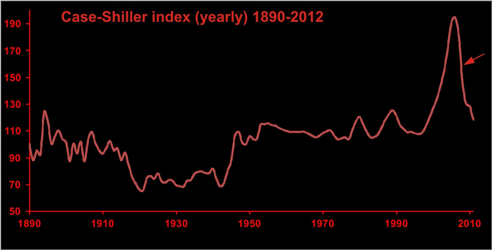
Or house prices vs real interest rates.


Data from Shiller [2005].

Defining a phase space from multiple variables requires multiple records. The state space can only be characterized over the duration of the shortest record. Dating errors will lead to various forms of distortion in the projected phase space. The economic time series tend to lend themselves well to this form of projection, because many of them exist to any arbitrary level of precision. If you choose month-end or year-end prices, there are normally no dating errors.

Phase space from a single time series

It is pretty uncommon to have more than one geological time series of sufficient length with good dating control. So geologists will normally have to work with a single time series. The method below can similarly be used in other types of time series as well.

When you have one time series, you may wonder how much dynamic information it contains. Fortunately, ergodic theory suggests that dynamic information about the entire system is contained in each time series output from the system [Abarbanel, 1996]. Therefore, a phase space portrait reflecting the dynamics of the entire system may be reconstructed from a single time series.

Time-derivative method

Packard et al. [1980] propose a method in which the function is plotted along one axis, and its various time derivatives are plotted on the other axes. If we use the simplest two-dimensional case, the graph would consist of a scatterplot of the function against its first time derivative. (i.e. y vs. dy/dt). An example of such a plot appears on the masthead of the blog.


In the above figure, we see the ice volume proxy plotted on the horizontal axis (ice volume increases towards the right) plotted against its first derivative over an interval of time lasting about 120,000 years. The numbers on the graph represent the time in thousands of years before present (ka BP). The rate of change of ice volume is plotted with +ve on top, so that as global ice volume grows (near A, for example), the system will move towards the right through phase space.

Any equilibria in this type of figure must necessarily occur along the zero rate of change axis.

Note the error bars presented on some of the states. Similar error bars would be found at all other states in the figure as well. The error in estimating the rate of change is a consequence of the error in measurement being similar in size to the difference between successive measurements. The size of the error bars is large compared to the variability of some parts of the trajectory--consequently our confidence in this trajectory is not as great as it otherwise might be.

Time-delay method

We reduce these errors by reconstructing the phase space by the time delay method [Packard et al., 1980], in which the elements of a time series are plotted against n-1 lagged observations from the same series (figure 2B). Identifying the lags and the embedding dimension (n) are key decisions in the reconstruction. To simplify things in the following discussion we shall only use two dimensions. Thus we reconstruct our phase space portrait by a scatterplot of the data against a lagged copy of itself. The optimum lag is defined by the first minimum of the average mutual information function [Fraser and Swinney, 1986]; however for quasiperiodic data we find that this tends to be the first minimum of the autocorrelation function (about ¼ of the period of the dominant waveform).

Thus for ice volume:


Here we are looking at a two-dimensional phase space reconstructed from ice volume proxy data covering about 200,000 years. In this projection, lower glacial ice volume is at the lower left corner of the plot, with greater ice volume towards the upper right corner. We'll interpret these later. Moving on


Case-Shiller index


Official unemployment rate


Detour Gold Corp.


CNTY busted trades (1 s of trading activity each figure)


Gold-silver ratio in phase space

Dynamic systems, like climate, have historically been analyzed using power spectral methods, such as the Fourier transform and wavelet analysis [Hays et al., 1976; Imbrie et al., 1992]. This has been a reflection of the predominantly linear assumptions underlying early analytical methods.

The power spectrum is not an invariant property of a nonlinear time series [Abarbanel, 1996], meaning that significant changes may appear in the power spectrum despite the lack of changes in the dynamics of the system. Therefore, changes in power spectrum are insufficient evidence to infer changes in dynamics.

In our next installment we'll talk a bit about equilibrium and what any of the above plots have to say about it.

References

Abarbanel, H. D. I. (1996), Analysis of Observed Chaotic Data, Springer-Verlag, New York.

Fraser, A. M., and H. L. Swinney (1986), Independent coordinates for strange attractors from mutual information, Phys. Rev. A, 33, 1134-1140.

Hays, J. D., J. Imbrie, and N. J. Shackleton (1976), Variations in the Earth’s orbit: Pacemaker of the ice ages. Science, 194, 1121-1132.

Imbrie, J., et al. (1992), On the structure and origin of major glaciation cycles, 1, Linear responses to Milankovitch forcing, Paleoceanography, 7, 701-738, 1992.

Packard, N. H., J. P. Crutchfield, J. D. Farmer and R. S. Shaw (1980), Geometry from a time series, Phys. Rev. Lett., 45, 712-716.

Saltzman, B., and M. Verbitsky (1994), Late Pleistocene climatic trajectory in the phase space of global ice, ocean state, and CO2: observations and theory, Paleoceanography, 9, 767-779.

Sauer, T., J. A. Yorke and M. Casdagli (1991), Embedology. Journal of Statistical Physics, 65, 579-616.

Shiller, R. J. (2005), Irrational Exuberance, 2nd ed., Princeton University Press.

Wednesday, October 19, 2011

Inference of dynamics for complex systems, part 1

Today I will start over with the analysis of dynamic systems, describing a methodology and some of the rationale behind the interpretations from previous postings, as it occurs to me that all of this stuff, though discussed before, is buried in the archives and is not easy to pull together.

This will also be good for me as I have to put together some kind of paper on the topic for one or more conferences in the first half of next year. GAC, in St. John's next year, will be a given as it is my old alma mater, but I am giving thought to presenting at the upcoming 3rd Multiconference on Complexity, Informatics and Cybernetics.

You are studying an interesting system, with many components. You know that many of the components interact, but you don't know the details of their interaction. If the interactions vary with changing conditions  within the system (feedback) it may be described as a complex adaptive system. Examples of such systems include, but are not limited to, ecosystems and other biological systems, the stock market and other economic systems, the climate system, and some would argue, the entire earth system.

The behaviour of such systems is typically nonlinear, and typically characterized by self-organization and emergent phenomena. The presence of negative feedback gives the system a form of resilience, allowing it to resist perturbations; and the presence of positive feedback causes the system to experience episodes of rapid change, usually resulting in a shift from one equilibrium condition to another. Multistability (the presence of more than one equilibrium condition) is a common feature of such systems.

The system has input signals, which may be time-dependent, however it may be that you are only able to observe some of these signals; furthermore there may be input signals of which you are unaware. There are output signals, which you observe, and compile into one or more time series; however there is no way to know if your output signal is important in terms of developing a global understanding of the system of interest.

There are conditions within the system which influence the manner in which the input signals feed through to the output signals. You may have an inkling of some of these rules (commonly expressed as differential equations) but normally your understanding of these rules is incomplete. You hope to understand your system by deducing these equations on the basis of your observations.

Here are some examples of systems we may wish to study.


Daily closing prices for Detour Gold Corp. (DGC-T), from late November 2009 to October 2011.


Gold-silver ratio.


Case-Shiller index. Data from Robert Shiller data page.


Unemployment rate (from US BLS site).


Trading activity in Century Casinos, June 21, 2011. From Nanex.


Paleoclimate proxy records over the past two million years. Magnetic susceptibility of loess (proxy for Himalayan monsoon strength) at top. Deep water 18-O record (proxy for global glacial ice volume) at bottom.

At first glance, the problem seems insurmountable. How do you study a system when you can't even be sure that your observations are meaningful? What if you have failed to observe the most important observable parameters?

It is especially bad for the geological time series, for in addition to the above problem, there are both errors in measurement and errors in the date (or time) of each observation.

In future installments, we will work through the data sets shown above; but we will start with some thoughts on equilibrium.