Dust flux, Vostok ice core

Dust flux, Vostok ice core
Two dimensional phase space reconstruction of dust flux from the Vostok core over the period 186-4 ka using the time derivative method. Dust flux on the x-axis, rate of change is on the y-axis. From Gipp (2001).
Showing posts with label oil. Show all posts

Saturday, May 30, 2015

Earthquakes and oil wells in Oklahoma

Further to last week's post on Oklahoma induced earthquakes, I have taken two slides (nos. 8 and 9) from this presentation (pdf), and plotted one atop the other.


In the above figure, the purple circles represent well completions from June 2010 to 2012 (appearing as a semi-transparent layer overtop the other), and the yellow circles represent the epicentres of earthquakes over the same time frame. Not all wells are associated with earthquakes. Most of the earthquakes are located in a few clusters, the three largest of which have been circled.

The reason that not all fracking (and its associated waste water disposal) causes earthquakes is because the local geology has to be predisposed towards producing earthquakes. There have to be natural stresses within the rocks to be released, and it helps if there are pre-existing faults to be activated by these stresses.


The three largest earthquake clusters plotted on a  geological map of Oklahoma (source - pdf). Interesting and complex structures lie at the root of the eastern portion of the map, as well as across the southern portion.


The three major earthquake clusters plotted on a map of fractures in Oklahoma (slide 14 in this document - pdf). I think the projections were different, which was why I couldn't get a very good overlay. But the lower two clusters of earthquakes are definitely in heavily faulted rocks--the northern cluster less so.

Monday, May 18, 2015

'Fracking' breaks Oklahoma

Well, maybe not yet.

This story in Zerohedge has attracted the interest of the Centre for World Complexity (that's me). So I've decided to take a little break from my ongoing travelogue of China to talk about some real geology for a change (possibly the first time this year).

Our topic today is intraplate earthquakes.But rather than reiterate what Wiki has already collated, let's apply our limited understanding of earthquakes to the situation in Oklahoma, while noting that our conclusions may also be applicable in other areas where fracking is being pursued (North Dakota? Saskatchewan? Ontario?).

Most large earthquakes happen at the edges of tectonic plates where the grind slowly past one another, but there are large stresses within plates as well. For one reason, the continental plates are all composed of small bits of tectonic material that have all become stuck together due to innumerable collisions of smaller pieces of material which couldn't be subducted. Because the plates are so large, the forces that drive them are dispersed over a large area, and stresses accumulate not only near the edges, but along any fracture that may exist within the plates interior.

Sometimes these intraplate stresses cause really big earthquakes. Perhaps the most famous such earthquakes happened in New Madrid, Missouri in the early 19th century. With a magnitude up to 8, they were the largest known earthquakes not directly related to a subduction zone in America's (known) history.


Seismic hazard map for the United States, from here.

Seismic hazard can be assessed in a couple of ways. By far the most significant approach is based on a study of the historical record of earthquakes. Hence, the two big red spots in the eastern US come from the large series of earthquakes in New Madrid in 1811 to 1812, and the Charleston earthquake in 1886. Several earthquakes have also occurred in the St. Lawrence valley (NE US) as well.

The historical record in the US is short, but the geology is long. The scale invariant nature of earthquakes allows us to estimate the recurrence interval of very large earthquakes in other places of the map (devoid of historical large earthquakes). Such recurrence intervals may be greater than a thousand years In such areas, stresses do build, albeit slowly--thus the likelihood of a large earthquake may be much greater than estimated purely on the basis of the historical record because it is so short.

Pumping liquids under pressure deep into the rocks has been correlated with small earthquakes since at least the 1960s. Our understanding of why this happens is more recent. It seems the fluids act much like a lubricant, allowing stresses that are already present in the rocks to be released. As far back as the 1960s, there were proposals for using such methods to control the build-up of stresses in the rocks and so prevent large earthquakes from occurring--however the approach has not, to my knowledge, been undertaken as a deliberate policy, probably due to liability concerns.

Now we see a series of reports and presentations (all pdf) by the Oklahoma Geological Survey showing a relationship between small earthquakes and fracking activity (the most important activity appears to be disposing of waste water in deep wells). Naturally, some people are concerned about liability.

Although many small earthquakes can be tied to oil and gas activity, no one has ever tied a large earthquake to such activity. And it is likely that no one ever will. Although the O&G activity is increasing the likelihood of small earthquakes, it is difficult to say what the impact on the likelihood of a large earthquake will be. The earth, even smaller parts of it, is a complex system, and part of what makes them interesting is that their response to stimulus is at least partially a function of the entire past history of the system. Our knowledge of earth history (especially around Oklahoma) is incomplete.

Suppose that in the absence of fracking, the recurrence interval for a magnitude 7.5 earthquake in a certain part of Oklahoma is on the order of 10,000 years (I have no idea if this is reasonable). Increasing the likelihood of small earthquakes may make a large earthquake more likely. If the last major earthquake in the area occurred in the 16th century, then probably there wouldn't have been enough time for the stresses in the system to build for a large earthquake to be triggered by fracking. But if the last big earthquake was ca. 10,000 BC, then there might be a problem.

There are costs and profits to be made from all kinds of human endeavours. Drilling for oil is one of them. I don't think we can allow the risks of induced earthquakes dissuade us from searching for oil, as it is a key determinant for economic progress. My concern is--are the people making the profits from oil exploitation going to be the ones paying the inevitable costs? 

Thursday, November 13, 2014

Estimating final global production of resources, part 1

This post was going to be about copper, which is not my favourite metal, but at least it has character (i.e., is not grey).

Apparently there is lots of the stuff around---so much that, unlike gold, it is difficult to see the end of mining it. This is great--I need a new fridge.

I have a copper nugget somewhere among my personal effects in Canada. I had thought I had a photo of it to post here, but no such luck--just a copper coin.


This is the best I can come up with--a smashed open vesicle from a basalt I found in the Rae-Richardson river system ages ago, filled in with what might be a copper mineral. The penny is copper, too.

My interest today concerns long-term forecasts of metal production. In an earlier posting, I discussed estimates of the total amount of gold remaining to be mined (on Earth). My comments today concern Hubbert linearization in the application to forecasting the amounts of oil, gold, copper, and other minerals that have yet to be found.

The linearization approach can be viewed as a technical approach whereby in the graph of annual production/cumulative production vs cumulative production, the extension of the linear line towards the cumulative production axis gives the maximum cumulative production. Alternatively, one can attempt to plot the logistic curve, of P vs Q, and look to fit the total plot to a parabola, where annual production falls to zero when the total amount of the resource has been extracted.


P/Q linearization for US oil production. Data from EIA.

Oil was a classic example--but in the graph above we see a little wrinkle in the plot. The current fracking phenomenon in oil shales has caused the US to re-enter the climbing production phase (for as long as it lasts). If this climbing phase is no more than a small blip, then it will only result in a small change in the final estimate of total oil production (somewhat shy of 250 billion barrels). If it continues, however, then we can make no estimate of final production.

Copper, for instance, is still in the climbing production phase, so it turns out to be impossible to use this method to estimate the total amount to be mined. The problem is that the current slope of the graph is positive, so the line will not extrapolate to the cumulative production axis.

Scanning around the interwebpipes for estimates of the total amount of gold expected to be mined here on Earth leads to estimates ranging from about 250,000 t to around 390,000 t (much larger amounts considered possible mainly by lunatics).

But perhaps I am among them. The method by which these estimates turns out to be highly sensitive to estimates of historical production (generally prior to 1850, for which records are incomplete) but is also highly influenced by the recent historical production. In particular, where relative production is declining, we can use Hubbert linearization to predict a final cumulative resource.

But for this method to give a reasonable estimate, the history of production has to be relatively smooth. And this is something we do not see. Mining tends to occur in cycles--gold for instance.


For gold, some of these cycles are tied to discoveries--South Africa, for instance, or California, and the Yukon, are all visible on the chart. Large cycles may also be driven by finance, especially the current cycle, which is the result of the rise in price through the late 1970s into 1980.

Permitting of mines is taking a long time, and it would not be unreasonable to assume that another peak in production may occur in response to the rise in gold prices since 2000. Any resulting increase in production will have a sharp impact on the estimate of the total amount of gold to be mined in future.

Another potential cause of production increase is technological change. Such change can lower the price of extracting resources, making otherwise uneconomic deposits economic. More importantly, technological change can reduce the energy cost, which may greatly increase the resources that may be extracted.

As an example, the relatively recent development of heap leaching has made a host of near-surface, low-grade deposits mineable. What would a miner in 1885 think if you told him we would one day mine gold deposits with grades of 0.01 oz/ton?

Thursday, November 6, 2014

S&P 500 and oil follow-up

This could be another Hallowe'en special.


The monthly chart shows a noticeable break, caused by the breakdown in oil price. How far it will fall is anyone's guess. Probably it will take the S&P 500 down with it at some point--maybe through losses in all those oil companies that are heavily dependent on fracking and a high oil price.

Once we reach bottom though, we ought to have a pretty nice bull run in both oil and the broader market.

I can hear your objections. Someone will point out that those waves of "growth" over the past ten+ years are just the result of Fed inflation. Furthermore, that someone will say that the Fed has shot all of its bolts and they will never be able to engineer inflation again. These statements will be amplified with opinions about Fed incompetence. It's a story I've heard a lot over the last ten (and more) years. I've even voiced similar opinions myself. I've come to realize that they are competent--the reason they seem incompetent is because what they are really doing is different from what they say they are doing.

Wednesday, July 2, 2014

The changing correlation between the S&P 500 and oil

Today we investigate the relationship between oil and the broad US market, using the S&P 500 index as a proxy.

A common thought is that the two functions are inversely correlated, with the US market in danger whenever oil rises too high.


The relationship has been a complex one over the past 11 years, but the correlation is positive most of the time.

In particular, we see from 2003 until late 2007, both oil and the market rose in tandem. The only time the two records show an inverse correlation was during the windup to the financial crisis--from late 2007 to July 2008.

The collapse in both market index and oil price through the second half of 2008 shows up quite clearly. The two prices rise in tandem from early 2009 to the end of 2012.

It doesn't seem logical that the S&P should be positively correlated to oil prices--so it is more likely that both records are correlated to the same thing--inflation. But what to make of the last 18 months, in which we see an almost vertical rise in the stock market without an increase in the oil price? Is an American renaissance in the works, powered by increased American oil production? Or is it due to the much rumoured mass purchase of securities by financial institutions, powered by monetary creation? Is it being done to prevent another period of negative correlation, which might foretell another economic crisis? Stay tuned . . . 

Sunday, April 27, 2014

Waiting for the wheel to spin

And waiting.


As seen previously, consecutive states on this chart tend to migrate around the big ellipse in a counter-clockwise direction. Our current position is on the bright green (or yellow) dot near the bottom right of the ellipse, just below the silver blow-off.

Since 1990, the level of Brownian motion in the orbit has increased notably. Half of the big ellipse was traced out between 1984 and 1989. The other half has only been traced out since 1990.


How did the commodity market change in 1990? Some new rules, perhaps--or was it just the evolution in emphasis from production to financialization, as seems to have happened in other markets over a similar timeframe?

I'm not sure if it's connected, but I note that the Common Fund for Commodities was established in 1990. I may be cynical, but there sure are a lot of organizations which seem to do the opposite of their purported purposes.

Anyhow, going forward, I expect we will start to grind our way upwards to a higher gold/oil ratio--but the process will be slow and noisy.

Wednesday, March 26, 2014

Scale invariance and the "fat tails" problem

A good deal of the statistical description of populations is based on the normal distribution. I think this is because the first things we tend to notice (the variability of sizes of people and animals) tend to have such a distribution. The height of Canadian men averages about 1.74 m, and the probability of variance typically follows a bell curve such that the probability of a man being 2.1 m tall, for instance, is much lower than the probability of being 2.0 m tall. There are well-established physiographic reasons for why people will not be much taller, (or very much shorter, discounting factors such as amputations), so that we can discount the existence of 3.5 m tall men.

One way of displaying the normal distribution was through a normal probability plot, which is a graph in which the vertical axis is scaled so that cumulative probability (for a normal distribution) will plot as a straight line. There is special graph paper you can use, with an appropriately scaled vertical axis, variably called probability paper, or probability plotting paper (pdf). A description of its use with data appears here (pdf).

If we are looking at natural phenomena with a wide variety, it is likely the distribution will be log-normal.

A normal distribution is described well by a mean and a standard deviation. If we plot probability density, we observe a parabola, with the maximum probability density corresponding to the mean.

The concept of the normal distribution was so powerful that we naturally carried the description to describe other phenomena, for which there are no such limits on size. Landslides, for instance, like the current one in Washington state, or earthquakes. Our current understanding of such events is that they exhibit scale invariance, which means that there are normally many more small events than large events, and the frequency of larger events is related to the frequency of the smaller events through their size on a logarithmic scale. In particular, the size-frequency distribution is a straight line on a logarithmic scale.


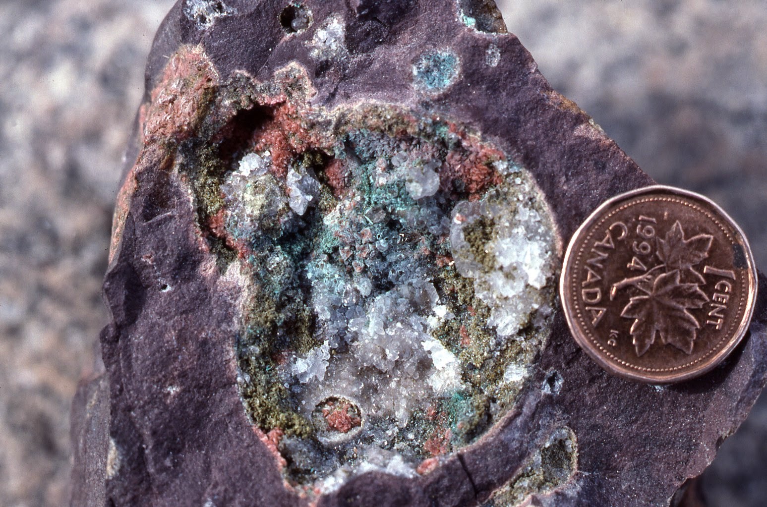
As the economic value shapes whether or not an accumulation of mineral is considered a deposit, mineral deposits only show scale invariance over a limited range. The numbers of, say 50-oz accumulations of gold in nature are extremely large, but these are very unlikely to be of economic interest. On the other hand, 50-million-ounce accumulations are much more rare, but are far more likely to be economically viable, and are thus more likely to constitute a "deposit". The size-distribution of deposits is controlled by these two contrasting probabilities, and the resulting distribution is log-hyperbolic. The probability density graph appears to be an hyperbola.


Hyperbola, parabola, what's the difference. Well, the differences are slight over much of the probability density plot, except at the tails. Of course, those tend to be the most memorable events (well, at the large tail).


Perhaps this doesn't look too impressive to you. But the differences in the tails can be extreme, especially for the most extreme events. The reason is that although the magnitudes of the slopes of both curves increases as you move away from the centre, in the case of the hyperbolic distribution, the maximum value of the slope approaches the slopes of the guiding lines (the asymptotes), whereas the slope of the parabola increases without limit. The discrepancy in estimated probabilities for extreme events can be orders of magnitude!

This is a possible explanation of the "fat-tails" problem that comes up from time to time in discussing extreme events (recent economic events for instance). IIRC, the failure of Long-term Capital Management had been estimated as extremely unlikely, as the risk model showed a maximum daily loss of $35 million. Losses eventually greatly exceeded the model maximum.

The implications of this distribution is happier for geologists--it means the probability of discovering a large deposit is larger than is frequently assumed.

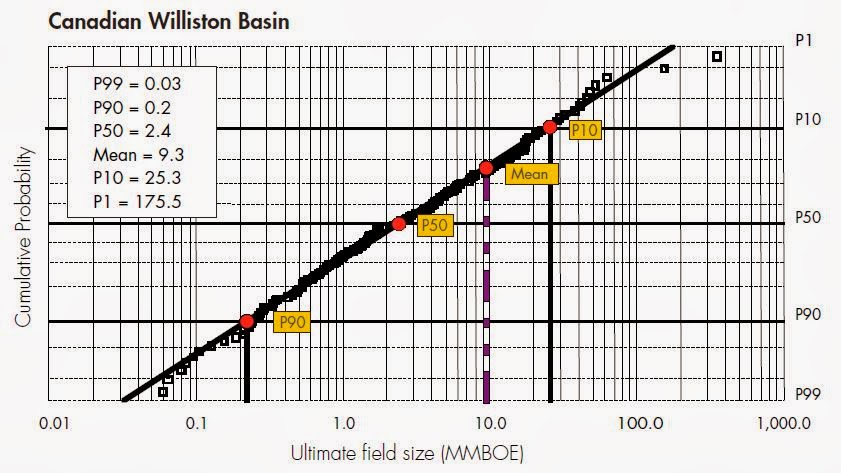
For instance, this is from what appears to be a Shell-training document (large pdf) on the role of play-based exploration in the decision-making tree (image is on pg 45).


The straight line is the log-normal distribution fit to the observations (squares). The model fit predicts that only 1% of discoveries will be larger than 175.5 million barrels of oil equivalent--but the observed data suggests that about 1.5% of discoveries are greater than about 350 million barrels.

Using the model to estimate the probability of a large discovery probably satisfies the accountants as being nice and conservative, but considering the potential economic importance of individual large discoveries, using the incorrect probability model may create a significant opportunity cost, if it results in an area play being discarded incorrectly.

I know some folks in the oil industry--and they can be a cagey lot, especially about something that influences their business plan. So it wouldn't be unheard of for the above document (as it is publicly available) to be deliberate misinformation. I have made enquiries, but so far no one will admit to knowing what I'm talking about.

Anyway, the play-based exploration idea is something I alluded to last time--but I don't see this entering into the playbook for mining companies until the costs of failure for mining exploration more closely resembles that of petroleum exploration--something that I think is still a few decades away.

Saturday, March 22, 2014

Scale invariance of mineral wealth--the exploration conundrum

I was dreaming when I wrote this. Forgive me if it goes astray.
Part of the reason I started this blog was to work through some ideas. Writing them and seeking comment while they are still forming seems to be an ideal use of interweb pipes.

I have written here and here about scale invariance in gold deposits--mostly on a global scale, using various data sources (pdf), including this one (pdf). What to do with this information?

The most common question is "what is the largest gold deposit left to be discovered?" Unfortunately, the answer is probabilistic. There will be a fairly low probability that the largest gold deposit still to be discovered is larger than the largest found to date. A more meaningful question might be "what is the typical size of a gold deposit that remains to be found?" Nobody seems to be interested in that one. Typical deposits are for other people to find. They are going to find the largest one.

As above, so below. Given sufficient data, the analysis can be repeated for separate structural provinces, or for particular trends. At present, there is limited interest in this approach (pdfs), but it may be because it is not completely clear how to best use the information obtained by the analysis. Mining companies don't really make decisions to investigate a general area on these sort of criteria.

Presently, most mining companies decide to get ground on wholly different criteria. They select a commodity not necessarily based on their expertise, but because the market appears to favour it. They select a locality on the basis of its current popularity (bonus points for recent spectacular discovery), political stability, the ease (or cost) of acquiring properties, their personal interest/familiarity with the region, or the availability of infrastructure. Just check the websites of some junior mining companies.

Oil companies, on the other hand, use this type of data in a process called play-based exploration. "Play" refers to a prospective area, not what the geologists do. The idea is that through studying the distribution of the sizes of known oil deposits within a field, a company will estimate the probability of discovering a pool of oil of a given size, balance that against the probable losses accumulated during exploration, and decide whether or not to proceed. This is entirely different, and separate, from the analysis of any individual prospect within the play.

An analogy within the mining industry would be to estimate the typical size of a gold deposit in a place like Kazakhstan, and using that information to make a decision about whether or not to attempt to look for ground to acquire. The mining industry is not at that point, largely because the costs of failure are nowhere near as high as similar costs in the oil industry.

Oil companies went this route as the costs of dry holes escalated over the past few decades, and they began to lose money on plays, despite having success with individual prospects. 

Tuesday, July 9, 2013

Will flood mud stick to the Harper government?

Past decisions have a way of coming back to haunt you. Just ask Stephen Harper.

The past several weeks have seen a series of events which, while not his fault, can be used by critics to attack his policies.

The first event was the Senate expense scandal, in which several Harper appointees were caught with their fingers in the till making inappropriate expense claims. The scandal is evolving, with one member of the Prime Minister's Office stepping down after it was revealed that he advanced one of the offending senators a cheque to cover his expense repayment. Although the senior aide in question resigned, and claimed that the PM had no knowledge of this event, Harper's history of micromanagement makes this claim rather dubious.

The second event was the massive flooding in Calgary. Though Harper was born in Toronto, this inconvenient fact is often glossed over in his appeals to his power base in Alberta. Especially Calgary.


Downtown Calgary showing the Stampede Grounds in foreground. Via

The event was driven by record intense thunderstorms across southern Alberta. Some areas received about half their average annual rainfall in less than two days. Many were quick to jump to the conclusion that this was a form of natural payback for Harper's push to develop the oil sands at the expense of any reduction in greenhouse gas emissions; however, Canada's muzzled environmental scientists were not among the critics.

(As an aside, it is impossible to ascribe a single event to global warming--although one can acknowledge the rising probability of such an event).

Before the floodwaters subsided, a near-crisis occurred--a train carrying petroleum distillates across a bridge derailed as the swiftly flowing Bow River scoured around the bridge foundations. It was mere foreshadowing for a major event.

Then came the apocalyptic train accident at Lac Megantic, which happened early Saturday morning. As is by now well known, a train hauling cars of oil for refining out east somehow slipped out of park and derailed and exploded in the centre of town, with what looks to be great loss of life.

Again, this is not Harper's fault--but critics are commenting on the tremendous increase in oil shipped by train in just the past four years. The amount of oil shipped by train has increased 28,000% in that time. I don't ever recall having a debate about the advisability of such an increase.

Perhaps this is not something that Harper has directed. But it has happened on his watch.

This brings us back to Toronto, Harper's real hometown. There was a surprising burst of rain, leading to a surprising amount of flooding. Unusual amounts of rain fell in a short time (about a month's worth in 6 hours). Not as bad as Calgary, and the results weren't as bad either. But notable.


This is my route to work. Via.

We were blacked out for about five hours. Some had it worse, with blackouts in Toronto ongoing today. Once again, there were critics blaming the flooding on Harper's energy/greenhouse-gas policies. Once again--this particular event can't be tied to it (although the probability of such events may well increase).

There is a lot of mud flying around. Eventually some of this mud may stick.

- - - - - - - - - - - - - -

Without any electronics, the kids were desperately bored. I shut down the laptops and unplugged them--we lost one due to a lightning strike last year. I finally engaged Jacob in a game of Shogi--he can play Chess and Chinese chess too (although he has a hard time finding credible opponents because I keep getting the pieces mixed up).

Wednesday, May 15, 2013

A cycle in commodity prices

I've pulled together a few longer time series for commodity prices, now going back to 1984. As done before I've plotted two ratios against each other--in this case I've used the gold-oil ratio (gold in $/oz, oil in $/barrel) and the silver-barley ratio (silver in $/oz, barley in $/tonne). I haven't found a consistent rough rice price series going back that far.


The first thing to notice is that the data are all pretty much confined to an ellipse, the main exception being the recent large excursion in silver two years ago. The second thing to notice is that the observations do not all occur throughout the ellipse, but seem to be confined to its edge. Almost as if the system were tracing out a large cycle (or series of cycles).

The direction and rate of change of the cycles can be seen by plotting the dates of observations on the scatterplot.


Starting at the lower right in 1984, the observations follow the outer edge of the above ellipse in a counter-clockwise direction, completing the upper half in about five years. The trajectory is not smooth, but very noisy, with some backtracking.


The trajectory is much noisier after 1990. The trajectory is confined into four areas in sequence outlined by ellipses in the above figure. The overall rate of evolution along the elliptical trajectory has slowed dramatically, as it has taken nearly 25 years to complete the lower half of the big orbit.

Interestingly, the direction of the orbit is the opposite to what I had supposed it would be when I first graphed the scatterplot. I had assumed we would see higher silver (industrial activity) followed by higher oil price, leading to higher food prices, which I thought would scare people into gold. But what we observe since 1984 is the opposite--higher silver prices leads to higher gold prices leading to higher food prices (anticipating inflation?) followed by higher oil.

The peak in the Au/oil ratio in 1988 is a reflection of low oil price rather than high gold. Perhaps the high silver/barley ratio is a reflection of low food prices, which allows more savings in India and China which translate into gold demand, raising the price of gold first, and food prices secondly due to increased demand.

I'm not sure what to make of the increased noise since 1990. It may have to do with the increasing amounts of easy money in the system encouraging more participants in the commodities markets. Maybe it was just that I was broke in 1990 and hung around with more broke people--but I don't recall anyone ever talking about investing in commodities back then. Not like today. I wouldn't ascribe it to central bank interference--if you were a CB, where is the sweet spot in the above plot?