Dust flux, Vostok ice core

Dust flux, Vostok ice core
Two dimensional phase space reconstruction of dust flux from the Vostok core over the period 186-4 ka using the time derivative method. Dust flux on the x-axis, rate of change is on the y-axis. From Gipp (2001).
Showing posts with label Lyapunov stability. Show all posts

Friday, September 27, 2019

We have passed this year's Arctic sea ice minimum

and what do we see?

This site informs us that we have tied with 2007 and 2016 for the second lowest sea ice extent in the satellite era--4.15 million sq km.

This gives us the wherewithal to update our phase space reconstruction of the sea ice extent.


We are near the middle of the same area of metastability we have been in since 2007. There is no way to tell how long we shall continue in this region of metastability; nor do we know if we will return to the higher region of stability occupied prior to 2004, or drop to another lower region of stability or fall to zero (as many disaster models predict).

All we can do is keep watch.

Wednesday, October 19, 2016

Arctic sea ice still hanging around

Another autumn, another sea ice minimum to add to the chart I have been posting yearly for awhile now. This year's minimum was about 4.1 million square km, among the lowest measurements on record.


Nevertheless, there still is not enough information for us to distinguish among several competing hypotheses.


1) The variation in sea ice is part of a dynamic natural cycle, which is currently in a lower area of Lyapunov stability, but which will at some point return to the higher area of stability (as it was prior to about 2003). There are alternatives to this hypothesis, such as the sea-ice system may naturally oscillate between two or more states, but this oscillation is being modified by anthropogenic effects.

If we are observing a natural cycle, and its duration is related to the time observed within the higher area of Lyapunov stability, then at some point the system will return to the area of stability occupied prior to 2003. The typical duration of natural climatic cycles is from a few years to decades. Given the length of time that the system occupied the higher Lyapunov-stable area, I would assume we are looking at a fairly long cycle length--meaning even in the best-case scenario (no anthropogenic effects) we would expect to remain in this state of lower sea-ice extent for at least another decade. A breakout, if it occurs will be towards the right first, before curving up toward the higher area of Lyapunov stability.

If anthropogenic effects are modifying the trajectory of the system, then we may still get an upward breakout, but it may be a short-lived one where the state does not reach the higher area of Lyapunov stability before falling back, either to the current Lyapunov-stable area, or possibly to a new, lower one. Even if, during the breakout, the system reaches the higher area of Lyapunov stability, it may remain there only a short time before returning to the present one or perhaps a lower one.

2) The variation in sea ice extent is in secular decline, likely driven by greenhouse gas emissions, but the dynamics of the natural system have temporarily arrested the decline in the current area of Lyapunov stability. In this case, we may expect the system to remain within this area of Lyapunov stability, before breaking out to the left and arcing downward.

Distinguishing between these differing hypotheses needs more time, but unfortunately we run the risk of an irreversible change occurring as we wait. Better would be to extend the record backwards by several decades, which can probably only be done by collecting near-surface sediment cores, and looking at their microfossils.

Sunday, March 27, 2016

Counting down to another deflationary impulse

First the bad news.


That pop-up I talked about last month in the phase space portrait of gold x USDX has gone the same way as last year's. Back into the increasingly significant area of Lyapunov stability near the centre of the above plot.

- - - - - - - - - - - - - - - - - - - -

The plot of USDX index vs gold price over the past decade has shown extreme variability in the specific relationship between gold price and the US dollar index. Conventionally, one might assume that gold and the US dollar strength are inversely related. If so, on the graph below, the plot would trace out a single hyperbola. Instead, we see that while there is a general inverse relationship between the two variables most of the time, the relationship is not simple. Furthermore, there are intervals when both rise together.


This impossible trend represents the increasing demand/value of real money, and is interpreted as an indicator of deflation. From September '09 until June '10 and from October '14 to late January '15, we saw a deflationary reaction in USDX vs gold. Interestingly one such trend began at the endpoint of the previous reaction.


Of course, it helped that major bond purchases by the Fed supposedly ended in October 2014.

For the last year, USDX vs gold has been confined to a relatively small area of phase space, with most of the action showing an inverse relationship between the two variables. In the last four months, however, the state of the plot has shifted from the upper left to the upper right of the following plot, bringing us very close to the endpoint of the last deflationary impulse.


Presently, with other deflationary indicators perking up (Au/Cu), we see the system evolving to the end of the last deflationary impulse. In conjunction with the breaking of the world, buckle up for another deflationary move. We just need a policy trigger. End to NIRP, anybody?

Monday, March 7, 2016

The world is breaking again

It's been awhile since I looked in detail at the relationship between Dr. Copper and Mr. Gold.


Last time the world broke, we saw the gold-copper ratio rip upwards from about 270 to roughly 600, in only a few short months. It never held that level, instead falling to a Lyapunov-stable area somewhat over 300.

The gold-copper ratio has generally increase since then, but is showing signs of some kind of break. Is this a sign of deflation? A crash of copper, and rising gold? In the last few weeks, copper is looking a little better--or is this just a prelude to PDAC?

Sadly*, I won't be going this year. China won't let me.


*Actually, I'm not that sad.

Tuesday, July 7, 2015

Stability of atmospheric CO2 over the last 20 million years

I've been playing with a "record" of atmospheric CO2 over the past 20 million years for some time, using the reconstruction of van de Wal et al. (2011). Today's graph is a representation of the various regions of Lyapunov stability teased out from state space reconstructions of segments of the data (windows), ranging from 150 to 250 ky (thousand years) in width.


The red dots all represent regions of stability defined using the methods described here. The blue dot represents approximately today's atmospheric CO2 concentration, which is about where it was 10 million years ago. More later, but I need to go for a walk now.

Saturday, September 27, 2014

Annual post on Arctic sea ice

Once again, it's time for The World Complex post on Arctic sea ice extent, viewed through the lens of a reconstructed state space.

The minimum extent for sea ice this year appears to have been reached on September 17. This extent is marginally below the extent from last year.


This figure has not changed significantly from last year. We see no evidence of a breakout out from the declining trend line. The slope of the trend line I have drawn is a little shallower than it was last year.


As before, I do not see any evidence to cause me to discard the hypothesis that the change in ice extent since the mid-1980s represents a change from one area of stability to another. What is still uncertain is whether this new area of stability represents a brief respite in a function that is heading to zero, or whether it is a part of normal long-term cyclical behaviour.

The horizontal lines labelled 2015 and 2016 show the level of the ordinate of the state space in those years. 

Tuesday, July 23, 2013

Identifying stability in complex systems

No, this is not about Egypt.

I use the term "stability" a lot, as in area of stability. Sometimes I describe the stability of systems projected into phase space as "Lyapunov-" in nature. It may have been awhile since I discussed the criteria for determining whether we observe stability in a system--the Case-Shiller index, for instance.


I've just noticed that I didn't label the axes on the lower figure--but they are the same as in the upper figure.

Why are the yellow blobs, and the large cluster of points at the lower left of the second figure, areas of stability, whereas the small cluster near the top of the lower figure is not?

One clue is whether we see many points that occur close together in time also close in phase space. A lot of points clustered in one area means that whatever measurement we are looking at is not changing much over a long period of time--just what we mean by stability, no?

Areas of stability can only occur in certain places on a time-delay phase space reconstruction.


Same figure as above, but with the "y = x" line plotted. Points along this line would represent points where the value of the Case-Shiller index is the same as it was four years earlier. Areas of stability will straddle the line. The system cannot remain in one spot for long if it is off this line. That doesn't mean that the system has to report to the line. It can meander away from the line for long periods of time (twelve years already)--but while it is doing so, it is not stable.

What about the point where the state crosses the y = x line at the first quarter of 2008?


The first quarter of 2008 would be about where the arrow was. The index was at the same level in early 2004--but we would not say that that was a point of stability because of what the index did during that interval.

Time-derivative phase space reconstructions are topologically equivalent--but perhaps more intuitive, as in this case the system dynamics are reconstructed by plotting a measurement against its rate of change.


In this different projection--time-derivative state space portraits (of the gold-silver ratio)--in which I have plotted the GSR vs its first time derivative, all points of stability must lie along the dr/dt = 0 line. But why doesn't every point on this line represent stability (for example, the point where the curve crosses 0 when GSR = 96)?

You may recall from calculus that apart from critical points of inflection, rates of change also reach zero at local maximum and minimum points. So once again, the fact that a point plots on an area that may represent stability does not mean the system is stable at that point. You need to see a lot of other points, which are close neighbours in time, in the same area.

Wednesday, June 13, 2012

Origins of multistability in economic systems: commentary on Soros (2012)

All over the world, the same message is relentlessly hammered home--conventional economics has failed. Policy makers did not foresee the 2008 crisis--and their attempts at remediation of the unemployment situation have had effects opposite to what was intended.

Why is this? Does economics in the real world differ so much from the theoretical? And if so, why?

Let us consider how complex behaviour arises in some natural systems.

Multistability in natural systems

The global climate system is a nonlinear, nonequilibrium system involving internal time-varying mechanisms, feedbacks, and external forcing. Systems with feedbacks are commonly multistable, prone to bifurcations, and hysteresis—even when those systems are driven by invariant driving functions.

In previous posts we have seen that the phase space projections of numerous climate functions show multistability--that is they tend to evolve not to a single equilibrium, but oscillate among any number of equilibria. The reason that multiple equilibria arise is because the dynamics of the climate system include both negative and positive feedbacks.


Different forms of stability. For asymptotic stability, given a limited range of  initial 
conditions, the system evolves towards a fixed point. For Lyapunov stability, once the system
reaches a limited region of phase space (b), the system tends to remain there. 


Where negative feedbacks dominate, the system tends to be stable. In the diagram above, there are different forms of stability, but the two most important are asymptotic stability (also called a point attractor) and Lyapunov stability. It will normally not be possible to distinguish between these on the basis of observation of some system.

Positive feedbacks tend to enhance the effects of external forcing, multiplying the magnitude of the stresses brought on by forcing. The presence of both negative and positive feedbacks supports a system with multiple disjoint regions of equilibria, bounded by separatrices. 


Time evolution of a system with multiple equilibria. In actuality, the separatrices 
are likely to show fractal interfingering.

I have commented on applications of this idea to unemployment, but have not discussed the origins of the necessary feedbacks required to generate multistability. Some comments by George Soros (below) seem to shed some light on this topic.

Soros' remarks on global economy

George Soros recently spoke at the Festival of Economics in Trento, Italy. What made his remarks interesting to me were his allusions to nonlinear dynamics in the evolution of the economic system, and their effects on policy. Soros begins by remarking on the lack of success policy makers have had in predicting economic outcomes in the past few years. The reasons for these failures . . .
go back to the foundations of economic theory. Economics tried to model itself on Newtonian physics. It sought to establish universally and timelessly valid laws governing reality. But economics is a social science and there is a fundamental difference between the natural and social sciences. Social phenomena have thinking participants who base their decisions on imperfect knowledge.
Anyone reading about Austrian Economics will be familiar with the argument. Market participants will try to act in a way that maximizes benefits to themselves, but what constitutes maximum benefit may vary from one to another. A highly technical treatment of this topic can be found here (probably not of interest to most of you, except for the part about aggressive participants with a strategy of investing in risky assets increasing the likelihood of a market crash for everyone).

The market participants do not perceive the true nature of the system in which they are operating, and so many will choose suboptimal strategies. However, as they act, they also change the nature of the system, so that what would have been an optimal strategy had all participants been "rational" may become suboptimal in the real world. Likewise, strategies which would be suboptimal in a purely rational world may become optimal.
I found a two-way connection between the participants’ thinking and the situations in which they participate. On the one hand people seek to understand the situation; that is the cognitive function. On the other, they seek to make an impact on the situation; I call that the causative or manipulative function. The two functions connect the thinking agents and the situations in which they participate in opposite directions. In the cognitive function the situation is supposed to determine the participants’ views; in the causative function the participants’ views are supposed to determine the outcome. When both functions are at work at the same time they interfere with each other. The two functions form a circular relationship or feedback loop. 
For instance, under normal circumstances it would not be advantageous to rush to the bank and withdraw all of your money. However, the economic system could be altered to the point where that might turn out to be the optimal strategy after all. 

Soros goes on to describe the inflation and bursting of a bubble in terms of the interaction between positive and negative feedbacks.
I developed a model of a boom-bust process or bubble which is endogenous to financial markets, not the result of external shocks. According to my theory, financial bubbles are not a purely psychological phenomenon. They have two components: a trend that prevails in reality and a misinterpretation of that trend. A bubble can develop when the feedback is initially positive in the sense that both the trend and its biased interpretation are mutually reinforced. Eventually the gap between the trend and its biased interpretation grows so wide that it becomes unsustainable. After a twilight period both the bias and the trend are reversed and reinforce each other in the opposite direction. Bubbles are usually asymmetric in shape: booms develop slowly but the bust tends to be sudden and devastating . . .
At any moment of time there are myriads of feedback loops at work, some of which are positive, others negative. They interact with each other, producing the irregular price patterns that prevail most of the time; but on the rare occasions that bubbles develop to their full potential they tend to overshadow all other influences.
What does the phase space of a system with myriads of feedback loops look like?


The recognition of multiple equilibria in economic systems does not go far enough, in Soros's view, because the collapse of bubbles can trigger policy responses which greatly alter the workings of the system. In other words, politics can become a potent driving force, with both secular components (such as the progressive concentration of wealth and power into fewer hands over the last forty years) and singular spectacular events (such as declaration of wage and price controls, short-duration spikes in interest rates; or even irreversible decisions like detaching the dollar from gold).

The addition of the political drivers adds a dimension which has no analog in nature. It also forces us to recognize that the future evolution of the economy will be not only a function of the feedbacks and forces we consider above, but also the entire history of the economy as well. For instance, Soros argues that the present European crisis is as much a function of history as of excessive government debt . . . 
because the financial problems were reinforced by a process of political disintegration. While the European Union was being created, the leadership was in the forefront of further integration; but after the outbreak of the financial crisis the authorities became wedded to preserving the status quo. This has forced all those who consider the status quo unsustainable or intolerable into an anti-European posture. That is the political dynamic that makes the disintegration of the European Union just as self-reinforcing as its creation has been. 
Unfortunately the non-linearities in the system make prediction hazardous. But given the preliminary indicators of bank runs in Europe, South America, and Africa, as well as Oanda's recent announcement . . . errm, yes, excuse me, but I have some preparations to see to.

Friday, March 2, 2012

Snapshots of multistability in the climate system

Today the World Complex presents images from the recently redrafted movie of the probability density plot of the proxy record for global ice volume over the past two million years. The reason for the redrafting was to shorten the window, improving the resolution of the individual frames.

The methodology for deriving these plots from original data has been previously described here. The O-18 data used below are from Shackleton et al. (1990). Variations in O-18 in the deep ocean reflect global volumes of glacial ice.


This figure is a map of a ice-volume phase space over the interval 189 ka to 39 ka (ka = thousand years ago). There are three distinct regions of higher probability (grey areas) in phase space, which represent stable global glacial volumes. This figure suggests that over the interval in question, there were three stable global ice configurations--one corresponding roughly to the interglacial condition we have today (at lower left), and two more with considerably more (glacial) ice--and that transitions from one to another happened relatively rapidly. As the probability of any state outside of the three LSAs is low, global climate change was rapid during the interval in question. Glacial ice volumes therefore have three conditions of equilibrium, which are punctuated by brief episodes of rapid change. Using our dynamic interpretations from previous articles, we have inferred three areas of Lyapunov stability in the time delay state space of global ice volume.

The graph only tells us about global ice volume, but not where the ice is. Thus we cannot infer the global glacial configurations for each of the three LSA.


In the 699-519 ka interval (still Late Quaternary) we still see multiple areas of stability. There may be a limit cycle in the low volume section of probability density diagram.


The interval 1509-1359 ka was characterized by a large limit cycle, with a couple of particular regions of higher probability. The high probability peak at lower left represents an area of Lyapunov stability. Limit cycle behaviour in the ice volume system suggests oscillatory growth and decay of ice sheets.


This plot shows a limit cycle and two areas of Lyapunov stability. The lower one, near (3.5, 3.5) is the same as the one in the next figure above. The second area of attraction, near (3.9, 3.9) is present in the figure at representing the interval 1599-1449 ka above.

In general, limit cycle behaviour is more common in the Early Quaternary, and simple LSA multistable behaviour is more common in the Late Quaternary. This observation is reinforced in observations of reconstructed phase space portraits of smoothed C-13 measurements from cibicidoides sp. (Raymo et al., 2004).


The C-13 data is purported to represent oceanographic conditions and are reflective of overall glacial conditions, with lower values corresponding to glacial maxima (Bickert et al., 1997). The phasing of variability in the C-13 differs from that of O-18 at different frequencies and is thought to reflect changes in oceanographic flow at least partially in response to glacial cycles (Raymo et al., 2004).

In the Early Quaternary, the probability density plots of the reconstructed state space mainly suggest limit cycle behaviour. The period of the oscillations is approximately 41 ky.


In the Late Quaternary, the oceanographic state is more suggestive of multiple metastable equilibria, punctuated by brief episodes of rapid change.


Limit cycle behaviour is still observed in some windows in the Late Quaternary . . .


 . . . but multiple equilibria is the predominant state in the Late Quaternary. 

I have recently completed epsilon machine reconstructions for the 13C predictive states (at least the forward-evolving e-machines as described briefly here in the references) and will be posting these shortly.

References

Bickert, T., Curry, W. B., and Wefer, G., 1997. Late Pliocene to Holocene (2.6-0 Ma) western equatorial Atlantic deep-water circulation: Inferences from benthic stable isotopes. In Shackleton, N. J., et al. (eds.), Proceedings of the Ocean Drilling Program, Scientific Results, v. 154: 241-254.

Raymo, M. E., Oppo, D. W., Flower, B. P., et al., 2004. Stability of North Atlantic water masses in face of pronounced climate variability during the Pleistocene. Paleoceanography, v. 19: 13p. doi: 10.1029/2003PA000921.

Shackleton, N. J., A. Berger, and W. R. Peltier, 1990. An alternative astronomical calibration of the Lower Pleistocene timescale based on ODP site 677, Trans. R. Soc. Edinburgh, Earth Sci., 81: 251-261.

Friday, February 17, 2012

An economy explodes--unemployment in Ireland 1985 to 2011

Today we look at the historical unemployment rate for Ireland. No word yet on whether they have different definitions for "unemployed" and "out of work." This data I found at this site, which allows you to telescope the record to obtain monthly data from 1984 to the end of 2011 (for Ireland--the range of data differs for other countries).


Through the '80s and early '90s the unemployment rate was pretty high (by our standards). It fell during the tech boom of the late 90s, staying low until early 2008 when the rate very rapidly returned to the levels of the late 80s.

In earlier articles we have used the phase space reconstruction as a tool for interpreting the dynamics of the system. For ease of presentation, we limit our reconstructions to two dimensions even though we recognize that two dimensions is not sufficient for a true reconstruction. Below we see such a plot using the time delay method, with a lag of twelve months.


I'm not sure whether I would characterize the high unemployment as an area of stability, but you could make a pretty good argument for the highlighted area in the low unemployment section of the curve. The unemployment state occupied that tiny region of phase space for nearly six years.

One observation that favours a high-unemployment area of Lyapunov stability is the return to late-1980s levels of unemployment once the economic "miracle" collapsed.

Enlarging the lower part of the graph shows just how compressed the reconstructed phase space is for six years during the real estate bubble.


I'm not sure how much massaging the unemployment numbers have undergone over the past few decades--it's possible the picture is even worse for Ireland that it appears.

When sorrows come, they come not single spies, but in battalions.

Sunday, January 1, 2012

Change in state for Arctic sea ice?

The recent Arctic Report Card concludes that  . . .
 the Arctic Ocean climate has reached a new state with characteristics different than those observed previously. The new ocean climate is characterized by less sea ice (both extent and thickness) and a warmer and fresher upper ocean than in 1979-2000. 
Well, this sort of thing just happens to be a specialty here. Let's look at the data to see what they mean.

The record of sea ice can be inferred here.


The National Snow and Ice Data Center has kindly drawn a regression line through the points.

We'll use the time delay method to reconstruct the phase space in two dimensions.


The choice of a two-year time delay is somewhat arbitrary, as one year also serves. The two reconstructions do not appear materially different.

We observe that the state tends to occupy a small area in phase space, centred at about 7 million sq-km (yellow) from the initiation of the data set (1981 in this projection) until about 2002, after which the system has evolved into a new area of phase space characterized by reduced ice cover. It doesn't yet trace out anything that looks stable in this new area, so I would not exclude the possibility that it is currently tracing out a transient excursion.


The extent of sea-ice cover in November has declined in a stepwise fashion since the early 1980s. Here we have tenatively labelled three possible areas of Lyapunov stability.

- - - - - - - - - - - - - - - -

We observe a decline in Arctic sea-ice cover over the past 30 years. Like other components of the climate system, it appears that sea-ice cover is prone to sudden changes in state. The direction of the change appears to be consistent with projections of the global warming hypothesis.

The caveat is that the records presented here are too short. We cannot be certain that the period of observations--in particular those from 1980 to 2000--were representative of "normal" climate. Consequently, the statement quoted at the beginning of this post seems premature.

The 1970s were at the end of a multi-decade period of global cooling. The Arctic sea-ice cover at the end of the 1970s may therefore have been unusually large, and the observed shift to reduced cover may be simply the natural variability in the system. We can't tell for sure because we would need to observe at least one more cycle of variability, and we do not have the records we need.

The only way to obtain longer records will be through some form of proxy measurement, either through micropaleontology (dinoflagellates seem to be a favourite), or concentration of aerosols in nearby glacial ice.

Friday, December 23, 2011

Innovation in complex systems

Innovation has been on my mind a lot lately. Unfortunately, not the kind that results in iPhones and the like.

We normally think of innovation as a good thing. But not all innovations are good ones. As counterexamples, let's consider recent political innovations in the US that allow indefinite detention without trial of anyone accused of terror-related activities; or the use of Predator drones to target American citizens.

My interest has been innovation in the Earth system--particularly in the behaviour of the climate system over the past two million years. The problem with recognizing innovation is that we tend to interpret any activities in light of what we already know--consequently it is difficult to discover anything new. Our first tendency would be to explain our new observations as a special case of what we already know. We resist the idea that something new is occurring.

The Earth system is driven by a few global parameters which interact with myriads of local agents; yet contrary to expectations instead of dissolving into noise, highly ordered global-scale structure arises. We may call such structures emergent properties, and the means by which they arise is termed emergence.

The problem of how these global structures arise from multitudes of interacting local agents is, shall we say, a non-trivial problem. They are in no way predictable from our knowledge of the local interactions; nevertheless we agree that emergence is in accordance with physical laws.

In earth systems, such emergent properties include plate tectonics, glaciations, superplume events, and some mass extinction events.

The emergent properties of a system may change. These changes may or may not be related to specific change(s) on the local level. For the purpose of this essay, I am referring to such changes as innovation.

Possible examples of innovation in Earth systems include the (somewhat controversial) proposed change in mode of tectonics in Archaean time; (very controversial) Neoproterozoic glaciation (i.e., "snowball Earth"); and magnetic pole reversals.

I have been considering change in operation of the climate system during the Mid-Pleistocene (from about 1 million years ago to about 500 thousand years ago).

I present the following probability density plots of the 2-d phase space reconstructions of the ice volume proxy, produced using the time delay method with a delay of 6 thousand years. Each of the figures below is calculated from 150 thousand years of data.

Starting from the Early Pleistocene . . .


Limit cycles (green dashed ellipses) are common in the Early Pleistocene, less so later.

Areas of Lyapunov stability, labelled A1 and A2, represent relatively ice-free conditions. Current global ice volume is comparable to A2, and A1 represents even less ice than at present. Limit cycles in the Early Pleistocene (representing slow, steady growth and decay of ice sheets) start from either the A1 or A2 condition.


The Late Pleistocene is characterized by discrete areas of high probability, suggesting rapid transitions between longer periods of stability. A2 represents an interglacial condition, and A3 to A6 represent separate metastable ice configurations of greater volume respectively. A6 represents a glacial maximum condition, as we experienced about 18,000 years ago.

Climate dynamics as inferred from global ice volume seems to have changed during the Pleistocene epoch. Was it innovation?

Opinions about what happened during the Mid-Pleistocene include changes in atmospheric CO2 leading to greater glaciations, cumulative cooling in the deep ocean changing the nature of the glacial-interglacial transition, erosive uncovering of crystalline bedrock leading to greater thickness of ice sheets, and spontaneous (chaotic) change. There is general agreement that there is no obvious external forcing or any fundamental change in the low-level dynamics leading to the change in climate behaviour, so it is at least possible to argue that the climate system began to act in an "innovative" fashion (provided we state that we do not view this innovation as having been directed in any way).

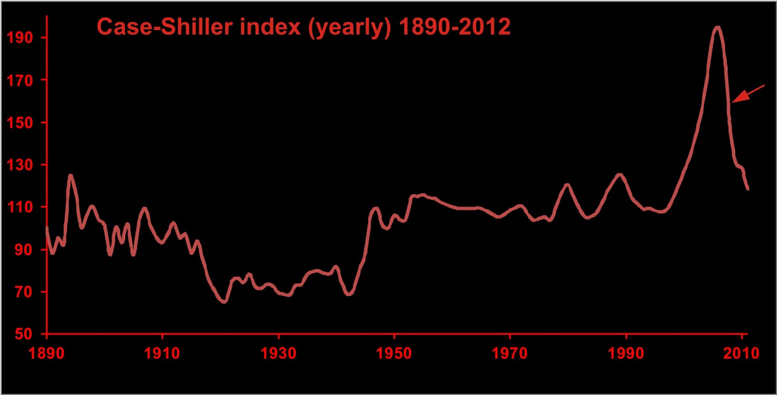
Let's look at another system instead--one represented by the share price of Century Casinos.


The chart of the daily closing price looks a little like my portfolio--up to a high in April, and all downhill from there.

The two-dimensional reconstructed phase space doesn't look much different from those of other stocks I've looked at in the past.


Actually, this has been smoothed a little, using a 3-point moving average.

There appears to be nothing interesting in the share price activity over the past year--unless we look at daily high prices instead of closing prices.


And here we see something unexpected--a singular spike in share price on June 21, where the share price bounced between about $3 and $8 several times over the day, on first a one-minute timescale, and around mid-day at a one-second timescale.

To investigate dynamics on this timescale, we have to construct our time-delay phase space with a small lag.


In two seconds of trading we have numerous fluctuations between $3 and $7. Lots of money to be made here! (or there would have been had the exchanges not cancelled all the trades).

A few minutes later we get this over one second.


This is orders of magnitude different from what we see in the annual behaviour of the stock, and even considerably different from the bowl of spaghetti above. This figure actually represents a phase space portrait of a random walk. Yes, you can trade randomly if you are quick enough.

So what is the difference between the trading in CNTY on June 21 and every other day this year? Another innovation--high-frequency trading, but in a form which creates the illusion of liquidity by placing lots of orders and then cancelling them as they begin to be filled. The resulting moves in a stock can be dramatic.

Suppose an institutional investor needs to buy a million shares of CNTY (perhaps part of some proprietary arbitrage position). The buyer looks at the depth chart and sees that there are a million shares being offered at $3, so the buyer attempts to fill the order--only to discover that he gets perhaps a thousand shares, the rest of the offer is cancelled, and there are now a million shares offered at $3.05. The tug-of-war may continue, but if the buyer is motivated, the share price may rise considerably in a remarkably short period of time.

Remember that the original intent of having a bid and ask price is that the various offerings were intended to be sold. The idea that these offerings would be used only as bait and not represent real liquidity is indeed innovative, but unhelpful.

Unlike the change in climate dynamics in the mid-Pleistocene, the change in dynamics in share price of CNTY is symptomatic of a fundamental change in the operation of the market, and this change is detrimental to the majority of its participants.

Friday, December 16, 2011

Inference of dynamics for complex systems, part 4: long records

Today we look at phase space reconstructions of long climate proxies (which are records of some geological parameter which is believed to be related to some climatic parameter--used because we have no way of directly measuring temperatures or global ice volumes of the distant past).

The proxy I will be looking at today is the ca. 2-million-year-long record of deep-sea d18O (difference in concentration of O-18 from some standard)  from ODP 677.


The record is actually inverted, as it is a proxy for ice volume. In the figure above, the curve is near the top of the graph at times of low ice volume (i.e., interglacials) and near the bottom during glacial maxima.

Reconstructing the phase space over the past 585,000 years (since 585 ka in the figure below), using a delay of 6000 years (noted as 6 ky below), gives us the following.


Now we need to decide what sort of system this graph describes. Is it like this?


Or more like this one?


There are a lot of loops in our reconstructed phase space portrait. Are there any areas of Lyapunov stability? It is not too easy to see directly from the portrait.

To simplify it, we can divide up the data into bins and contour the density of data in each bin. I have called these "probability density plots" in previous posts. With sufficient data, you may be able to use a Gaussian kernel estimator--as many commonly used mathematical software packages contain such a feature (you may have to create your own subroutines to work in two or more dimensions).


The probability density plot (modified from the Paleoceanography paper) is a lot easier to interpret than the original phase space portrait (second figure from top). The peaks in probability density (labelled A2 through A5) are interpreted as areas of Lyapunov stability. Global ice volume over the past 750 thousand years (and much more) is characterized by multistability--there are multiple equilibria. At any given interval, only one equilibrium is "in play"; but the equilibrium point is subject to abrupt change from, say, A5 to A2, over very short intervals.

The above image was constructed from a "window" (a shorter section of the record) of 750 thousand years. The entire record might be studied in a series of three such windows. Windows of lesser duration offer a higher-resolution characterization of the system dynamics.


Same data set, shorter window.

Creating a probability density plot is a robust method of limited computational difficulty which can simplify your interpretations of the dynamics from long, complex data sets.